A decentralised perpetual exchange needed to go toe-to-toe with the UX quality of centralised alternatives — without hedging, and without a watered-down middle ground.
Most DEXs at the time sat at one of two extremes: powerful enough for pros but hostile to newcomers, or simple enough for beginners but frustrating for anyone who knew what they were doing. TxFlow needed to serve both audiences from day one.
How I Approached It
I organised the work into two parallel tracks, each with its own design logic but sharing a unified visual system.
The first track was the design system — the foundation everything else would sit on. Without it, velocity would have collapsed into inconsistency by week three. Colour, iconography, motion, and typography were locked early and stress-tested against real trading UI before they were ever treated as final.
The second track was product UI — the dashboard, the order flows, the referral system, the homepage. The surfaces where a trader would spend hours, make decisions, win and lose money. Every component was designed with that weight in mind.
DEX
What Shipped
TxFlow is live on mainnet, processing real trades with real liquidity. The design system scales across desktop and mobile.
The engagement was a proof of concept for AI-augmented solo design — output that would typically require a 2-3 person team, delivered by one contributor at startup speed.
⚠️ A portion of final-month Figma work was not recoverable after offboarding. This case study reflects all available design assets. Sections marked as pending will be updated as assets are recovered.
1
Sole Contributor
LIVE
On Mainnet
2-3x
AI-Augmented Output
// 01 — DEX
TxFlow — Decentralised Perpetual Exchange
One designer. Full product scope. Shipped to mainnet.
This section covers all design work for the TxFlow DEX — the web trading interface, H5 mobile surface, design system, competitive research, and AI-augmented workflow. Work was structured as a solo contributor engagement with AI tooling used to match the output of a 2–3 person team.
Product UI — Trading dashboard, Vaults, Portfolio, Referrals, Points, Asset Selector, Homepage. The surfaces traders use every session.
Design System — Atomic structure from tokens up: colour, Space Grotesk typography, Remix Icons, component states. The foundation that kept the product consistent at speed.
Research — Competitive analysis across Hyperliquid, dYdX, GMX, Aster. Market positioning, UX gap analysis, and the design doctrine that informed every decision.
Agent — How AI tooling was integrated into the design process to achieve 2–3× solo output without compromising fidelity.
Product UI
Product UI
TxFlow had no interface. No design system. No components. No screens. One designer — working across web, H5, app breakpoints simultaneously — took it from nothing to a live perpetual DEX on mainnet. This is that work.
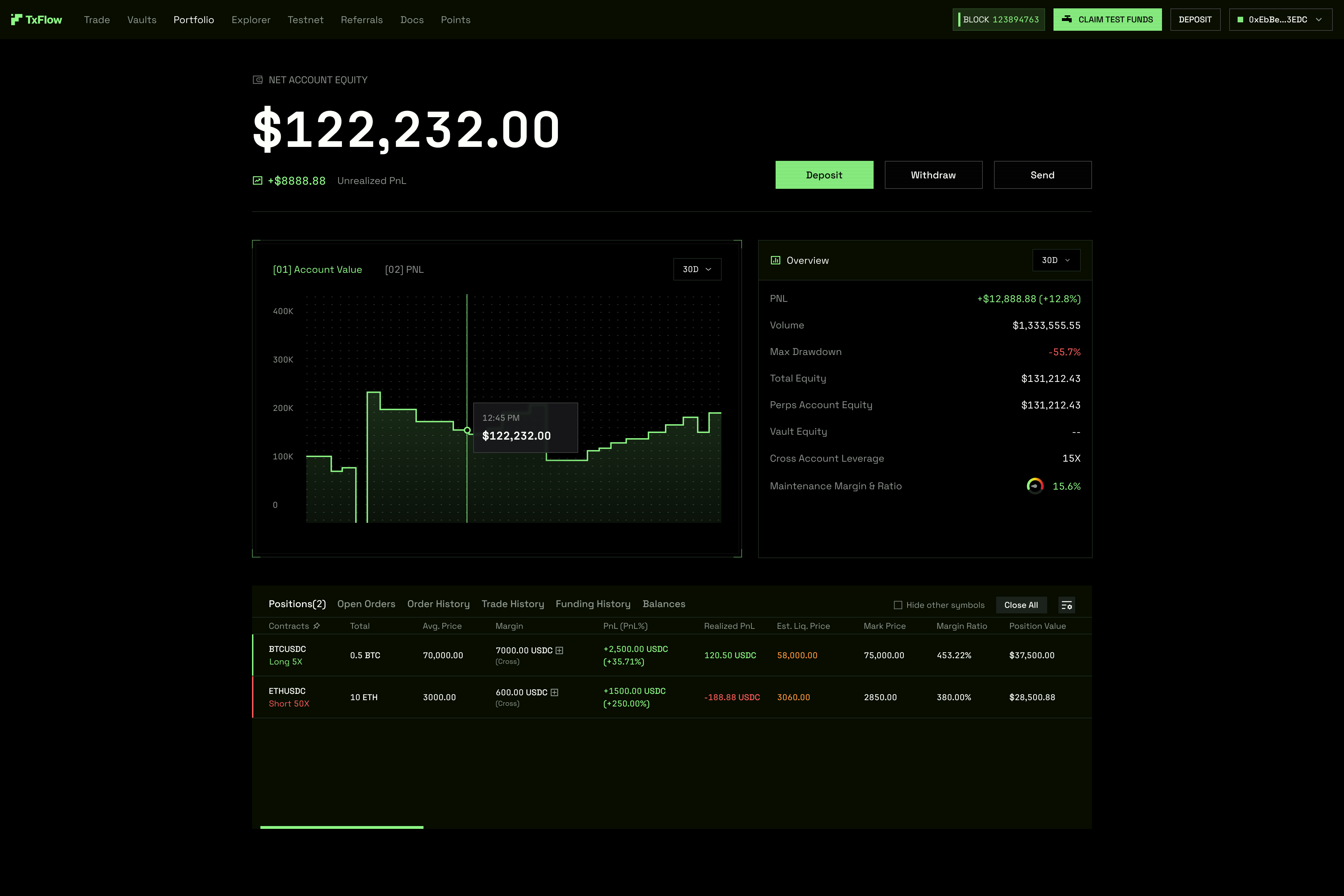
01 — Core Trading Page
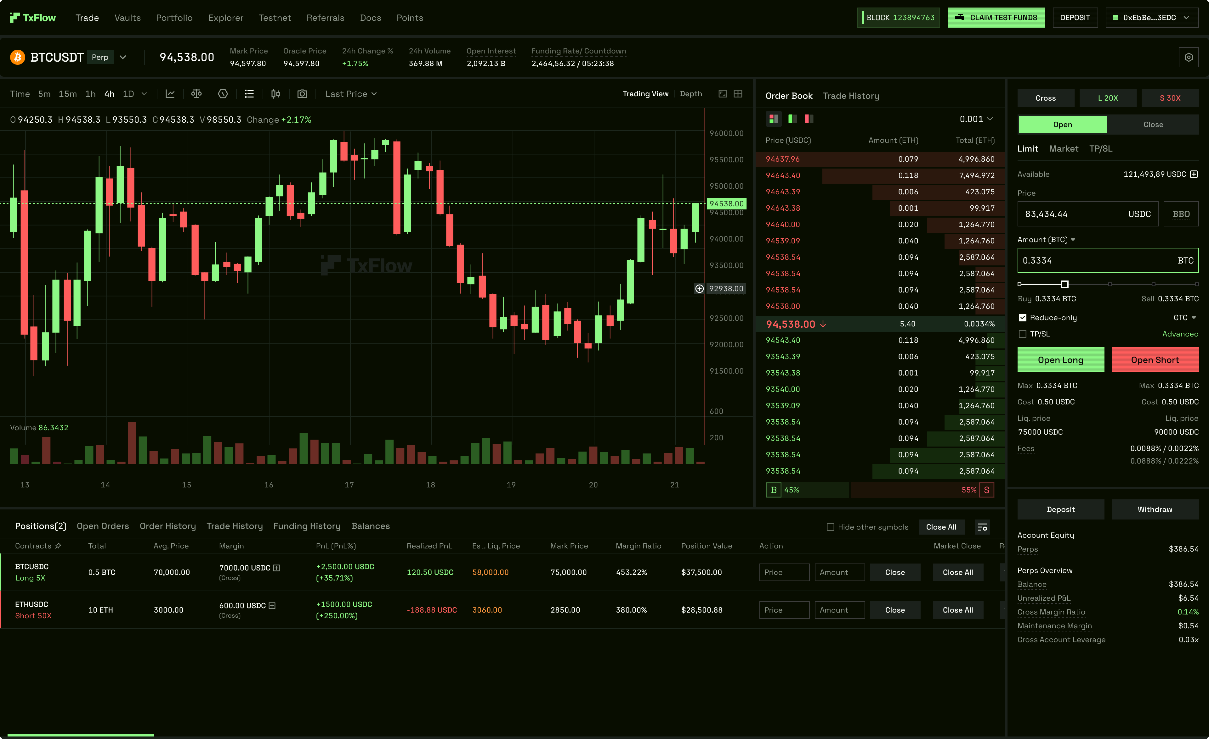
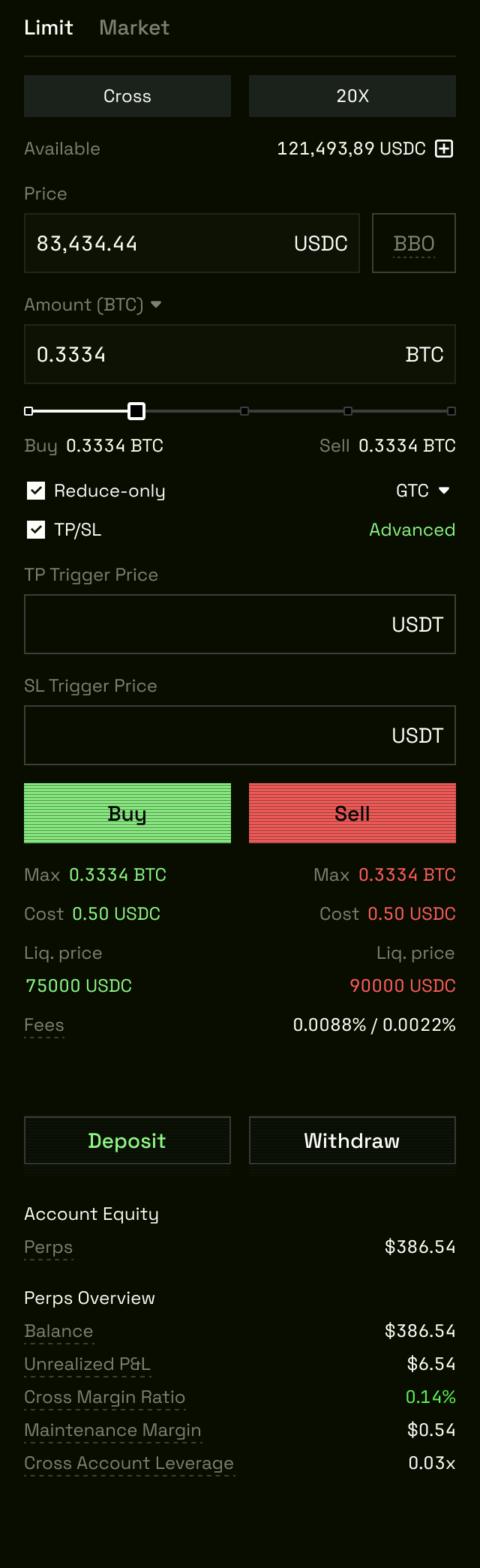
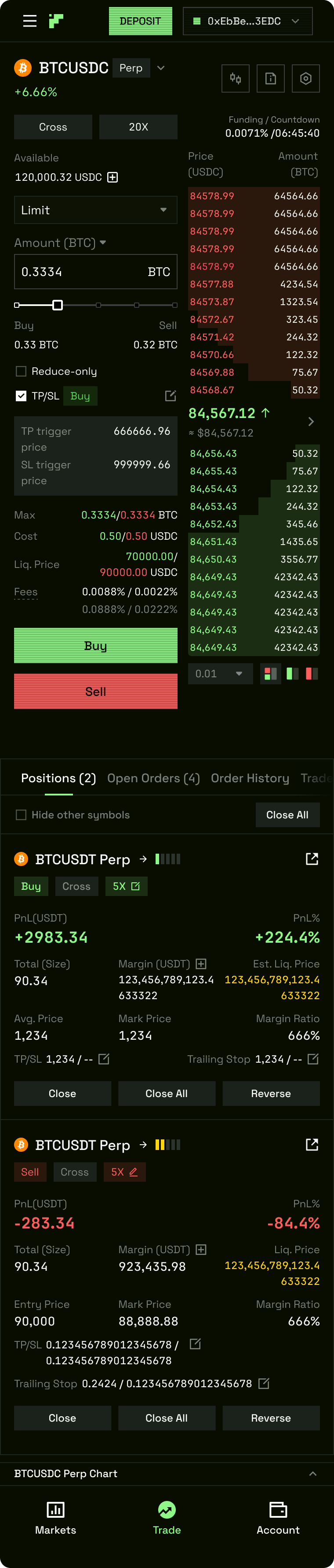
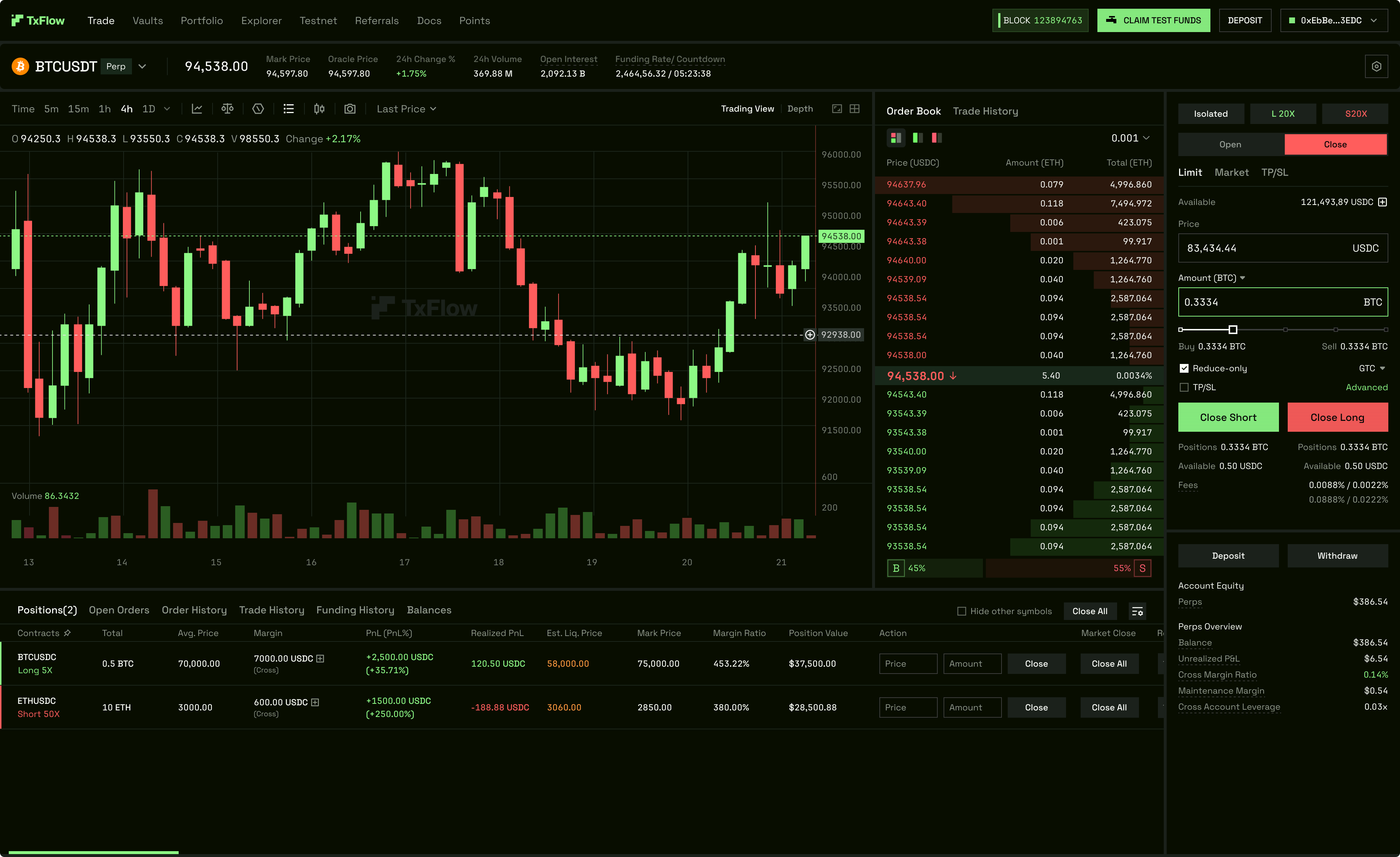
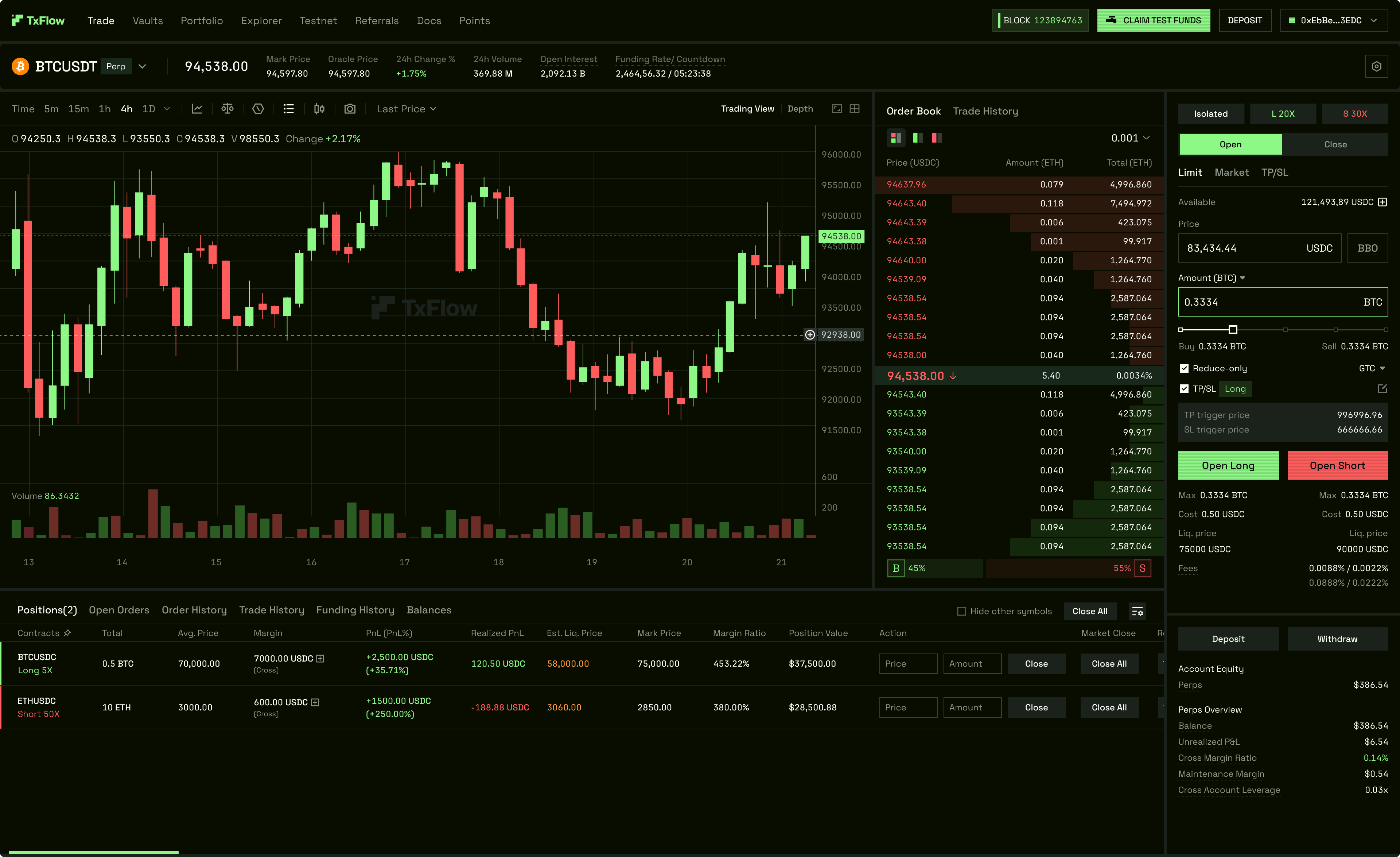
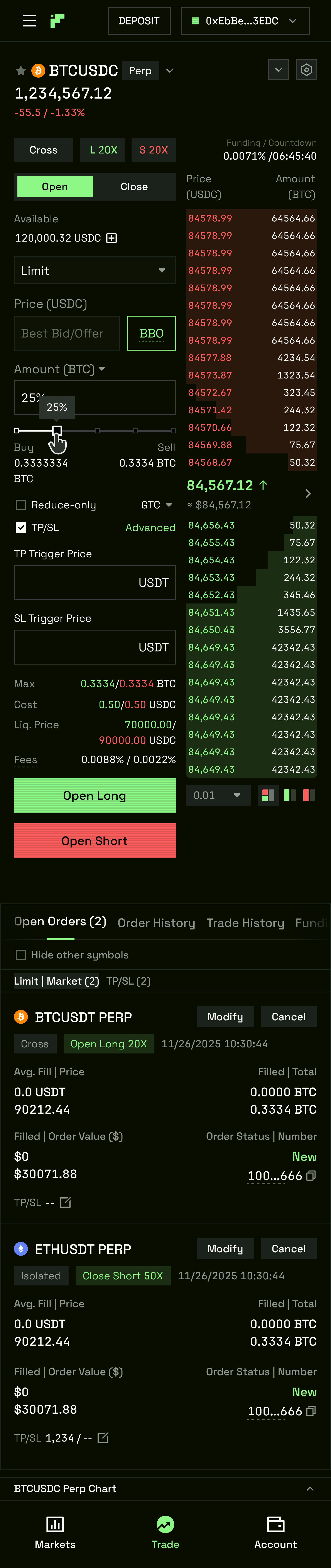
The trading page is the product. Everything else exists to bring a user to this screen and keep them here. It had to do what no DEX at the time did: serve a professional trader and a first-time DeFi user on the same layout, without compromising either.
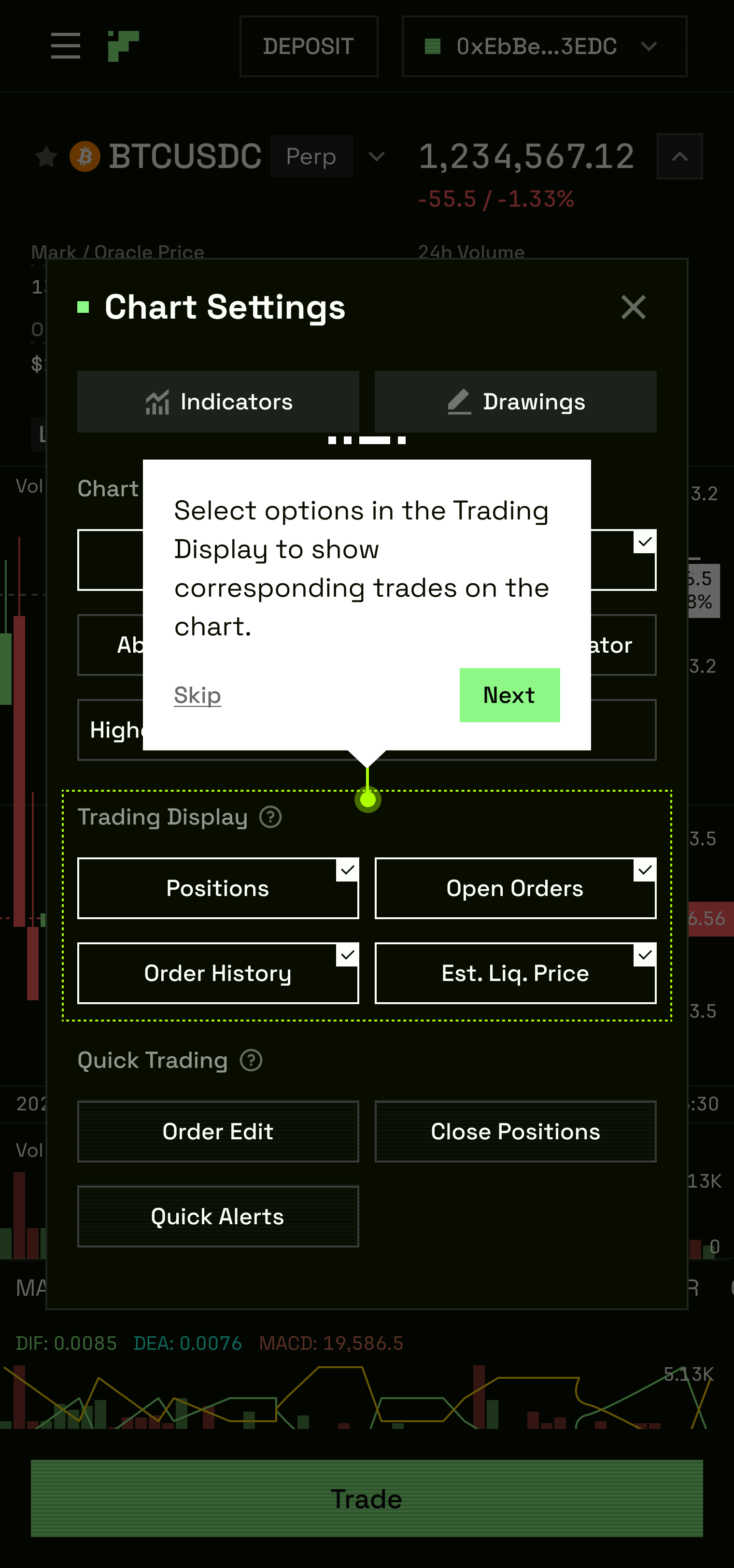
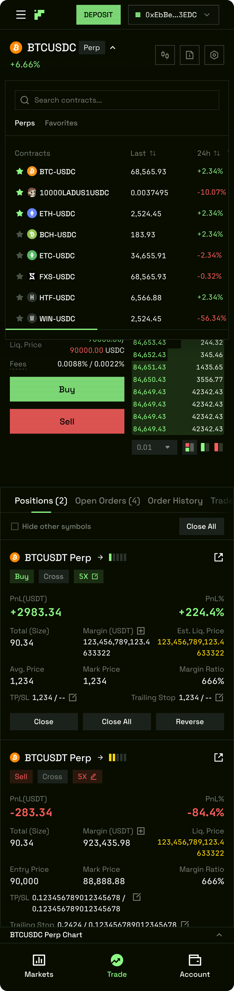
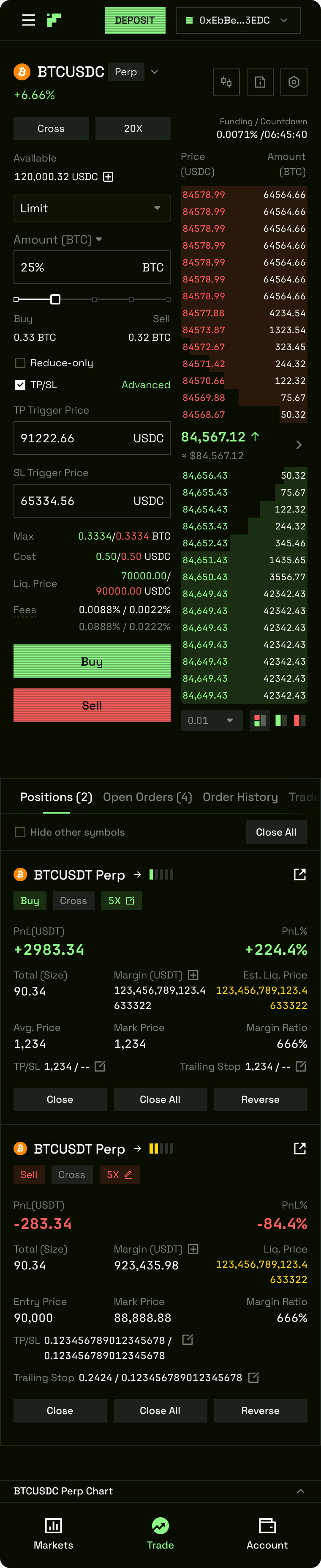
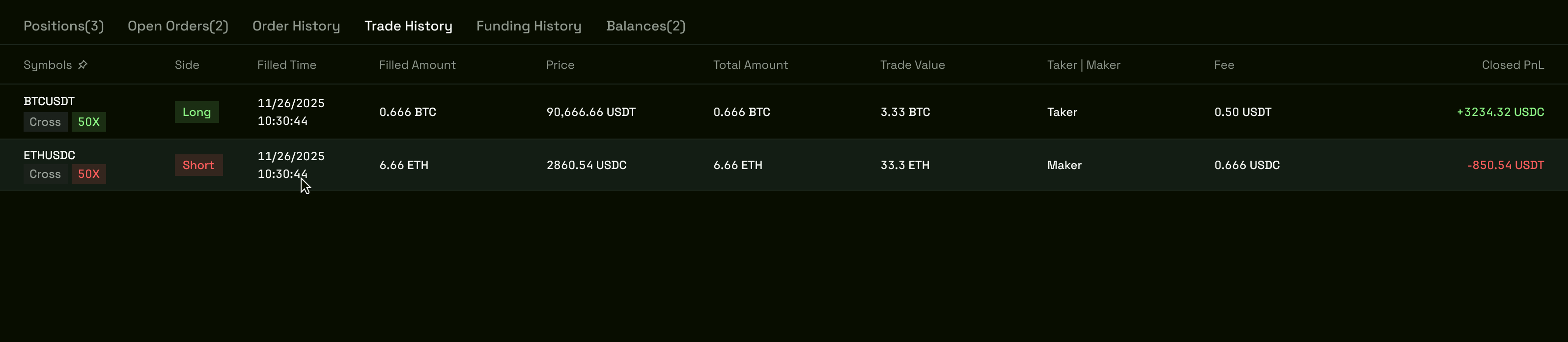
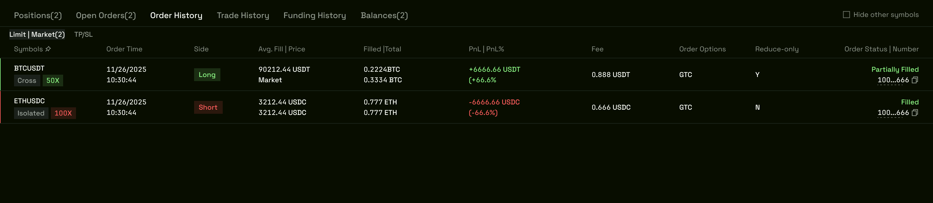
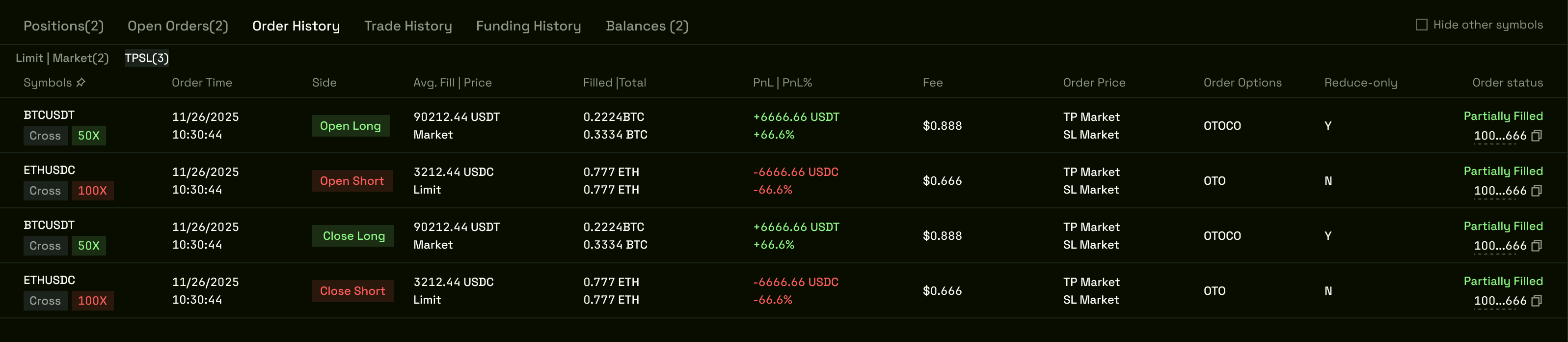
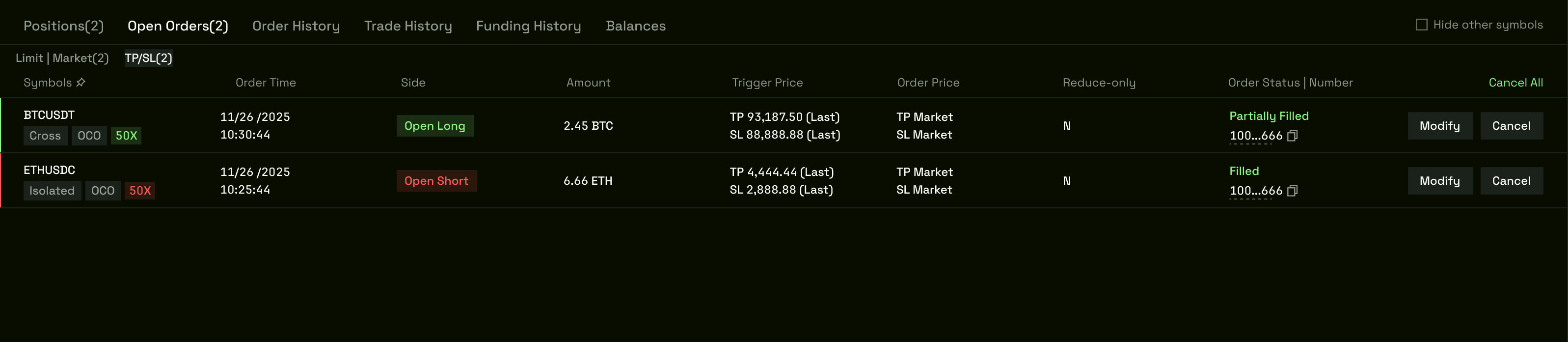
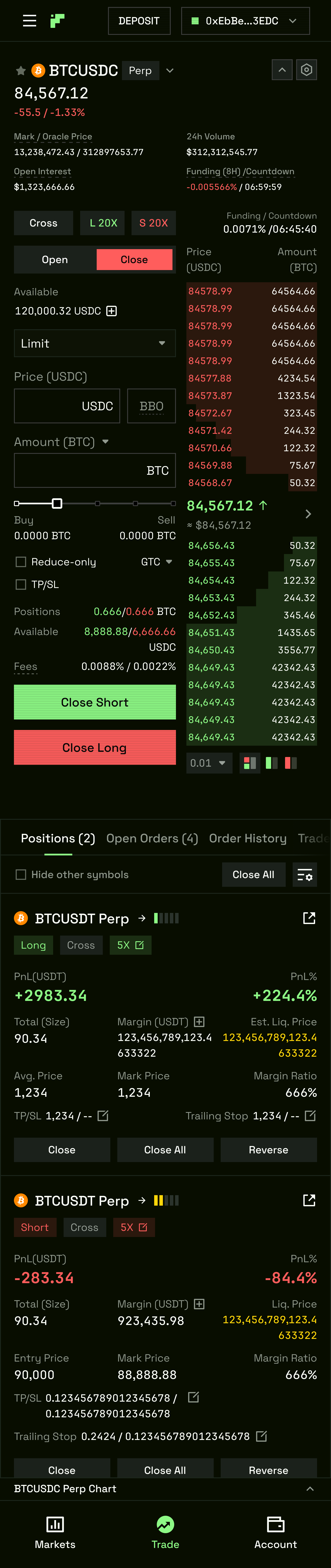
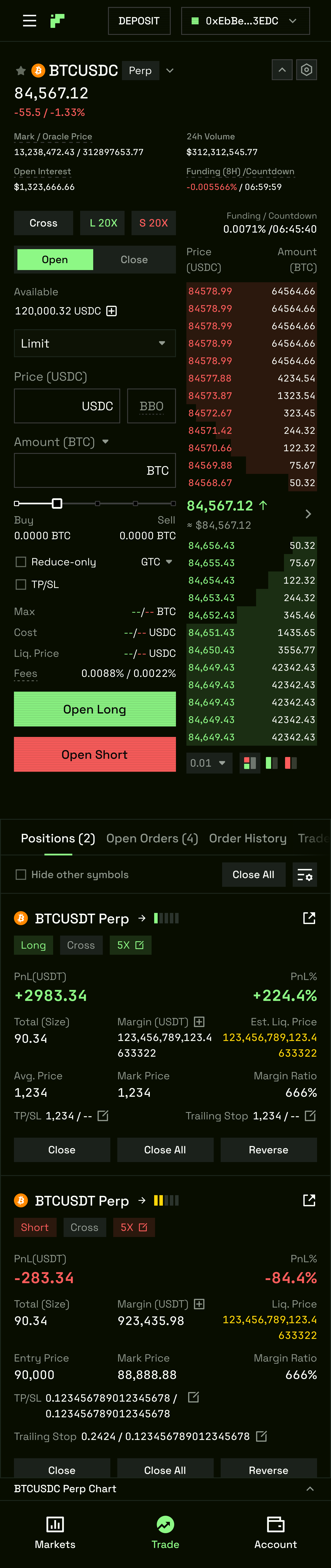
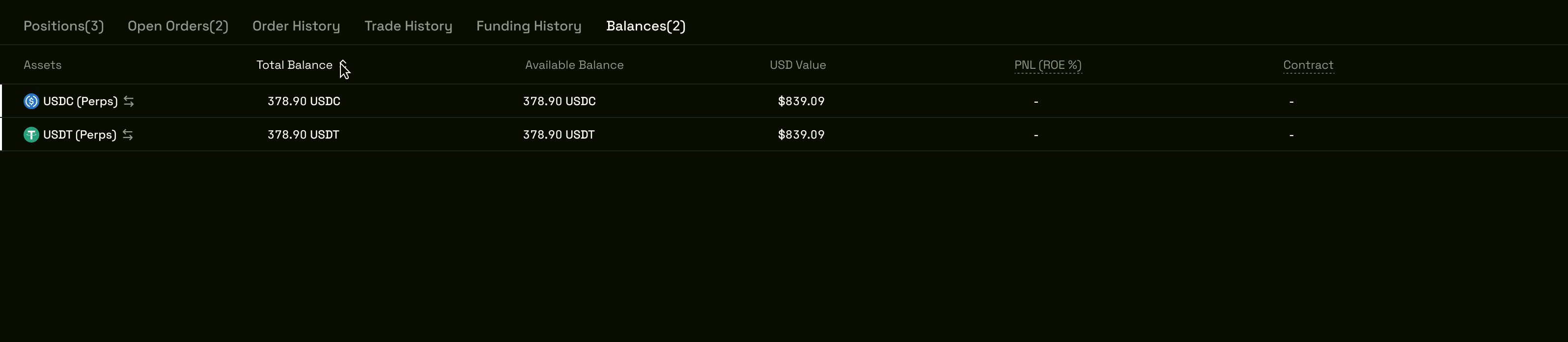
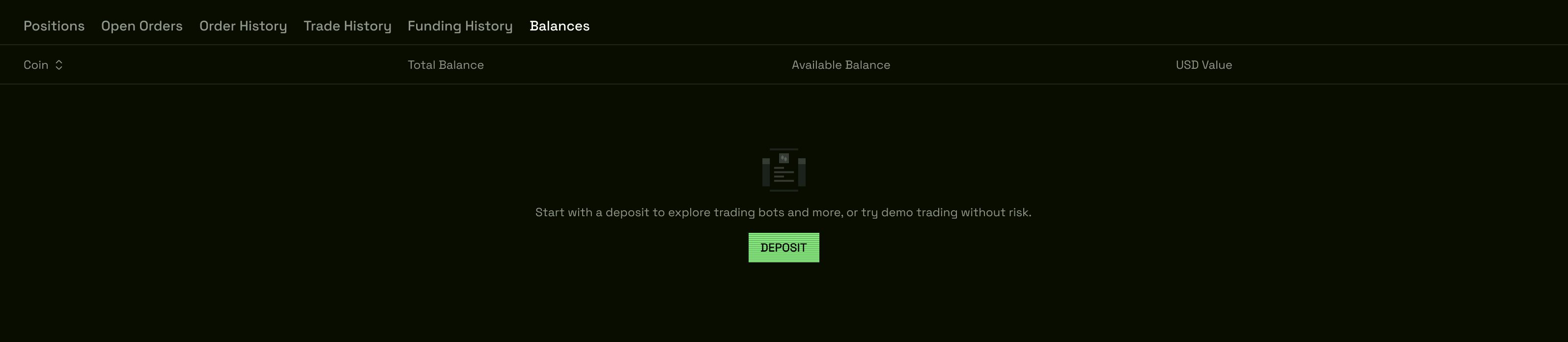
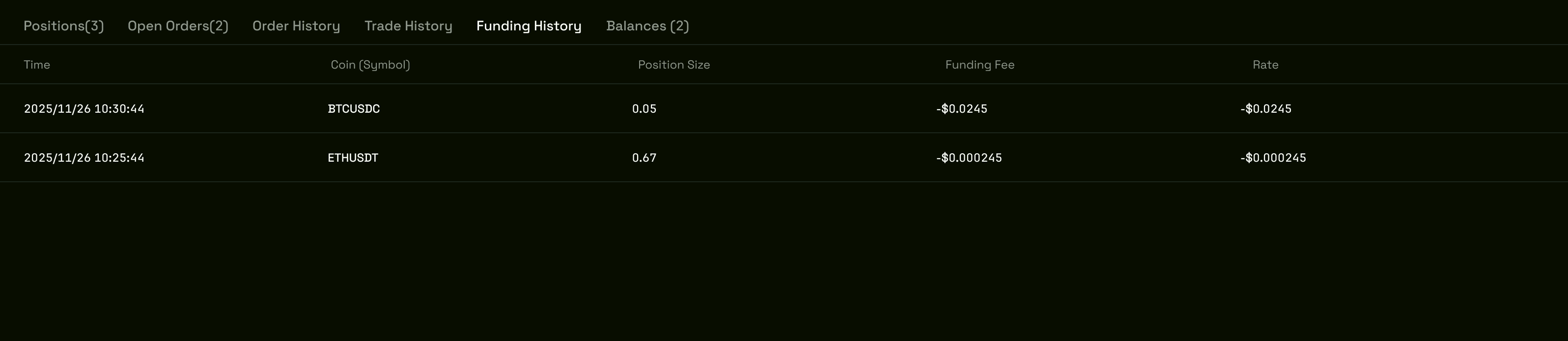
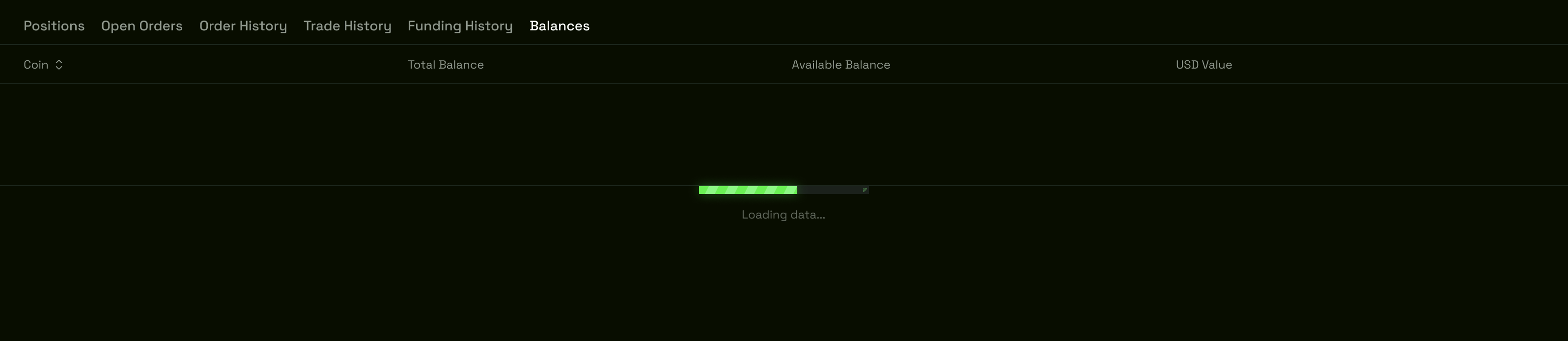
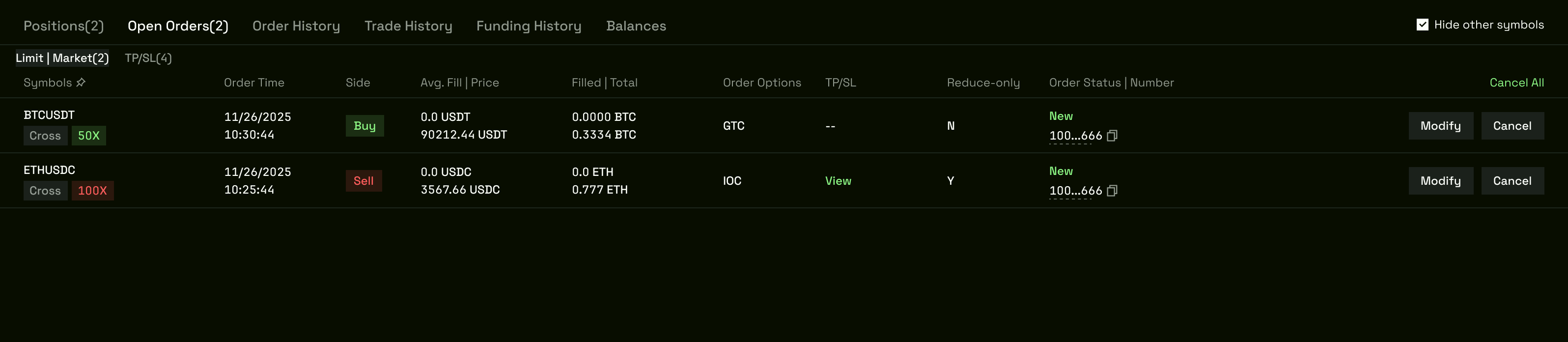
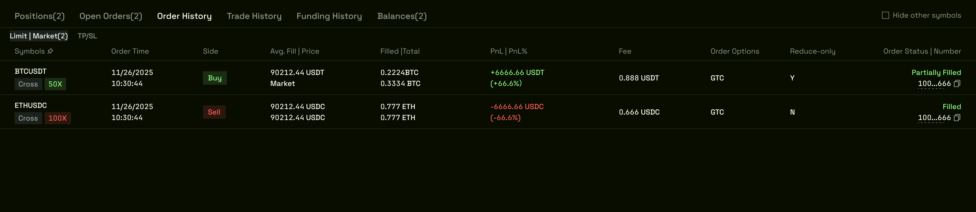
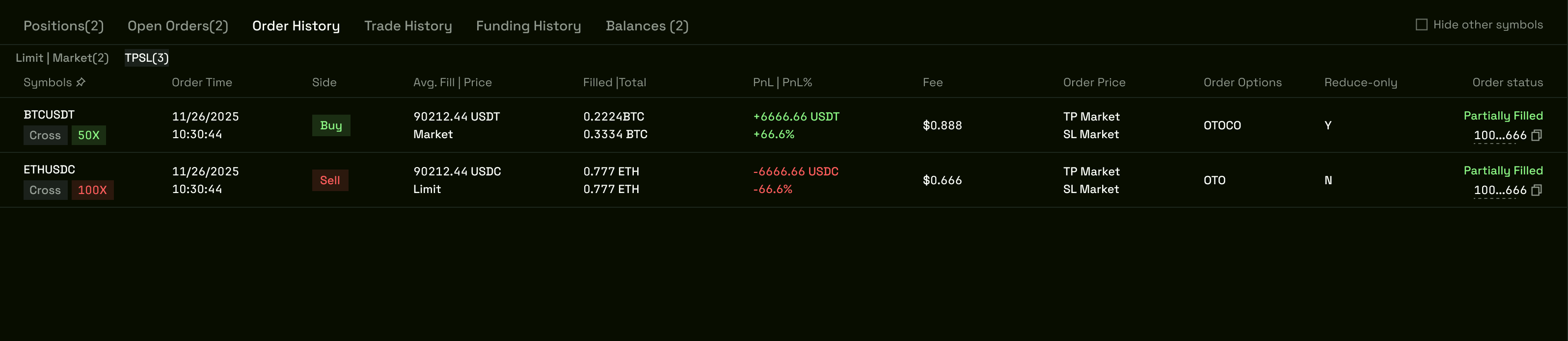
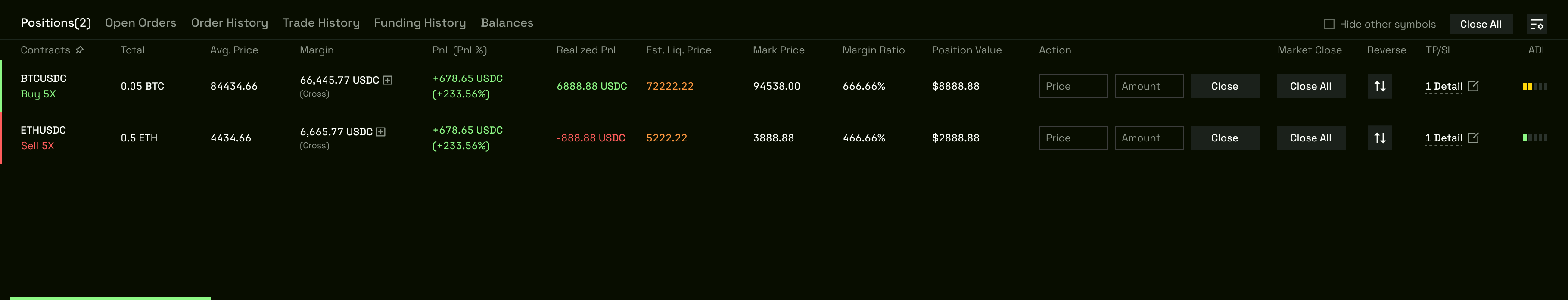
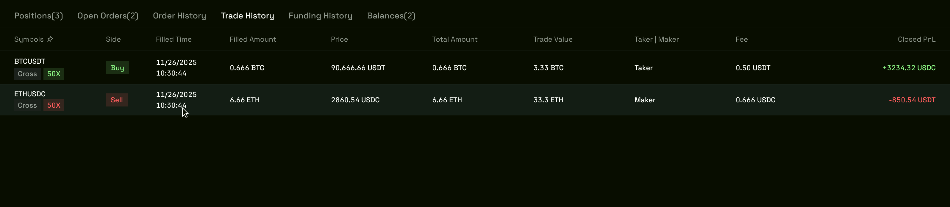
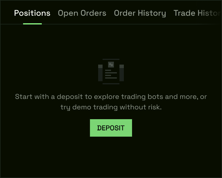
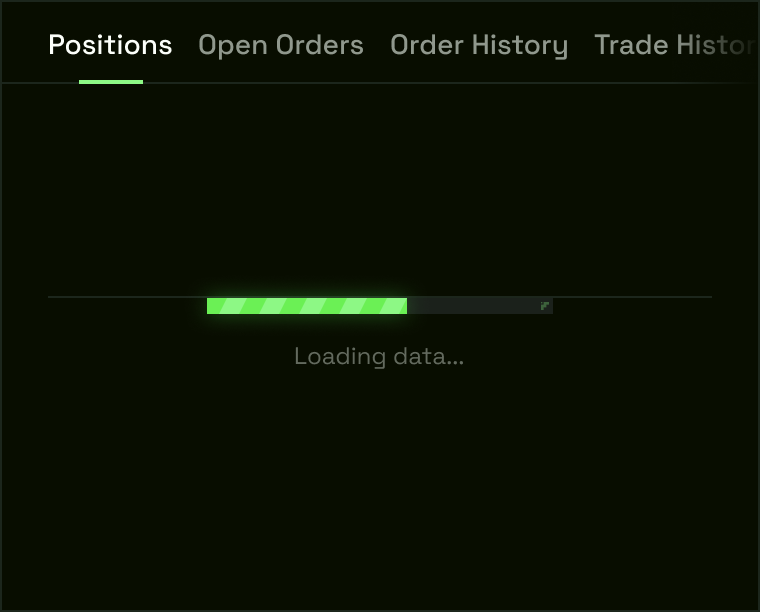
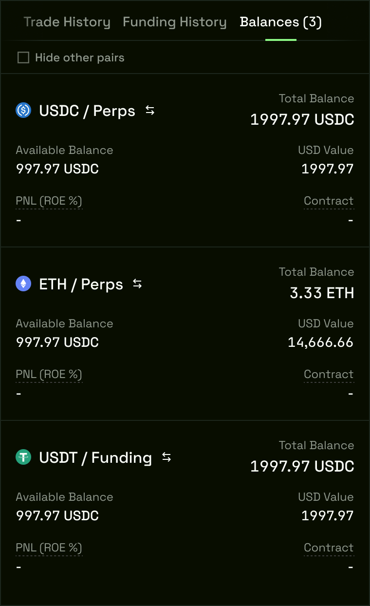
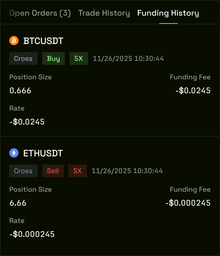
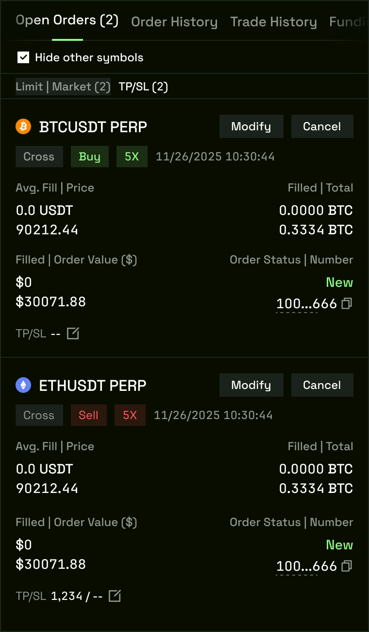
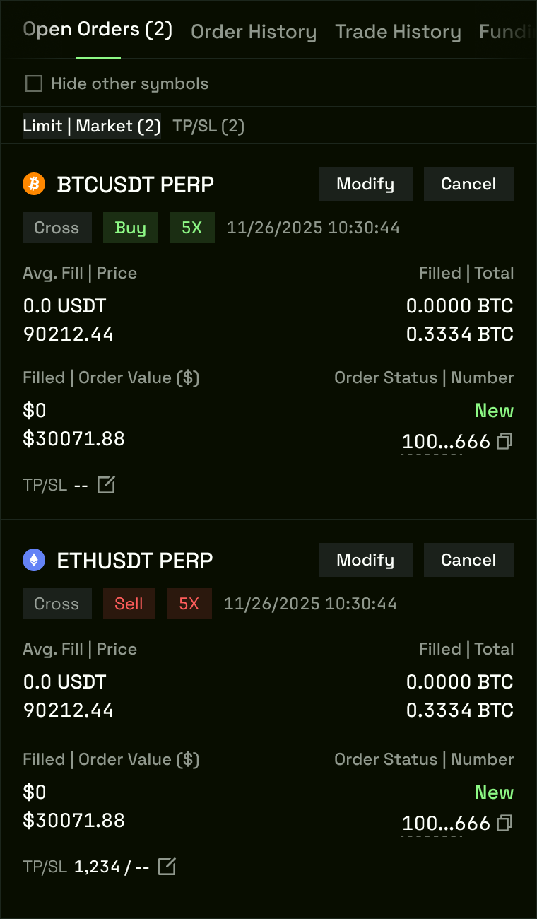
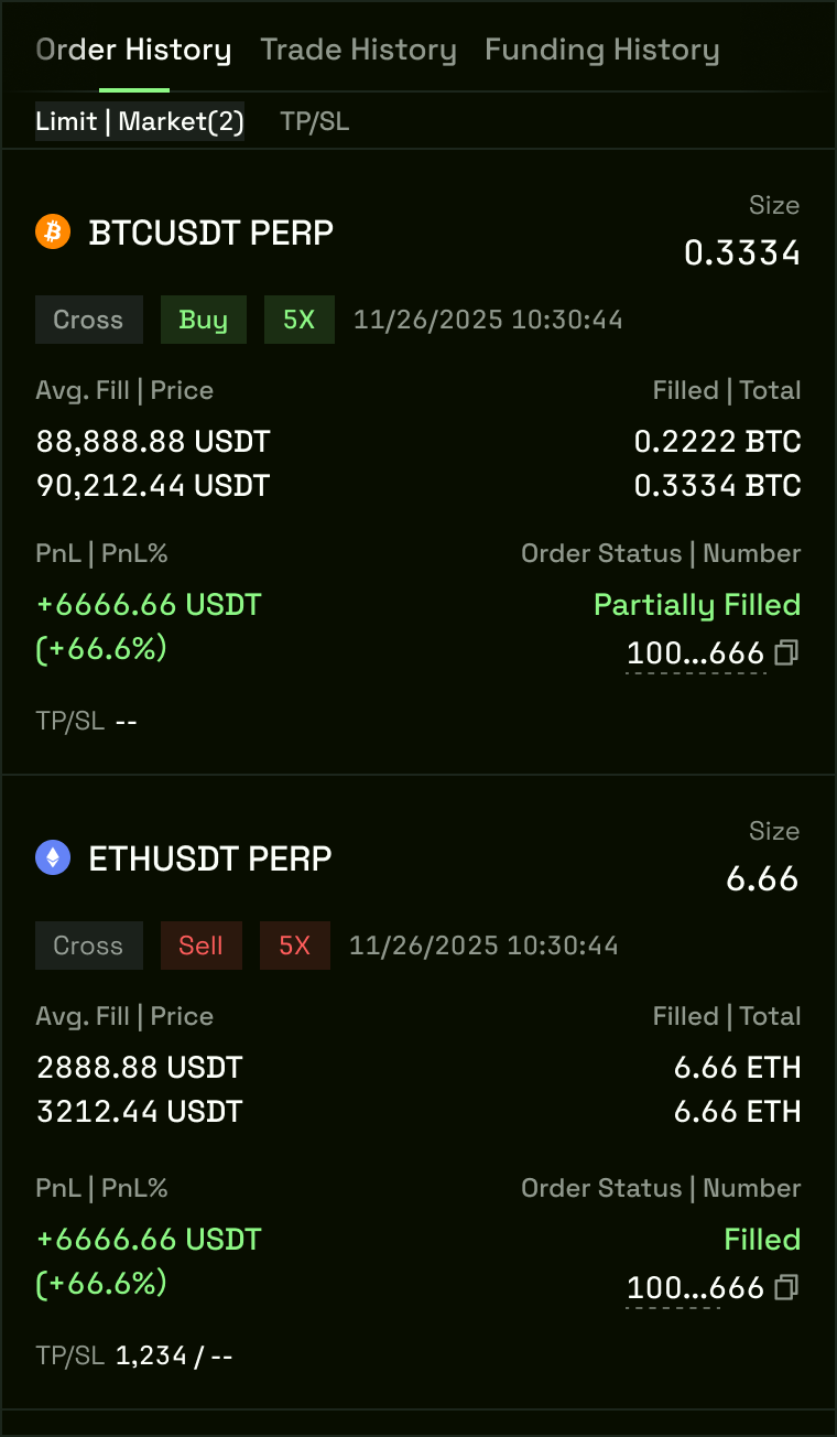
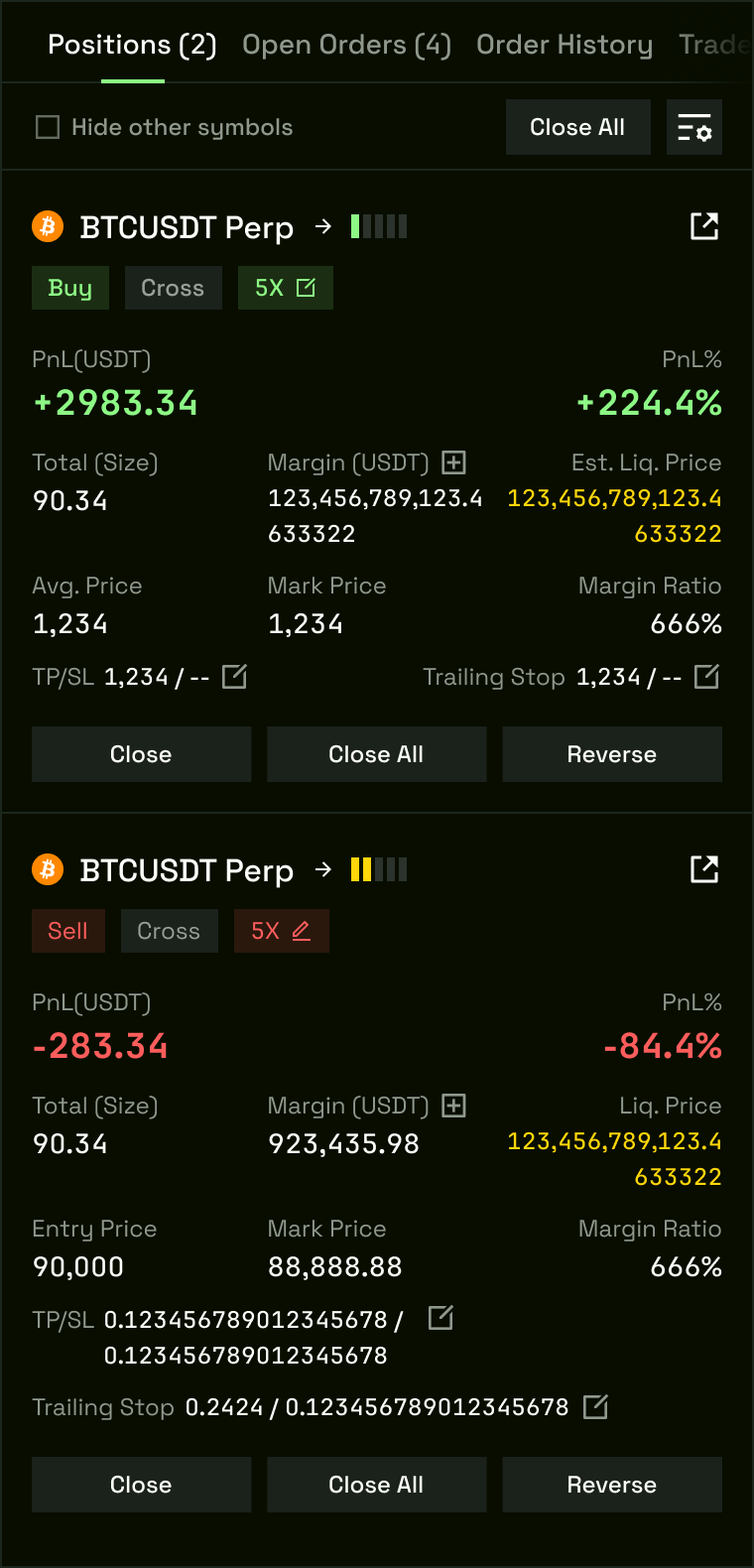
The position management table anchors the bottom of the dashboard with six persistent tabs — Positions, Balances, Open Orders, Order History, Trade History, and Funding History.
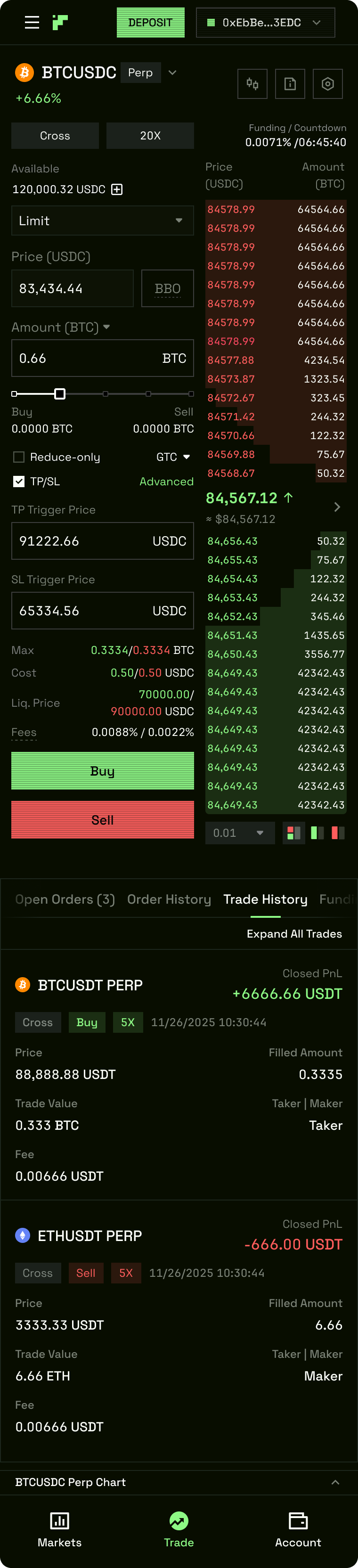
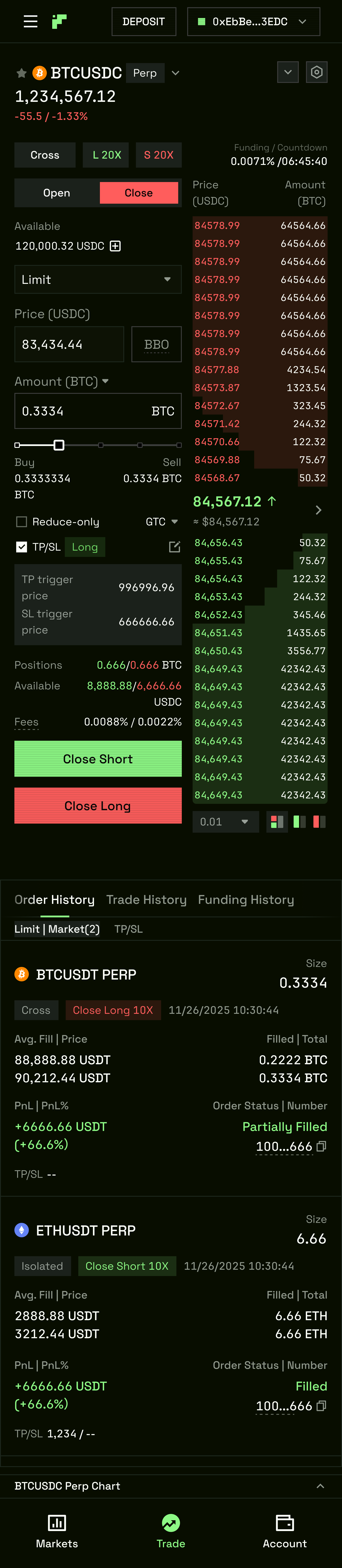
Each tab was designed with full state coverage: populated, empty, loading, and error. The Slippage & Fees Breakpoints component sits within the order panel — fee tier and slippage tolerance are visible at the moment of order placement, not before or after.
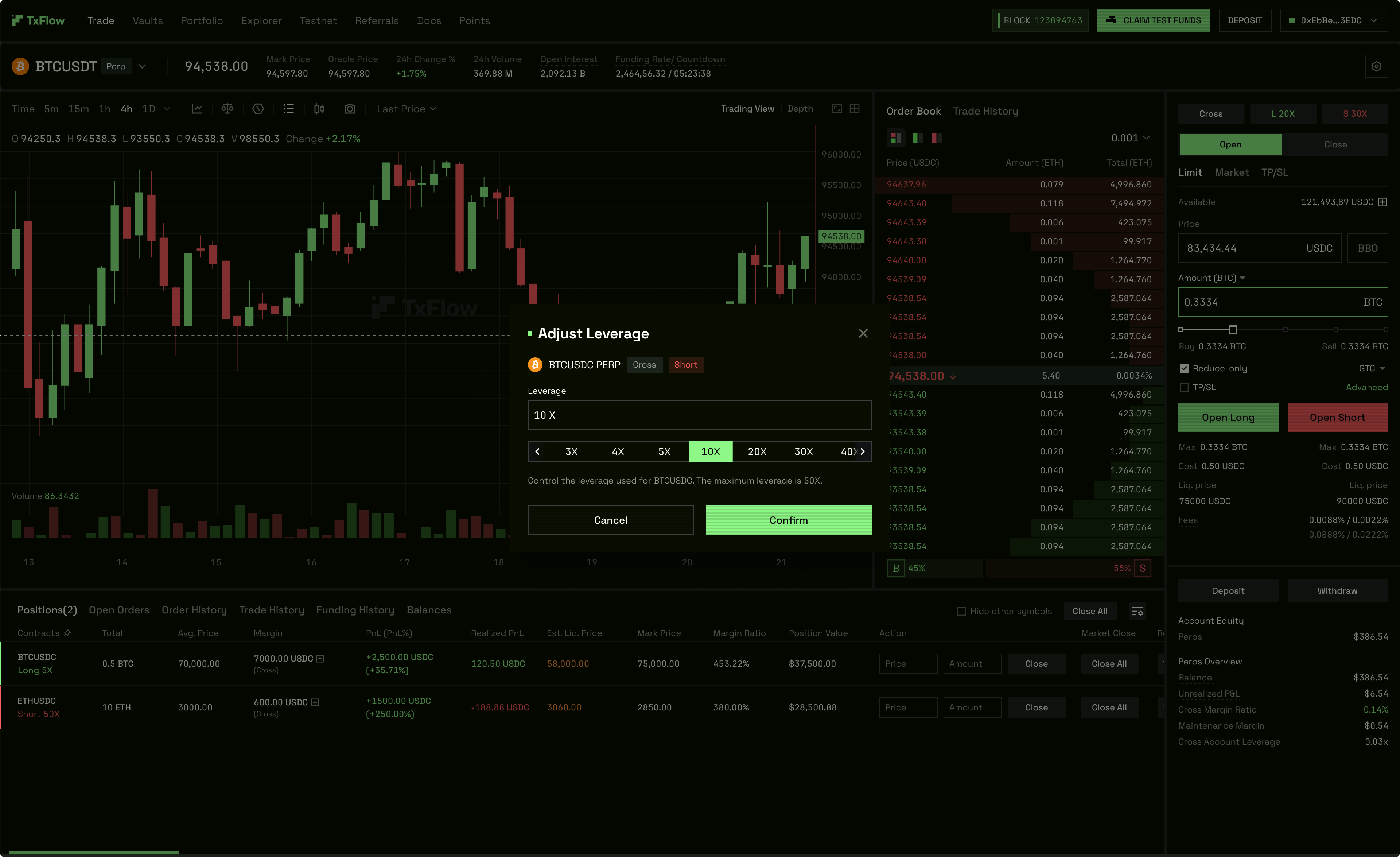
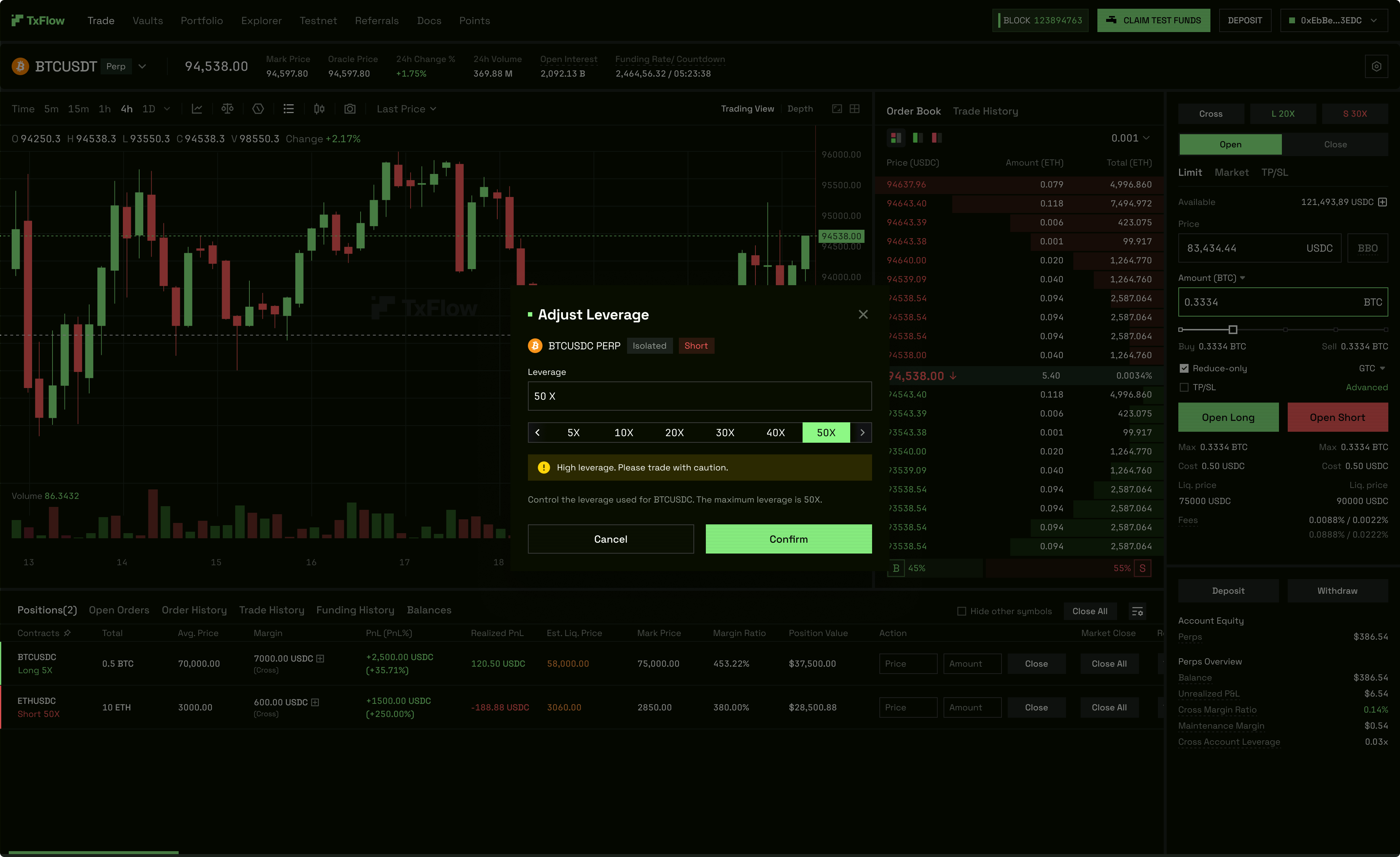
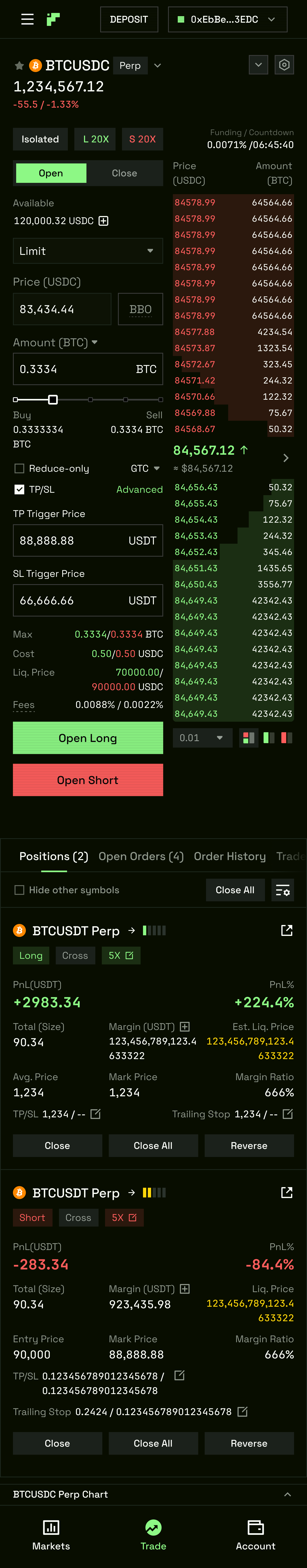
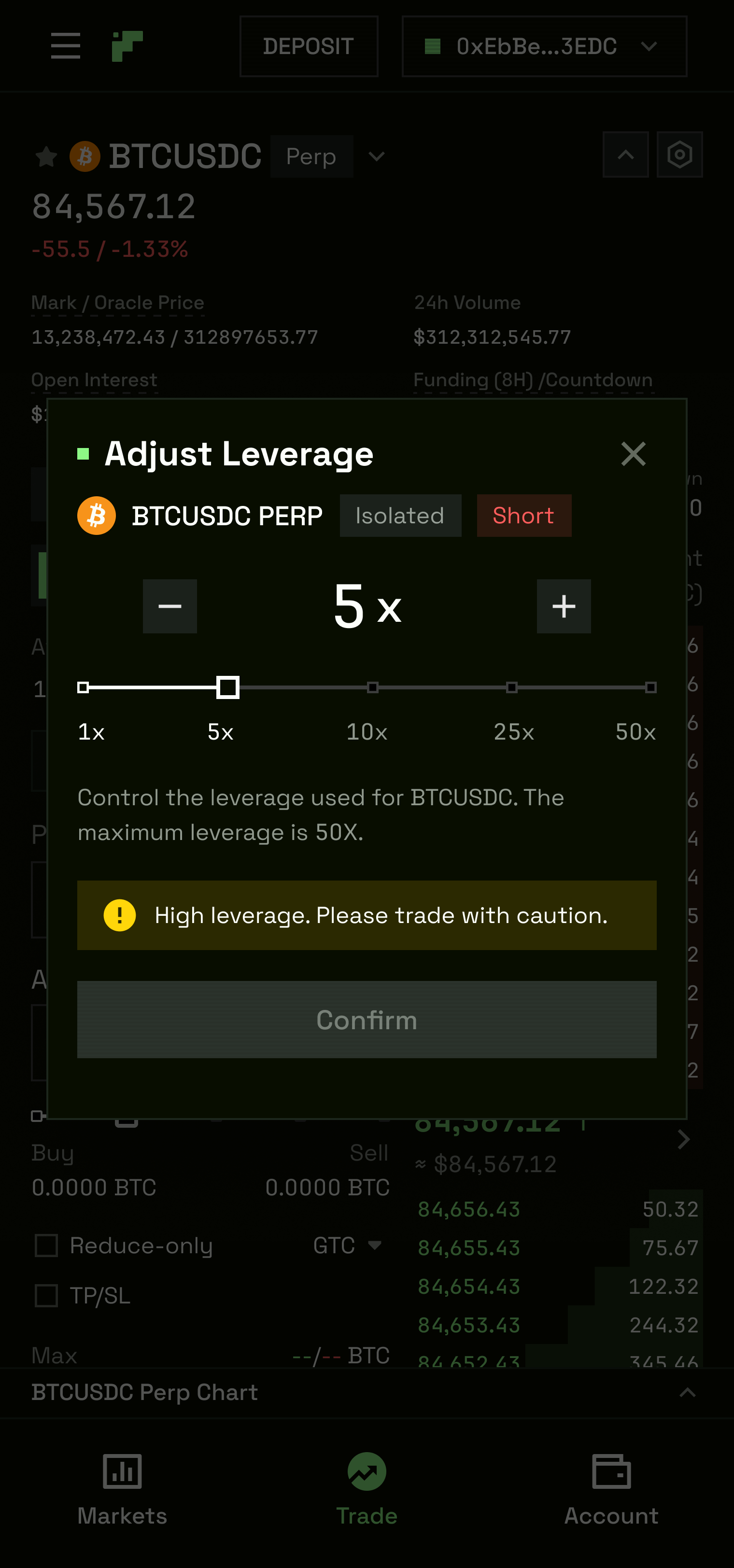
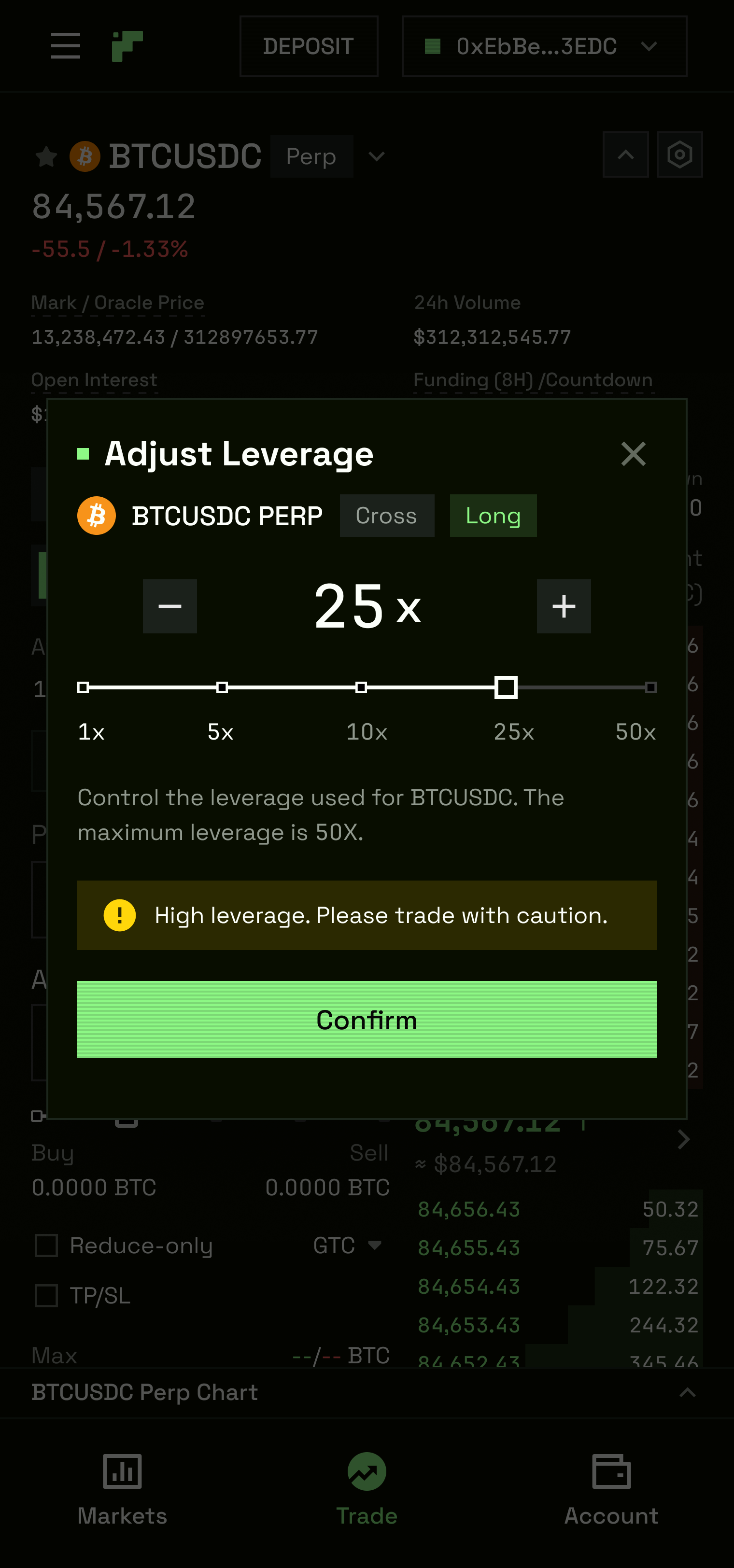
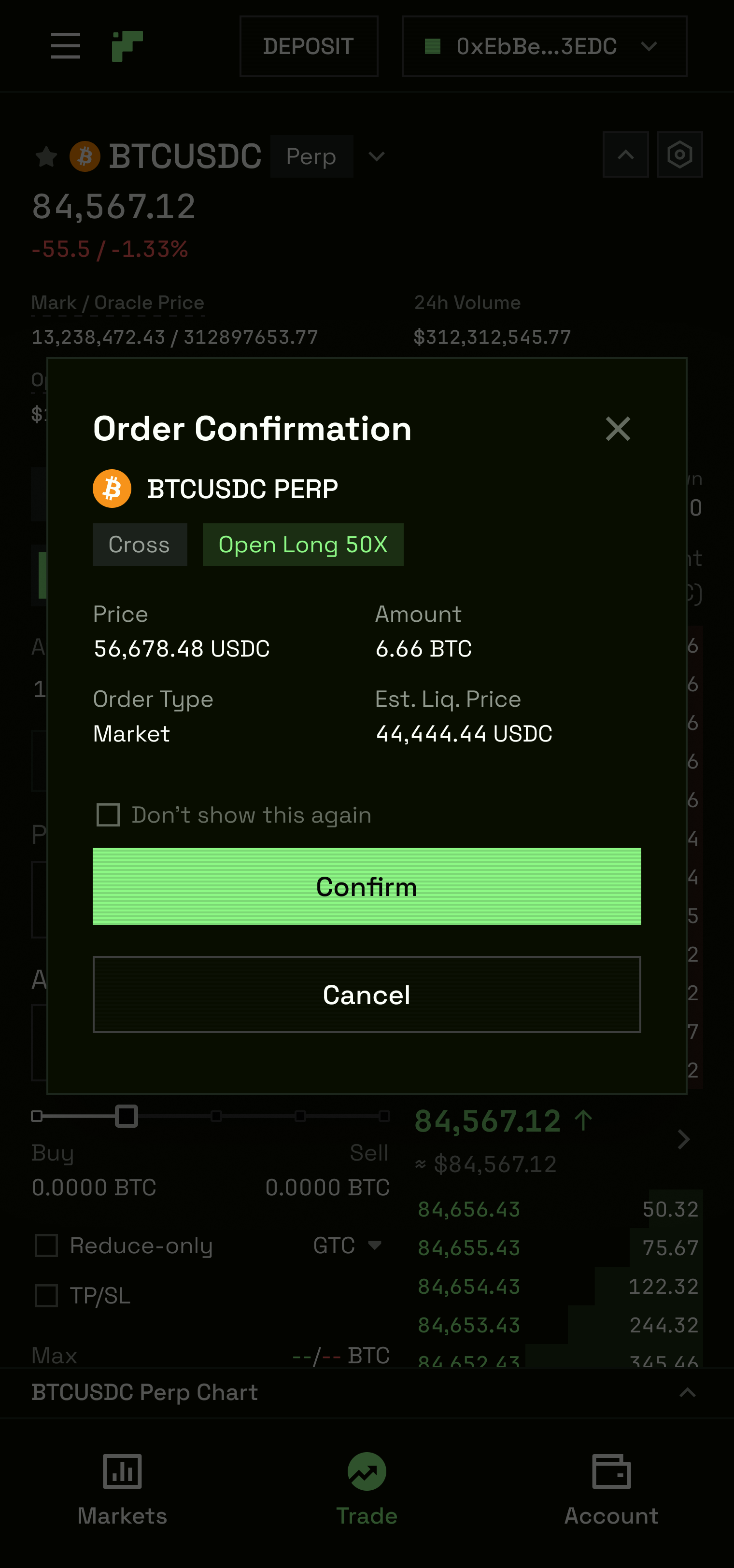
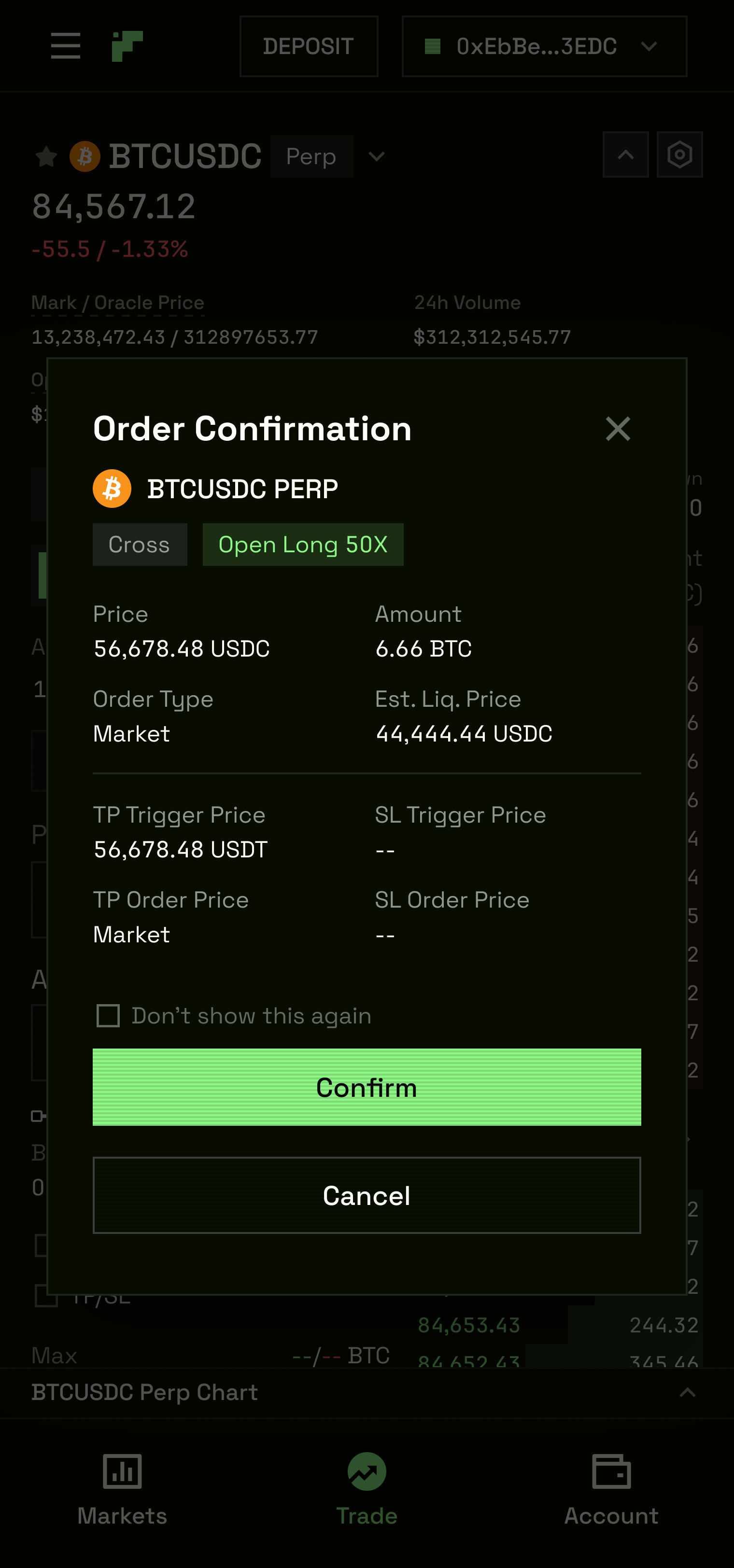
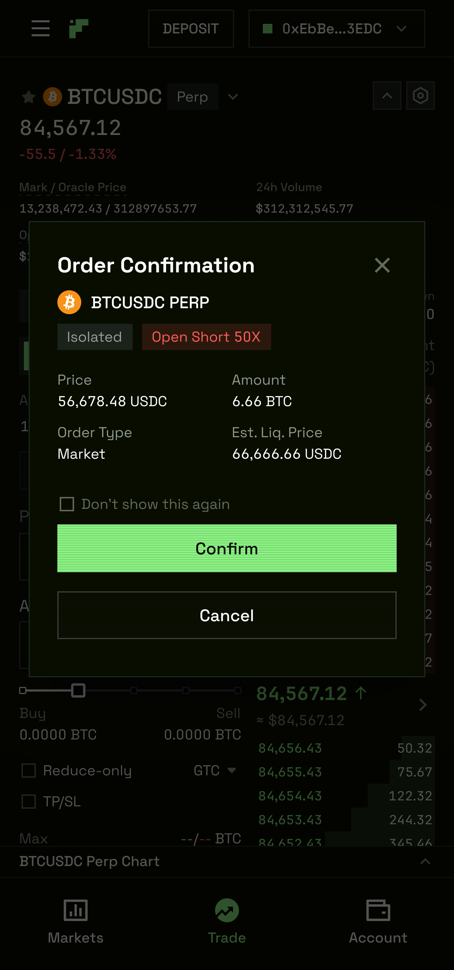
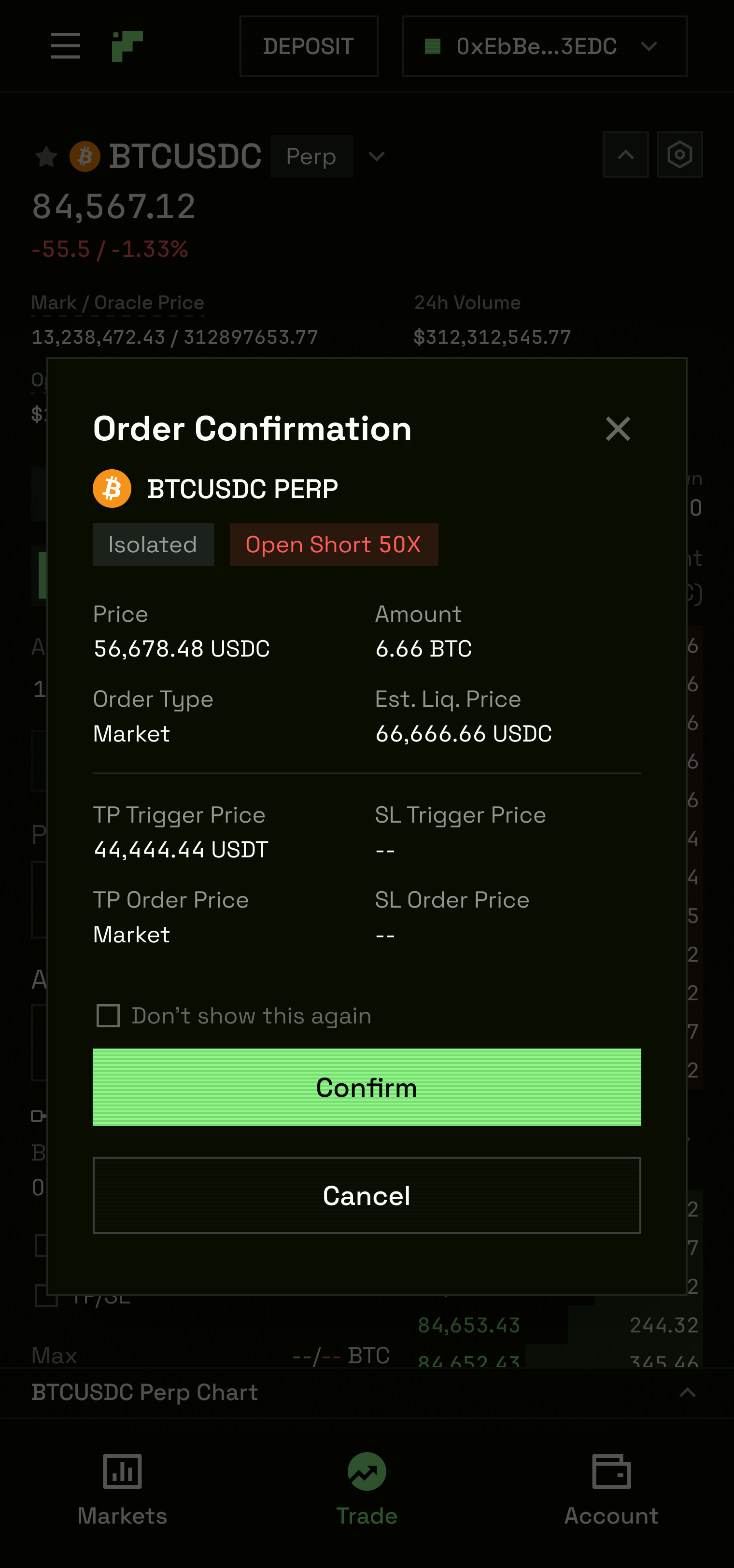
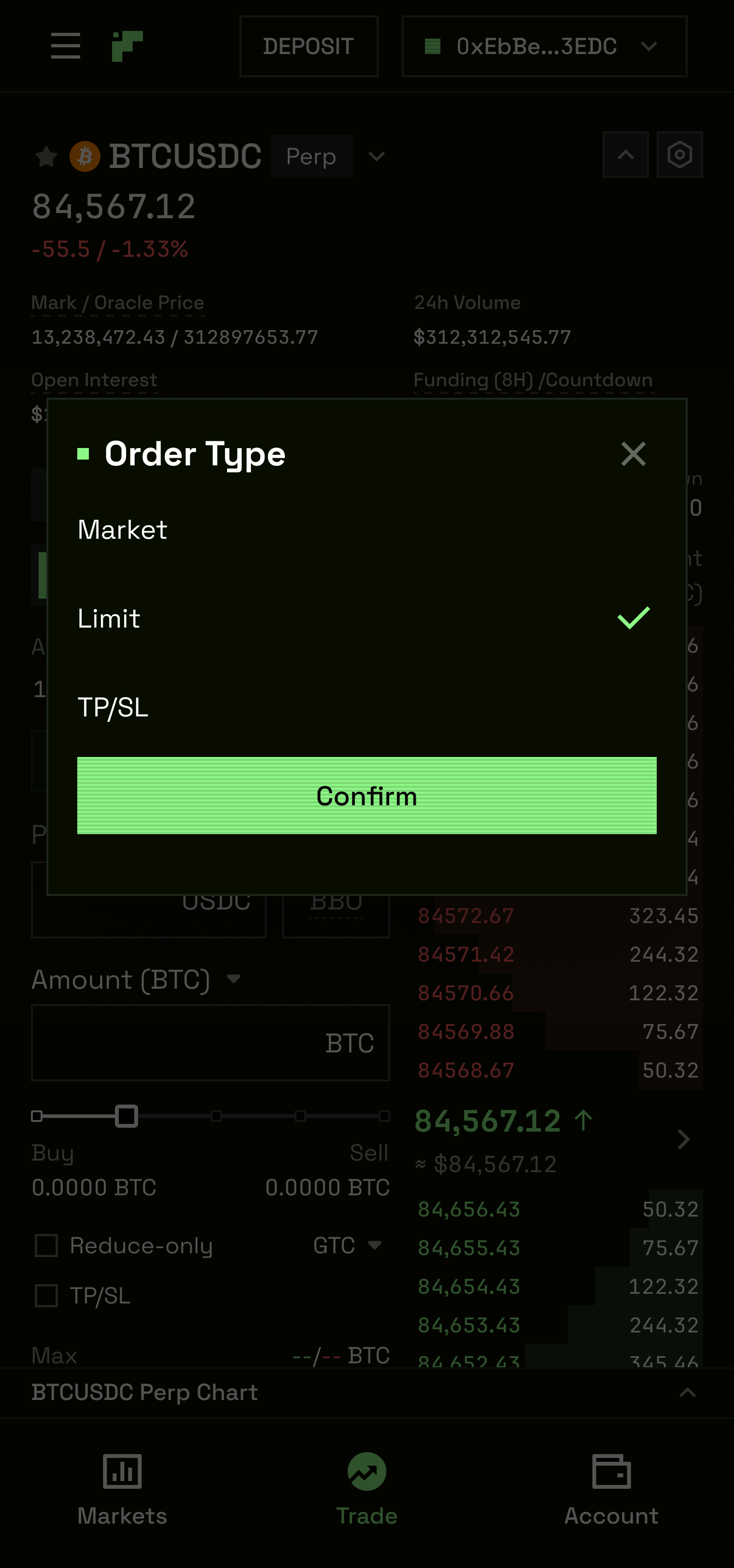
The order panel itself handles Limit, Market, and conditional order types, with Cross and Isolated margin modes and a leverage slider.
Every critical data point that professional traders expect to see without hunting — liquidation price, unrealised PnL, margin ratio, funding rate — is present on the default view. Nothing requires a hover, an expand, or a secondary screen.
Everything is modularised, componentised and built from scratch to ensure maximum customisability.
H5
02 — Asset Selector
The Asset Selector is the moment between intent and execution. Before a trader places an order, they need to find the right market. On TxFlow, that means navigating 50+ perpetual pairs — Layer 1, RWA, Spot etc. — with volume, price, and 24h change visible at a glance. The selector had to be fast, scannable, and correct.
A search input filters in real-time across pair names and base tokens. Columns are sortable — Pair, Price, 24h Change — with a directional indicator toggling between ascending and descending per tap. The active pair is highlighted with a distinct accent treatment. A grid-view density toggle provides five layout variants, accommodating different monitor sizes and trader preferences from compact to expanded data rows.
Interactive prototype accompanied with each new component feature designed
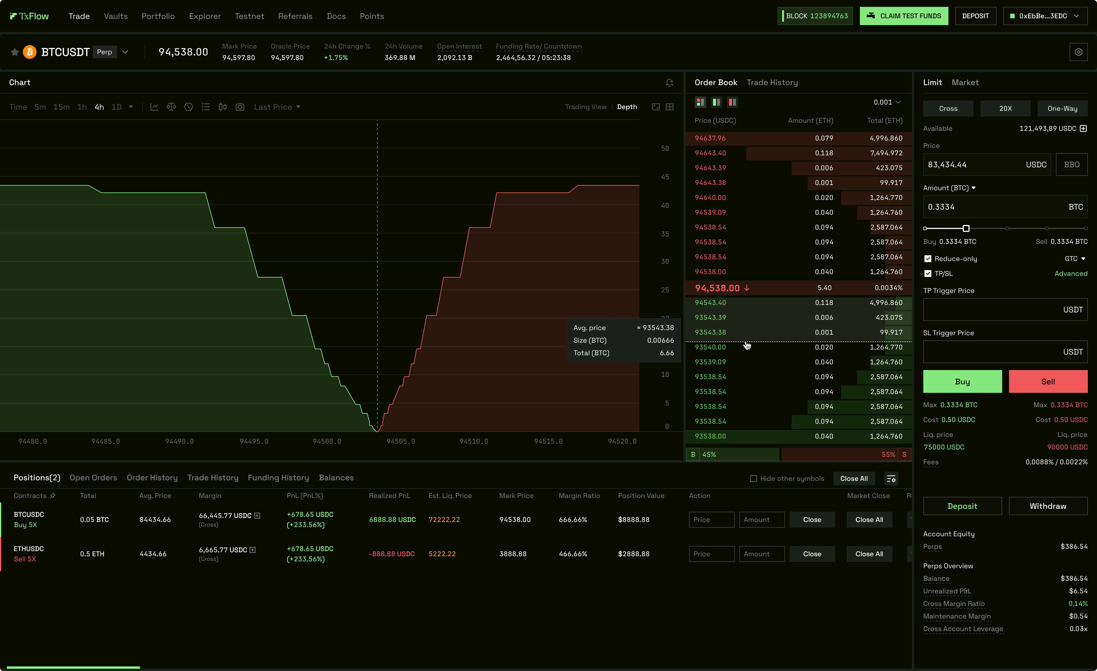
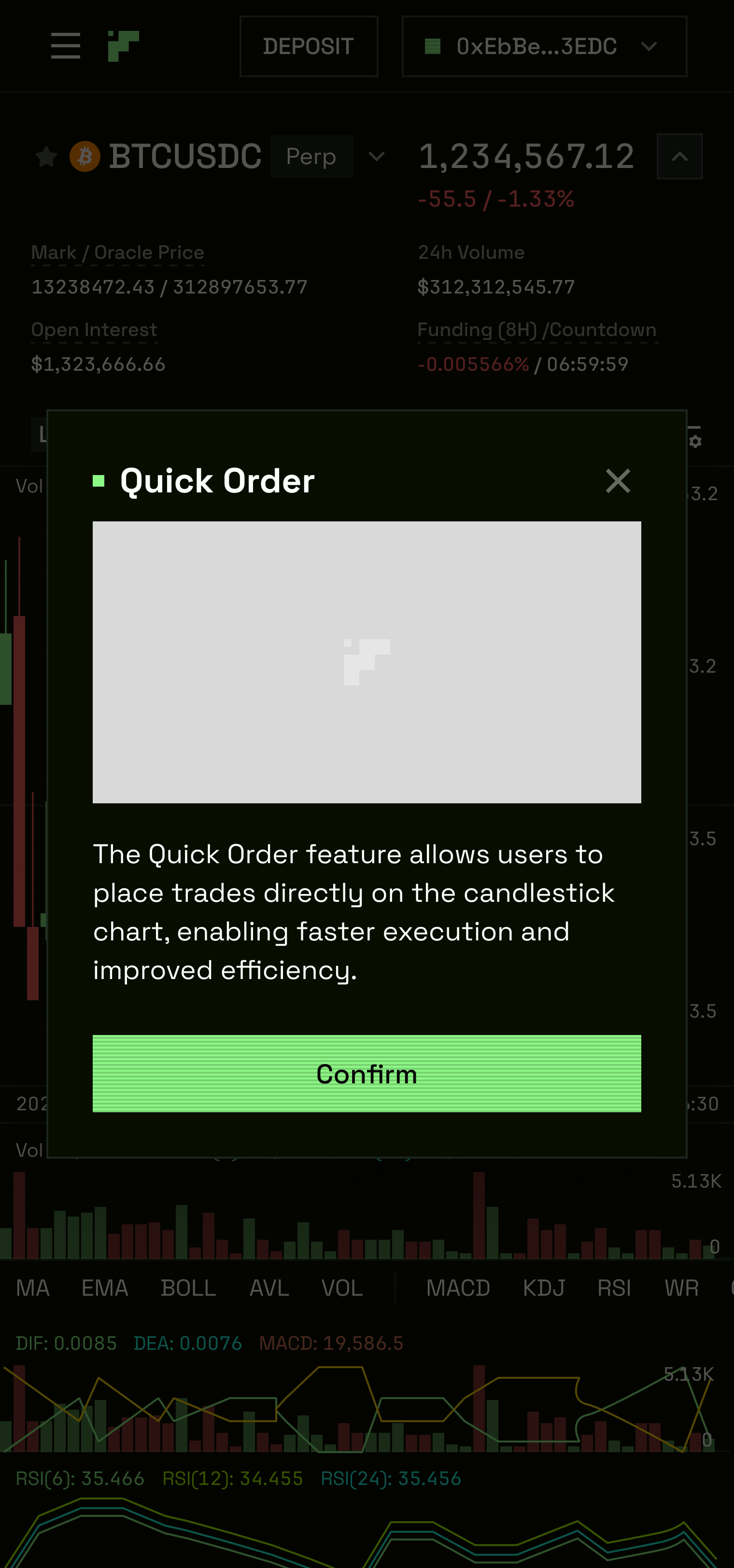
03 — K-Line Chart & Market Depth
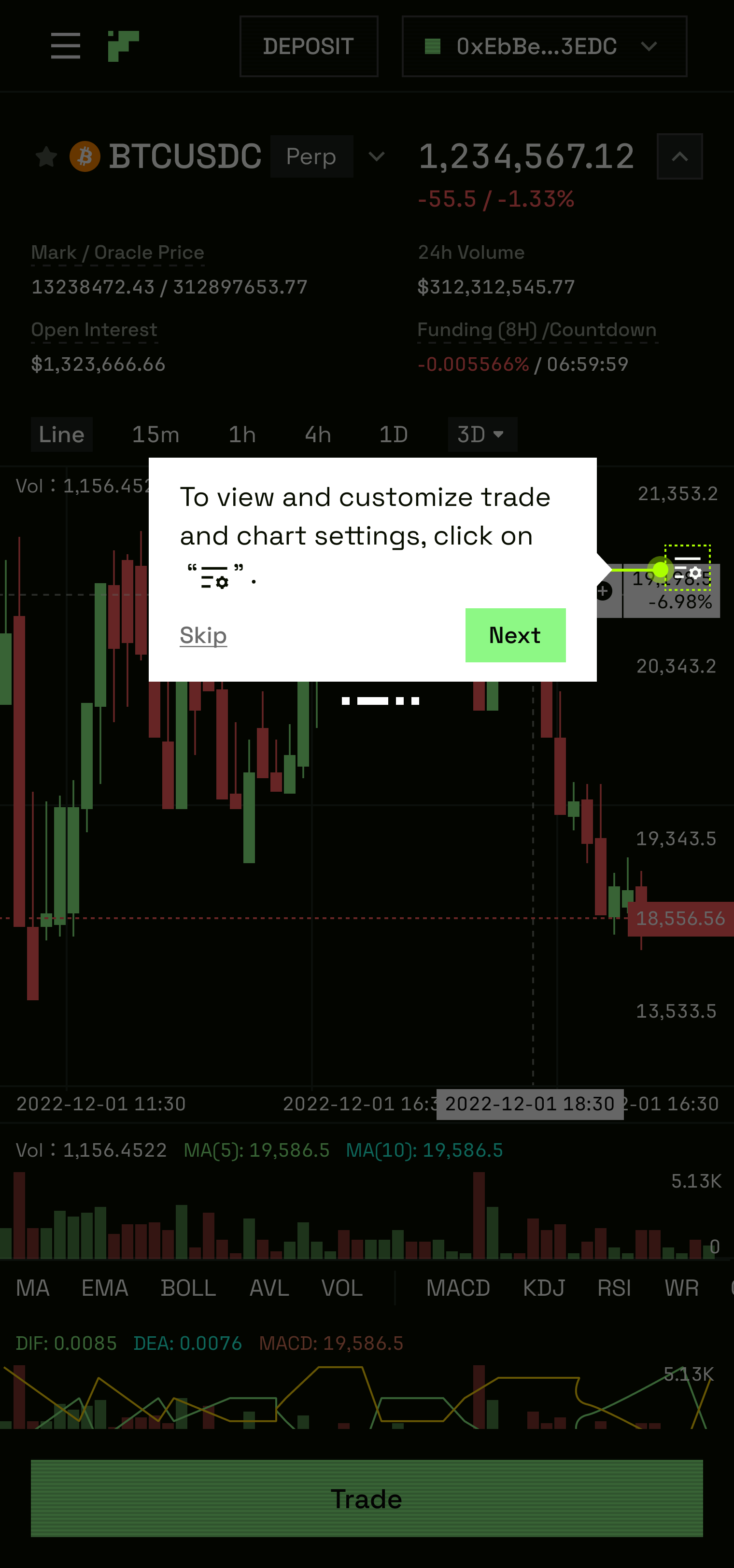
The charting surface is where traders make decisions. It required the same level of design rigour as the order panel — not a third-party chart drop-in, but a fully specified interface with TxFlow-specific interactions layered on top of it.
The K-Line trading interface covers the full standard flow, timeframe selector, order details and dropdown menus, menus and additional tabs, and mobile breakpoints as discrete subflows.
Market depth is designed in both default and interacted states — showing bid/ask depth bars that respond to user interaction. A multichart layout allows multiple assets to be viewed simultaneously on desktop, a feature absent from most perpetual DEXs.
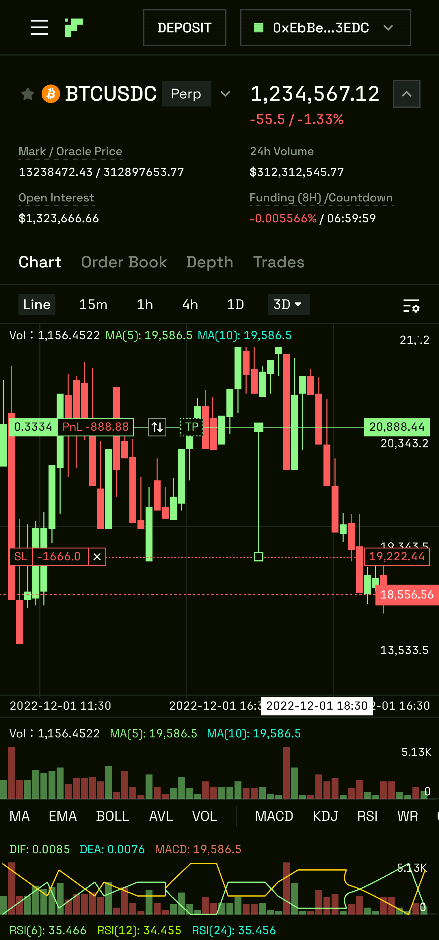
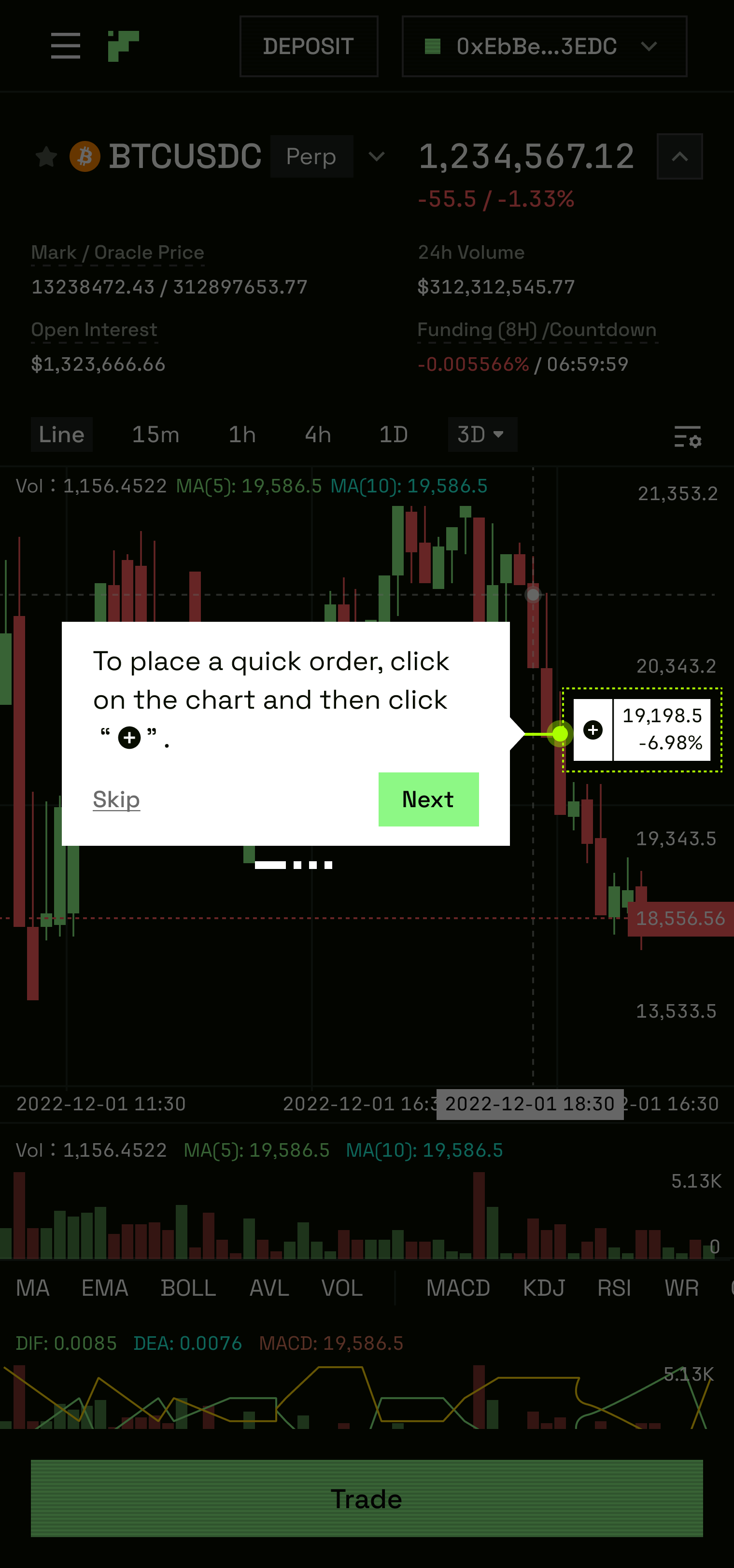
The H5 (mobile) K-Line surface goes further. "Trade on Chart" is a mobile-native interaction model where the order panel is triggered from within the chart view itself — the trader never leaves the price action to place a trade.
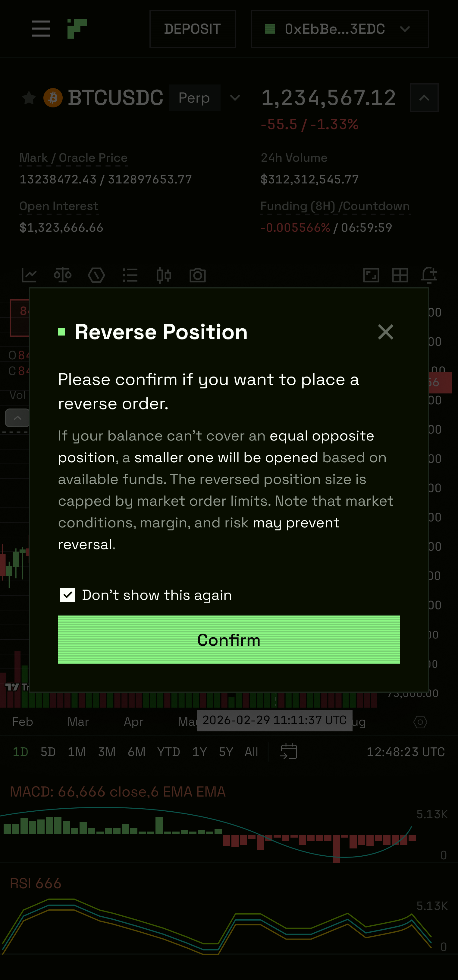
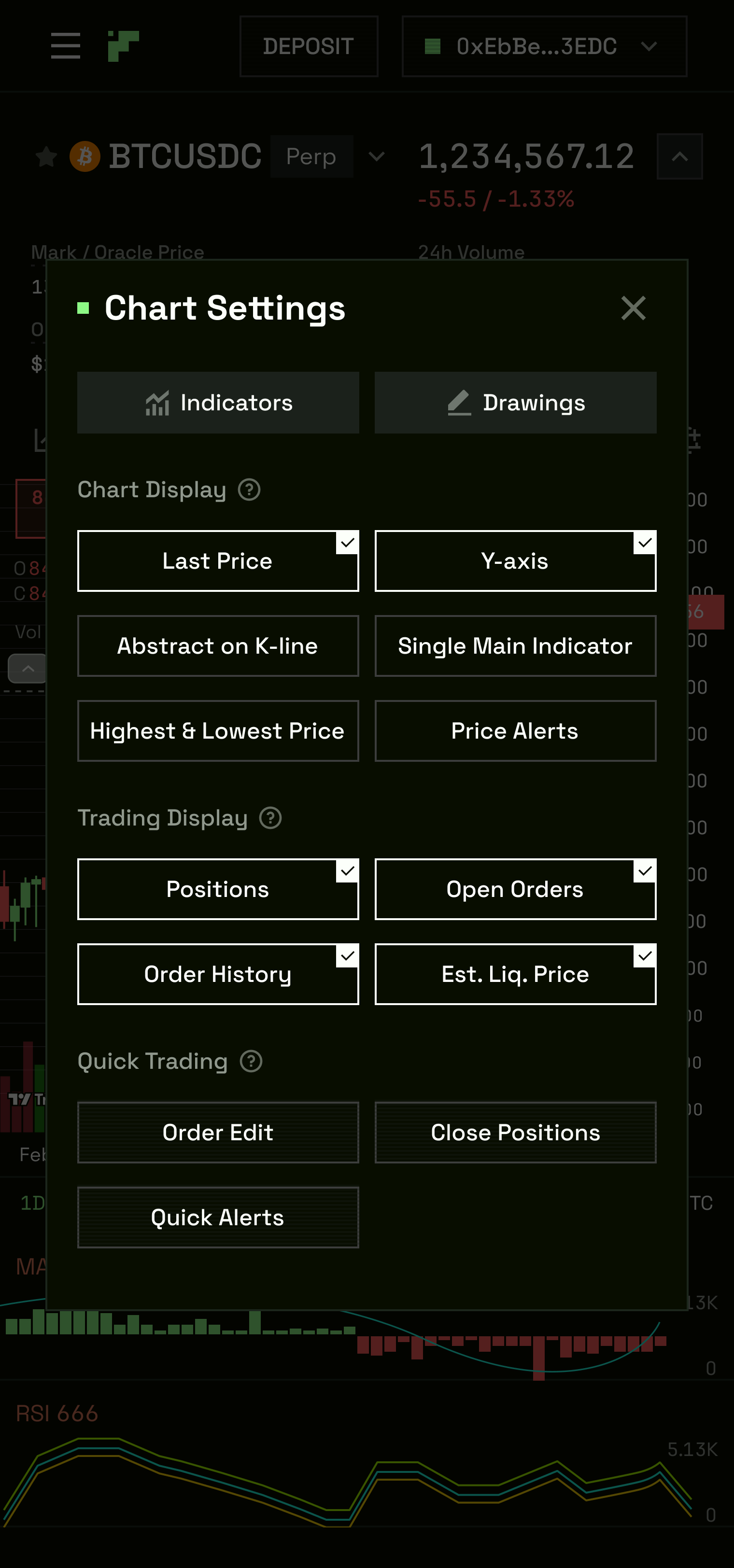
Dialogs within the chart view cover: close position, leverage adjustment, modify TP/SL (three states), reverse position, and settings. Position markers render directly on the chart with SL and SL-Limit lines visible, tappable, and editable in-place.
H5
04 — Onboarding
Five steps. Designed specifically for the H5 K-Line trading surface. No DEX in the sector had a guided first-trade onboarding flow at this point — Hyperliquid's onboarding was entirely friction-dependent, Aster's was frictionless but untutored. TxFlow's approach was to guide a first-time user through their first trade within the K-Line view — introducing the chart, the order panel, leverage, TP/SL, and position management as a sequential walkthrough rather than a settings page.
Steps one through five are each a distinct screen in the H5 context, progressing from chart familiarisation through to position confirmation.
H5
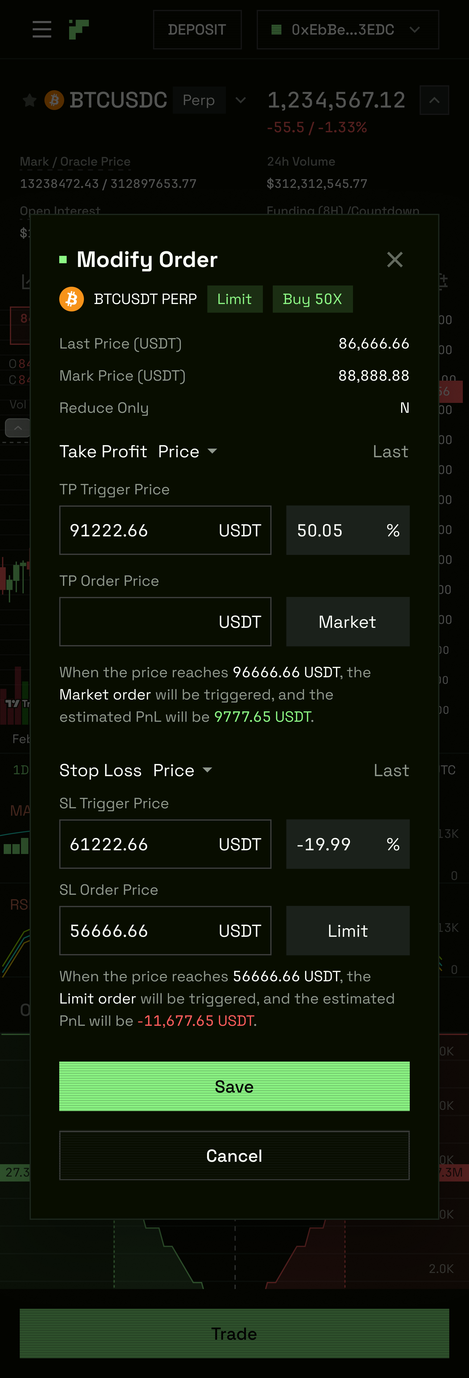
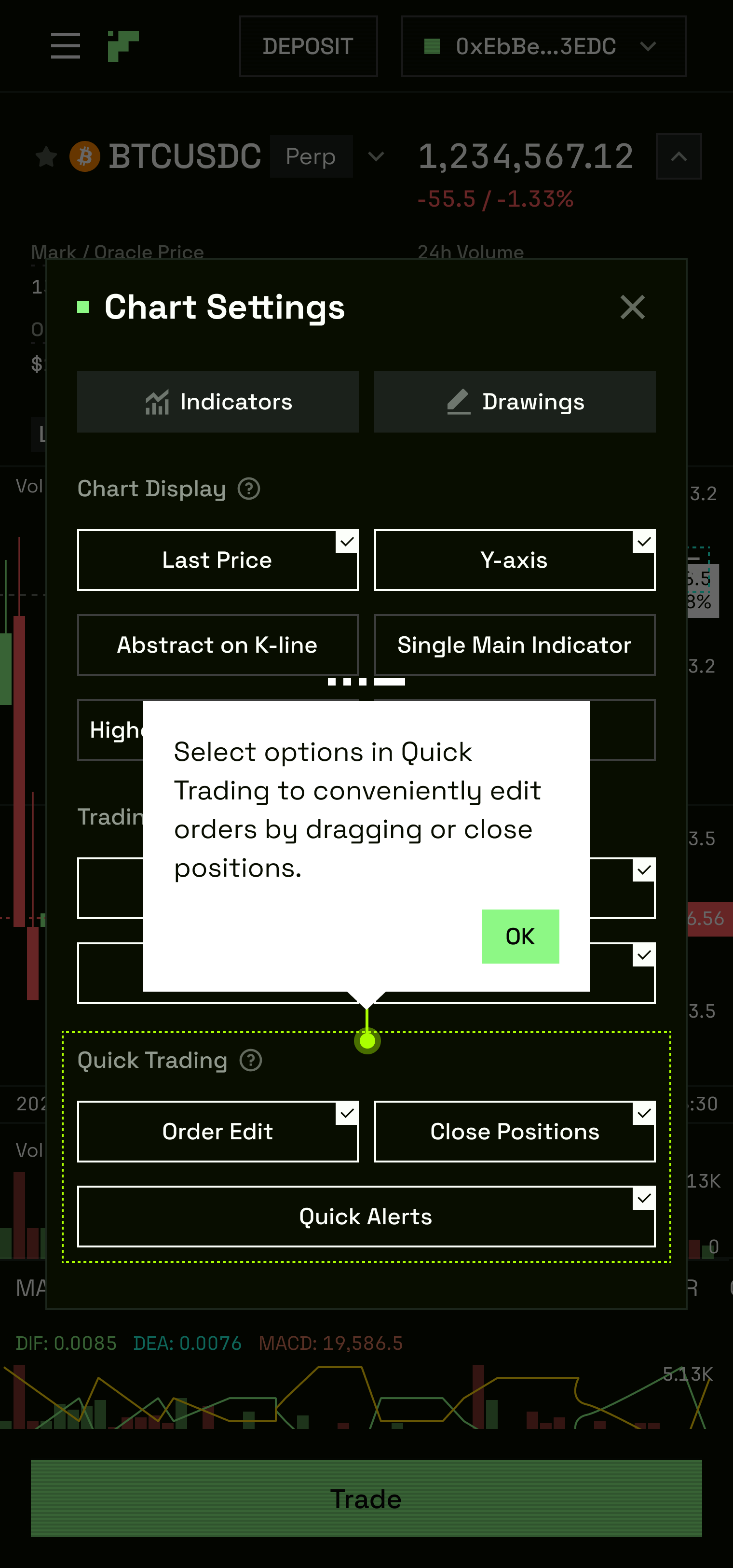
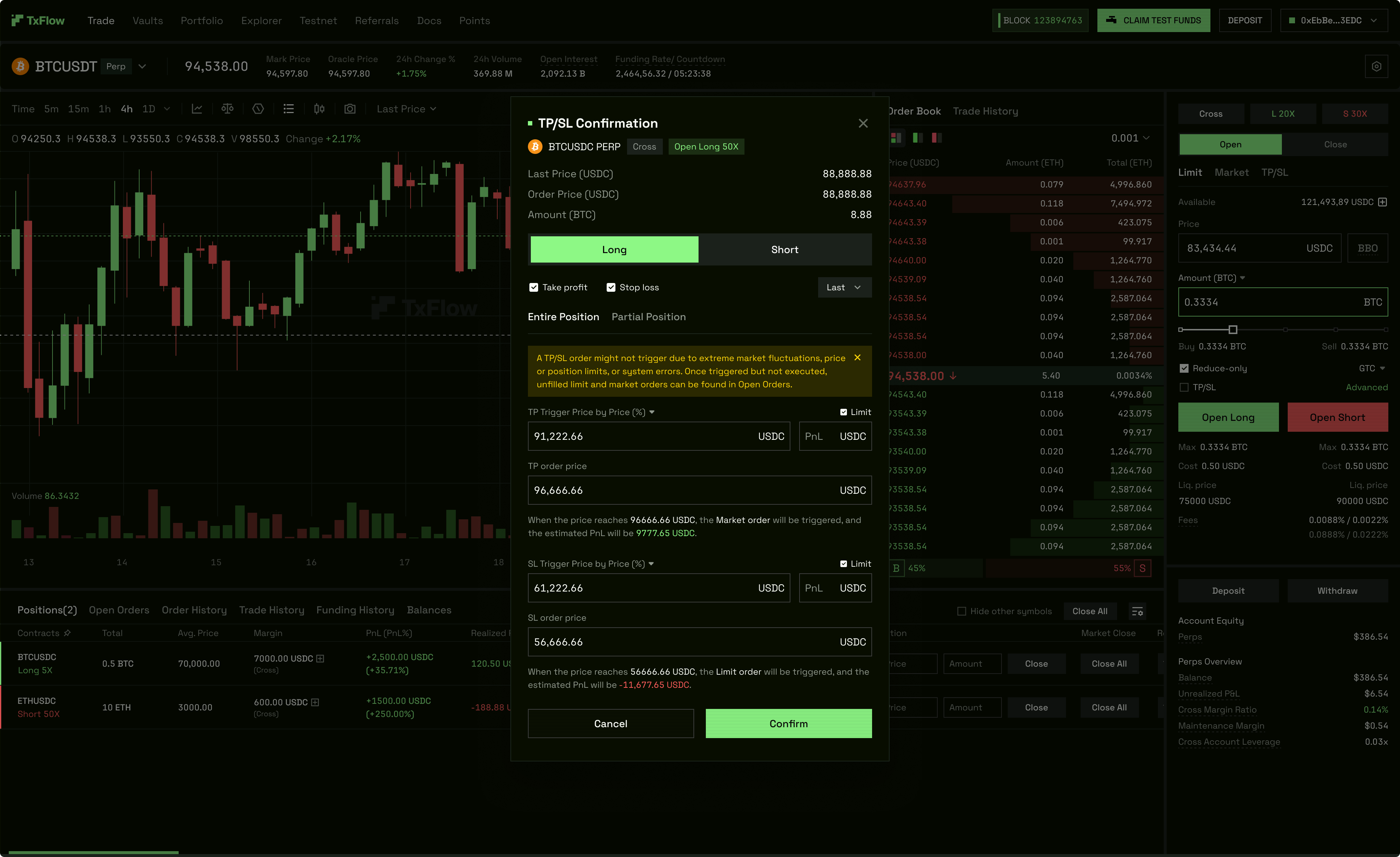
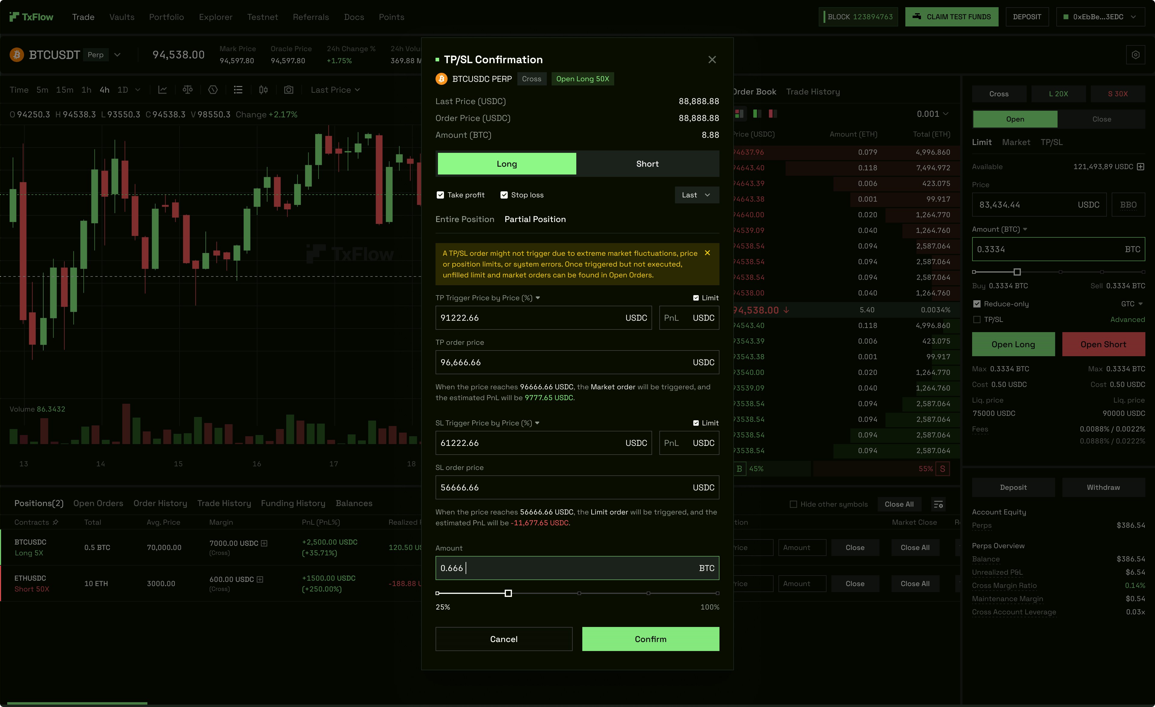
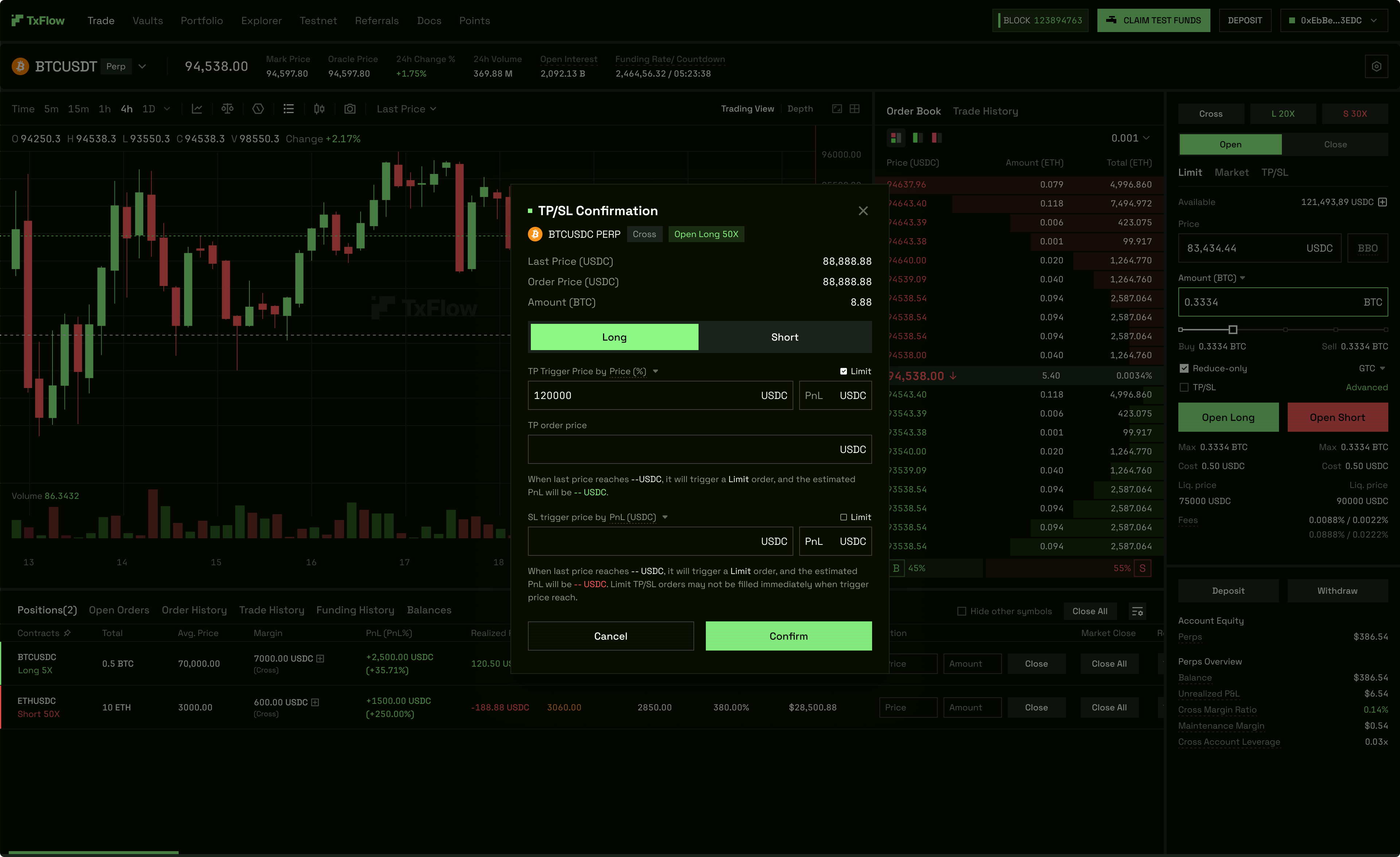
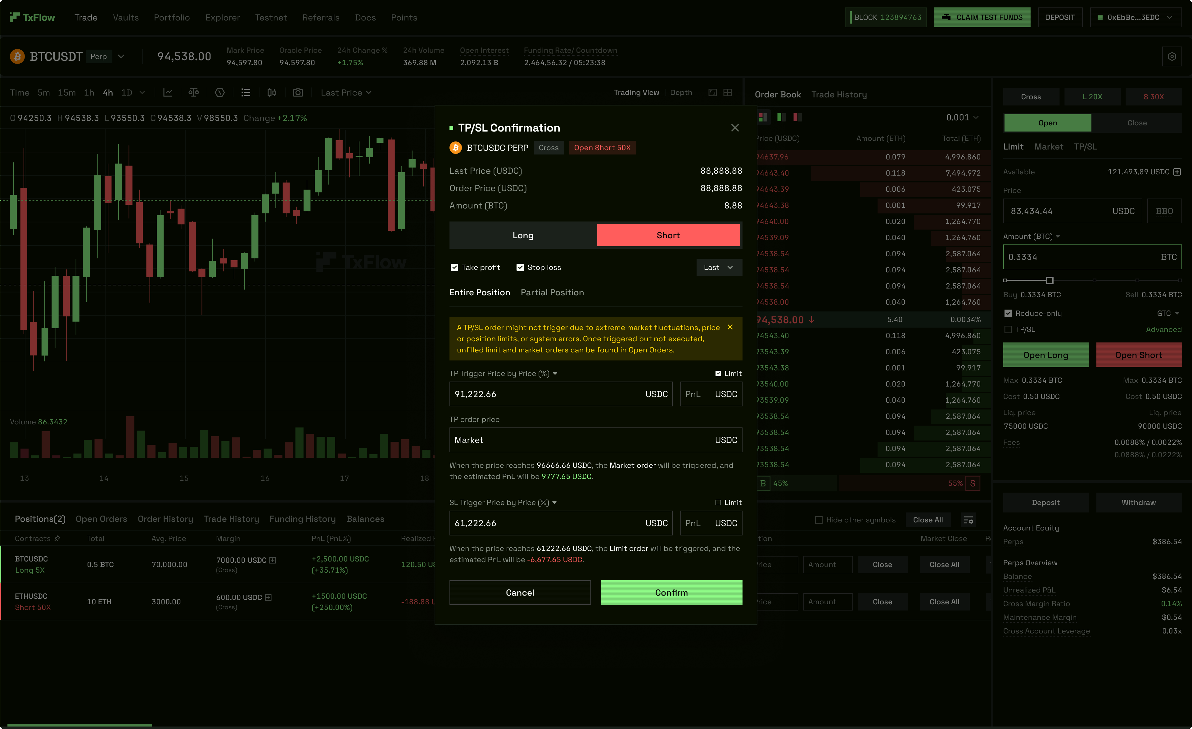
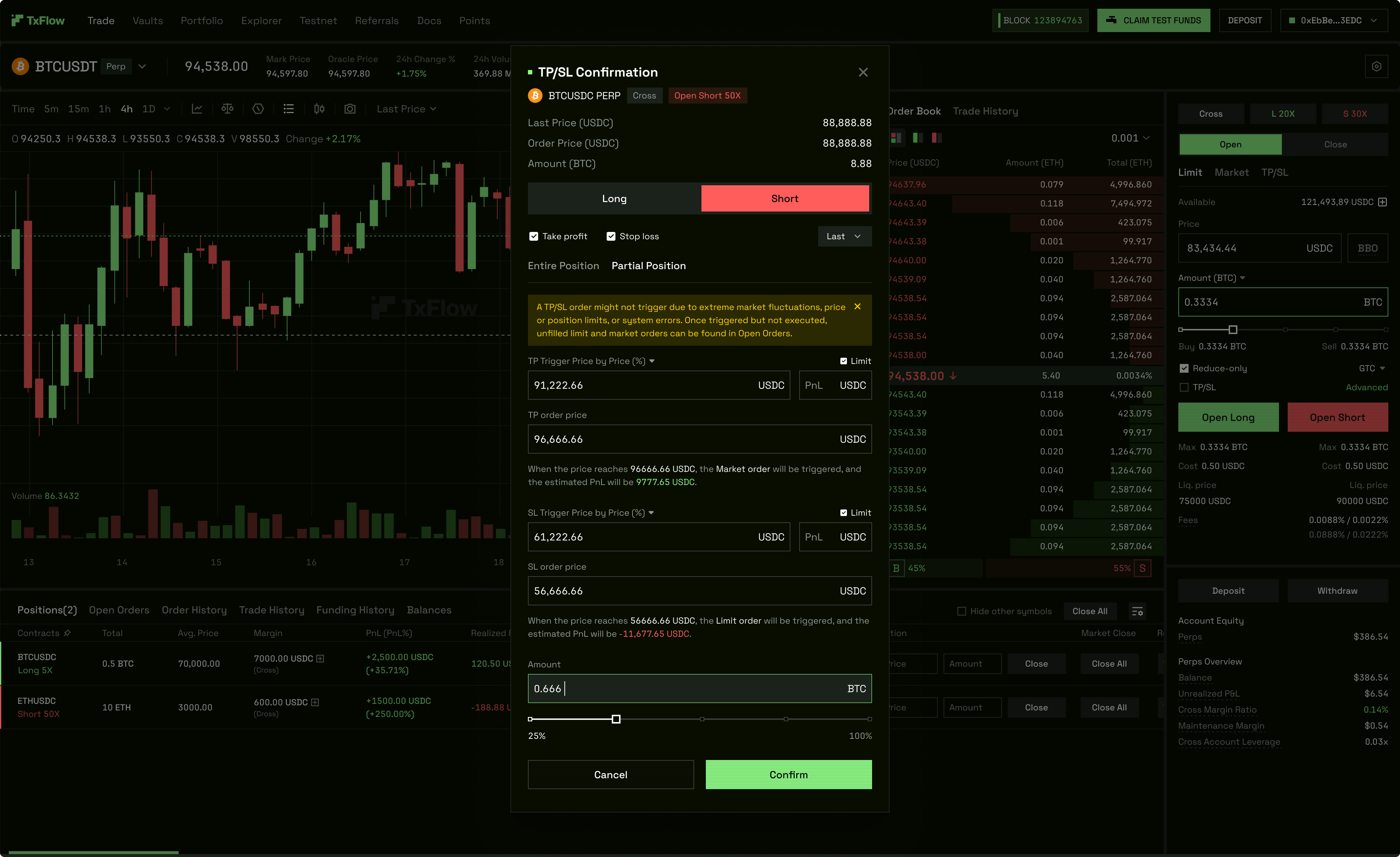
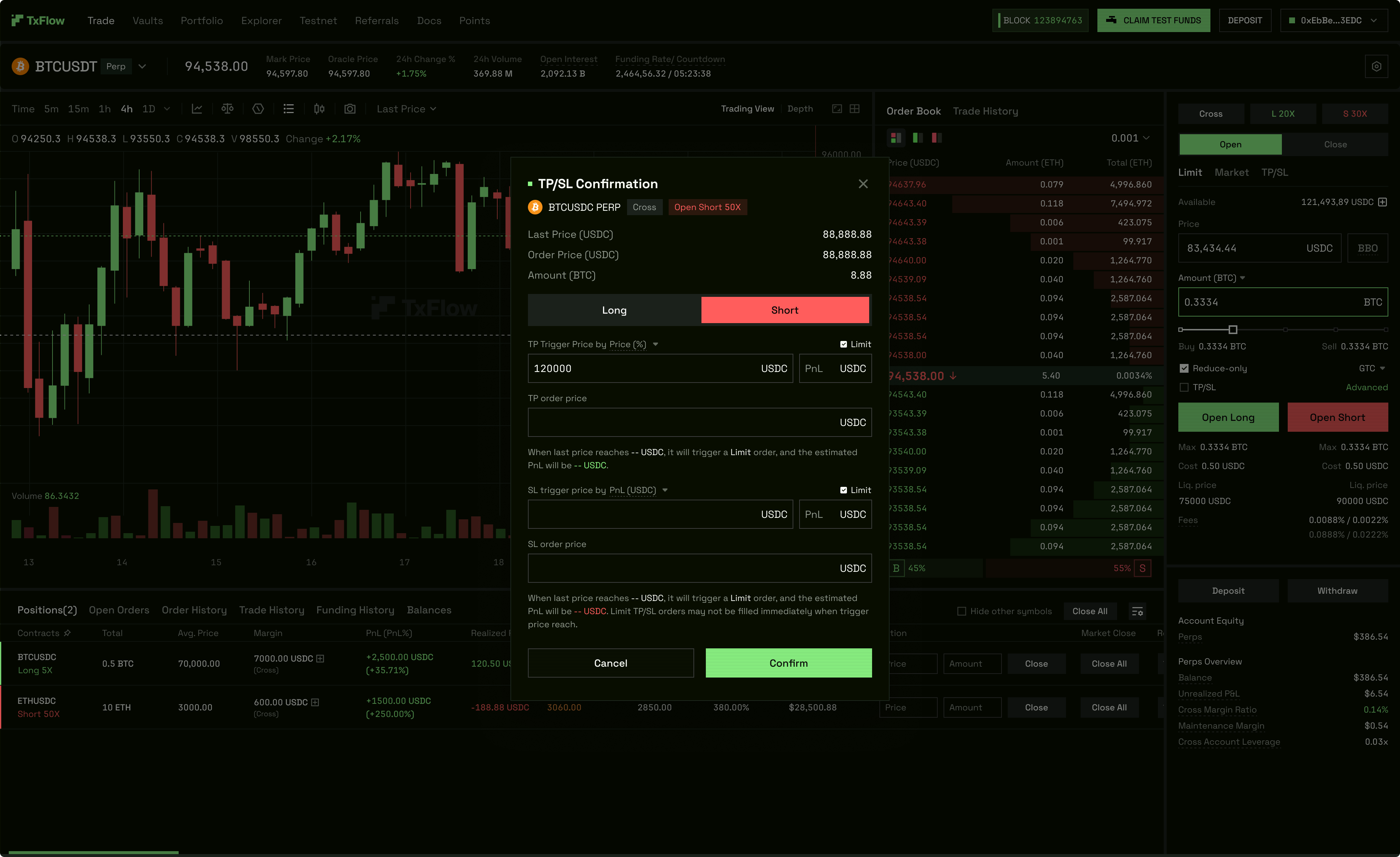
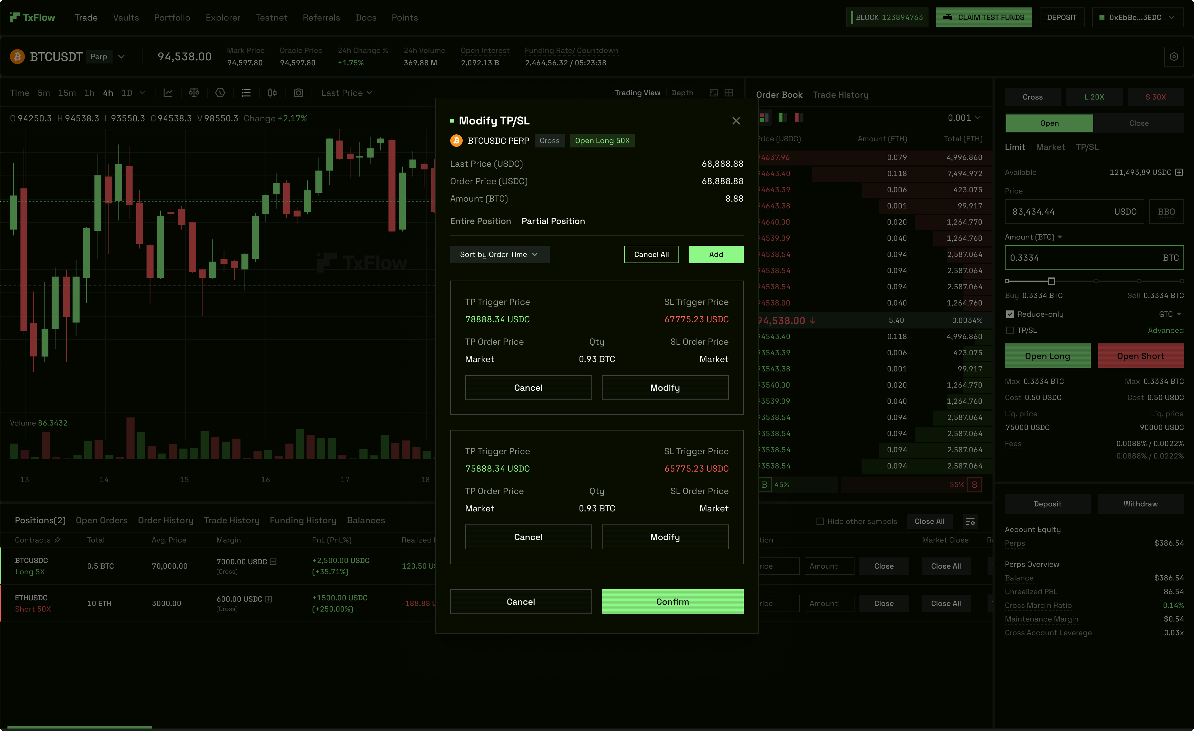
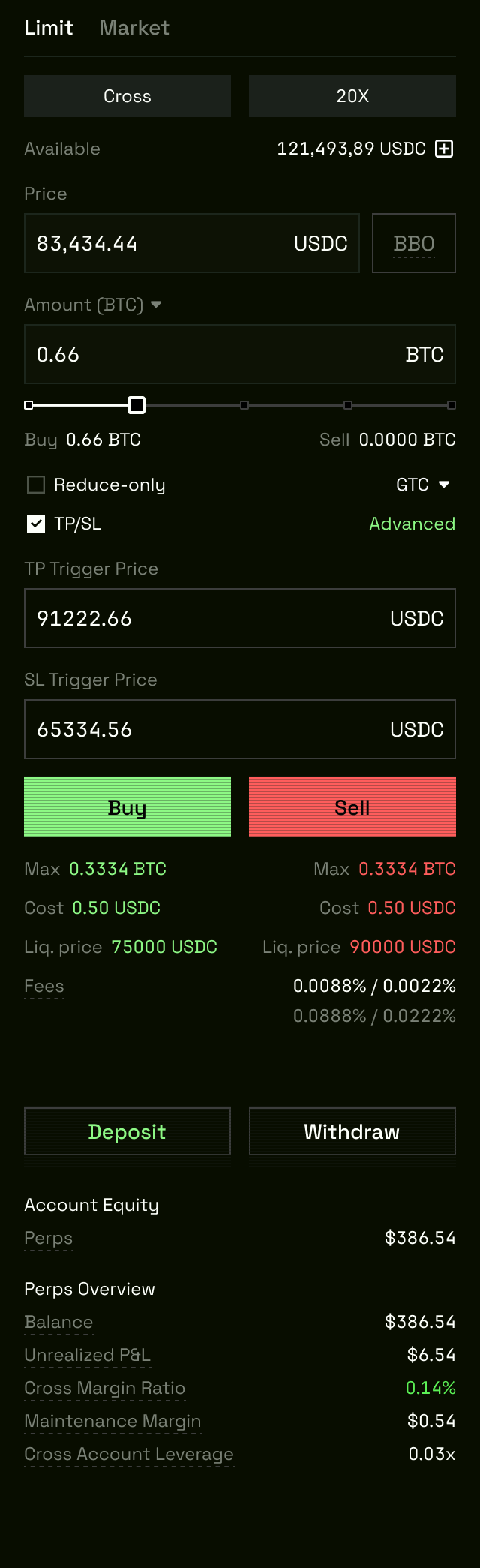
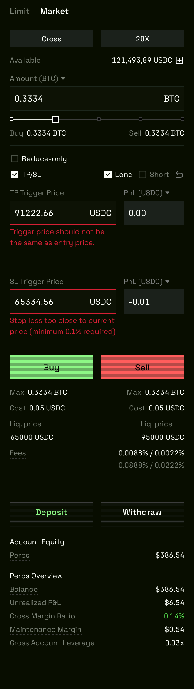
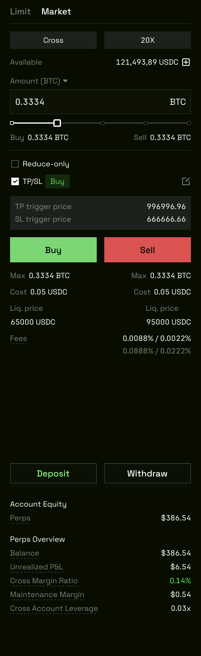
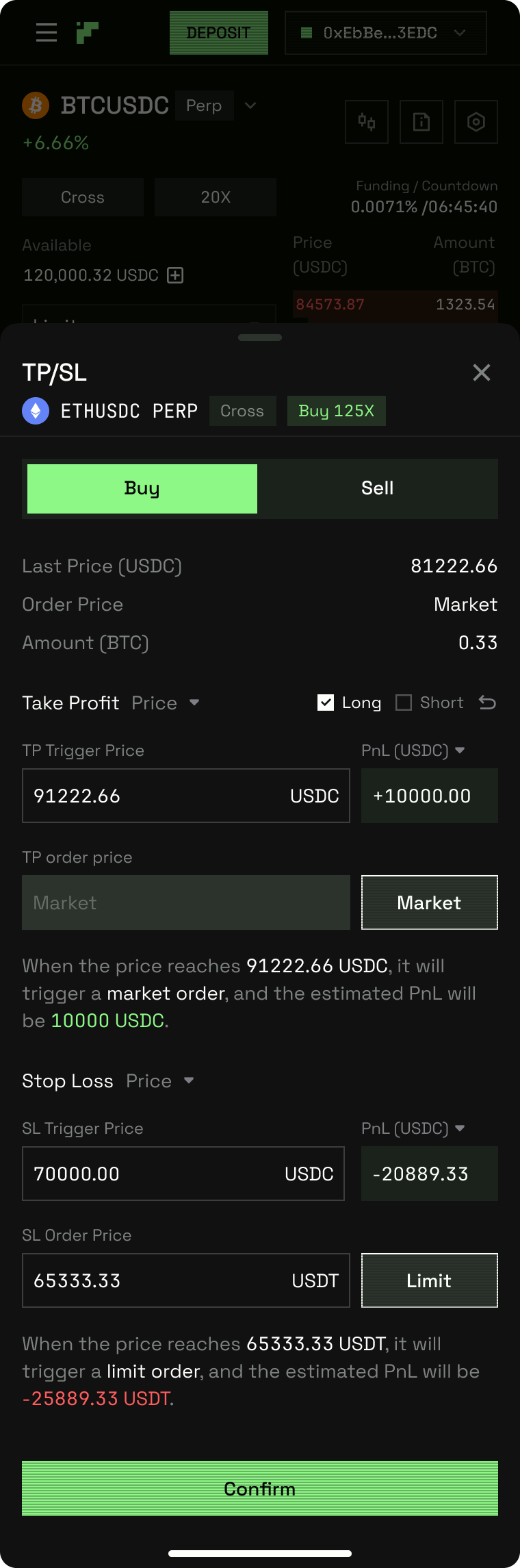
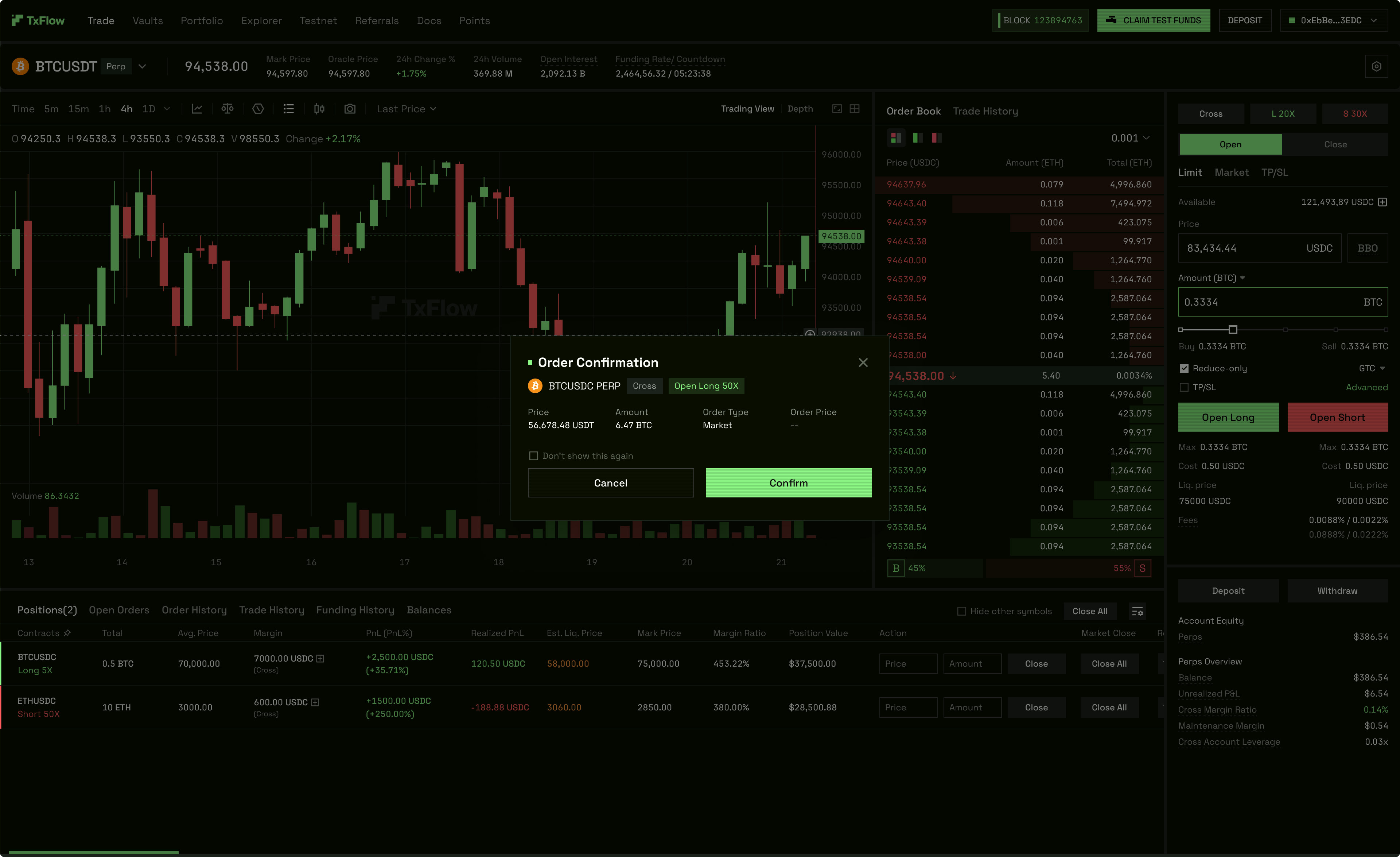
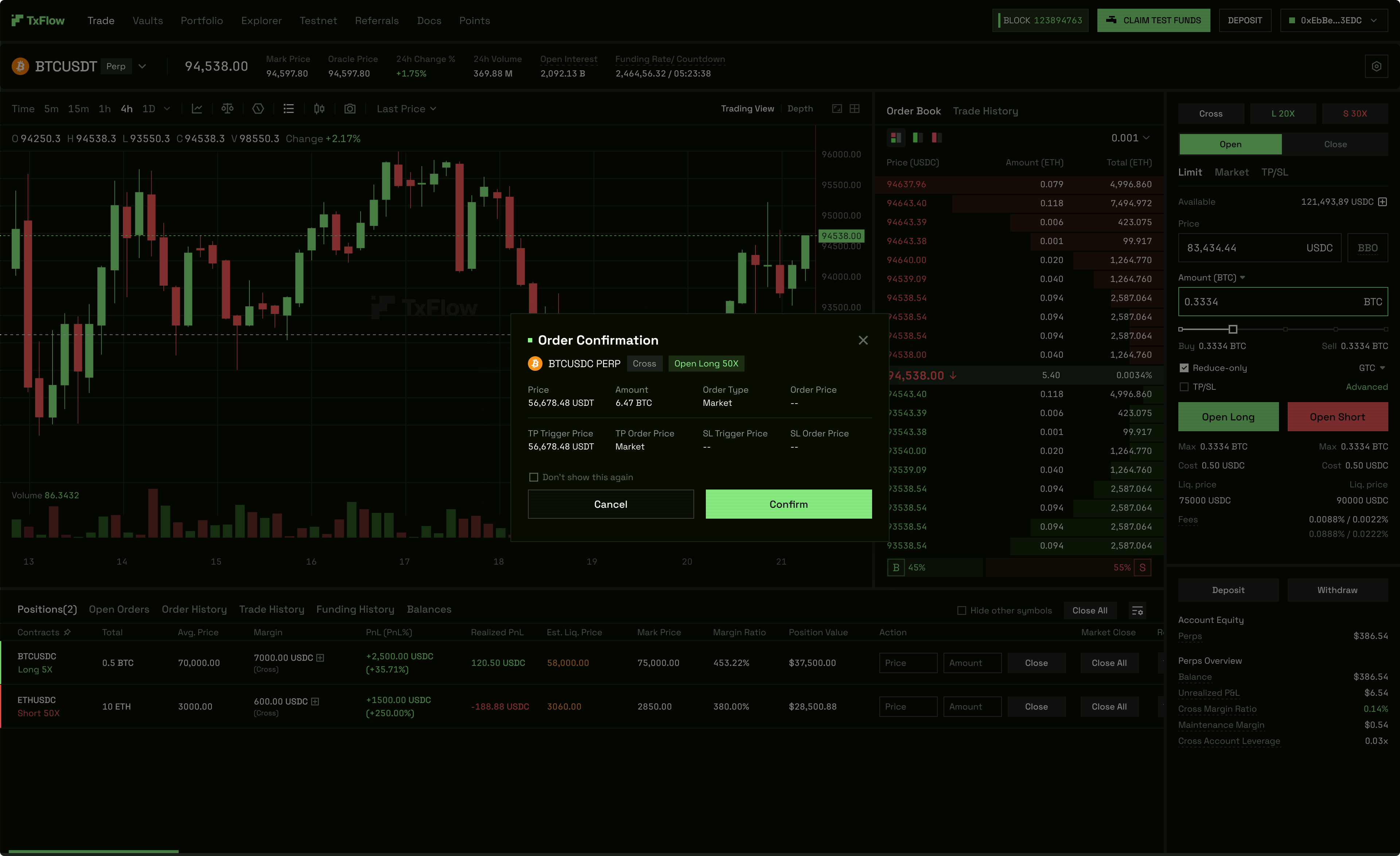
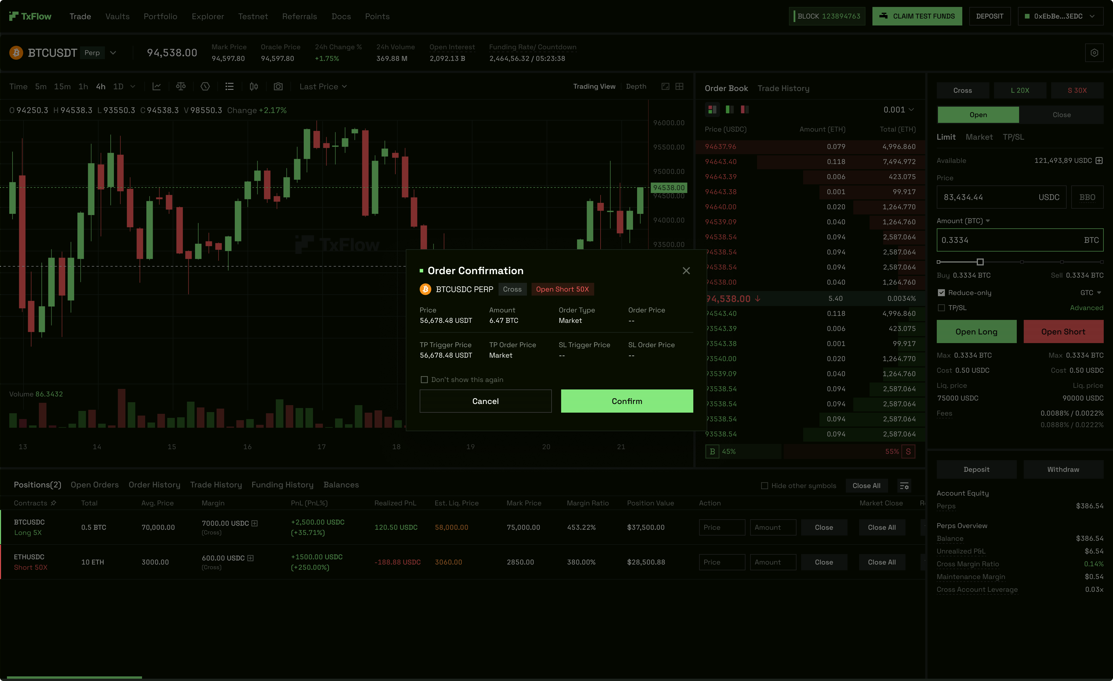
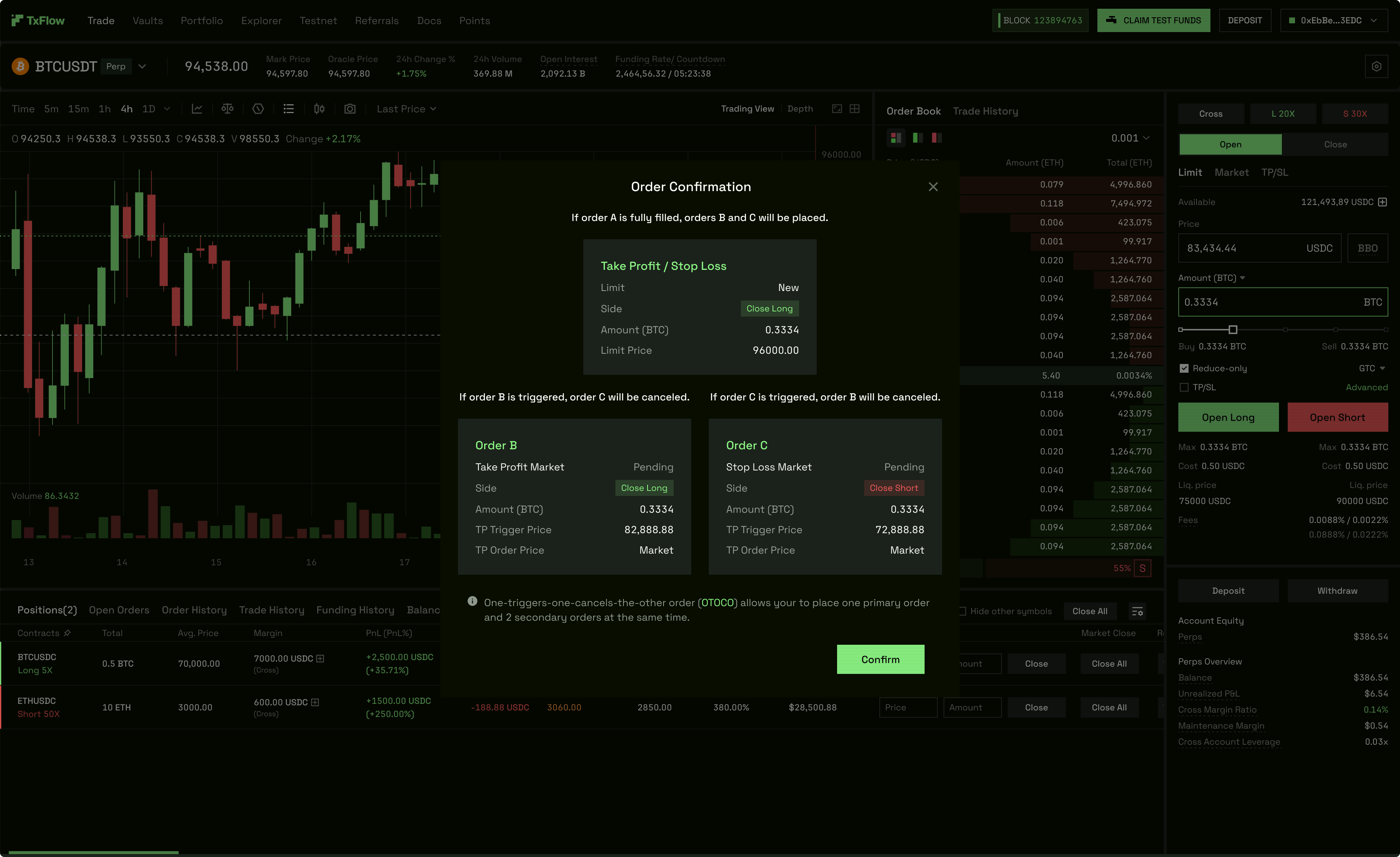
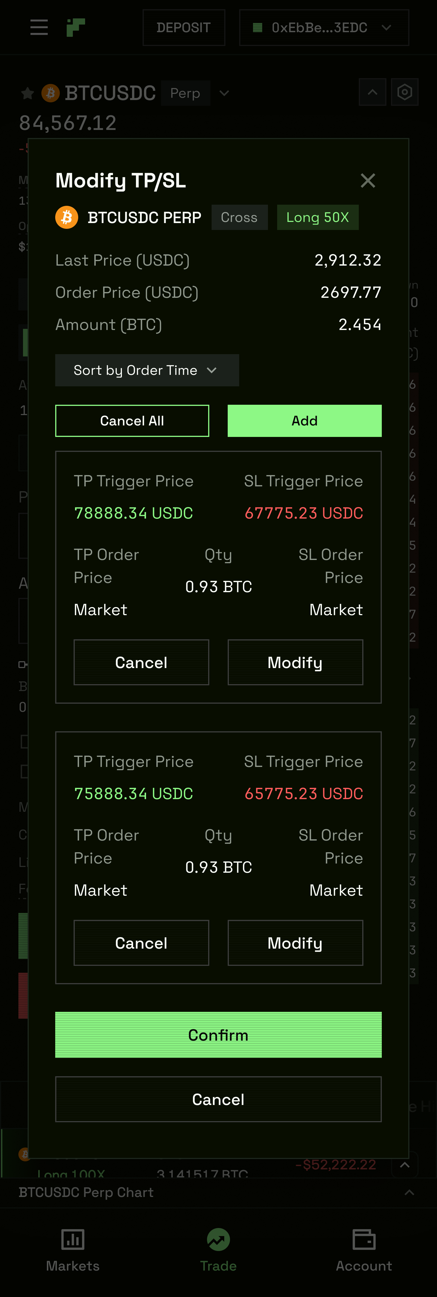
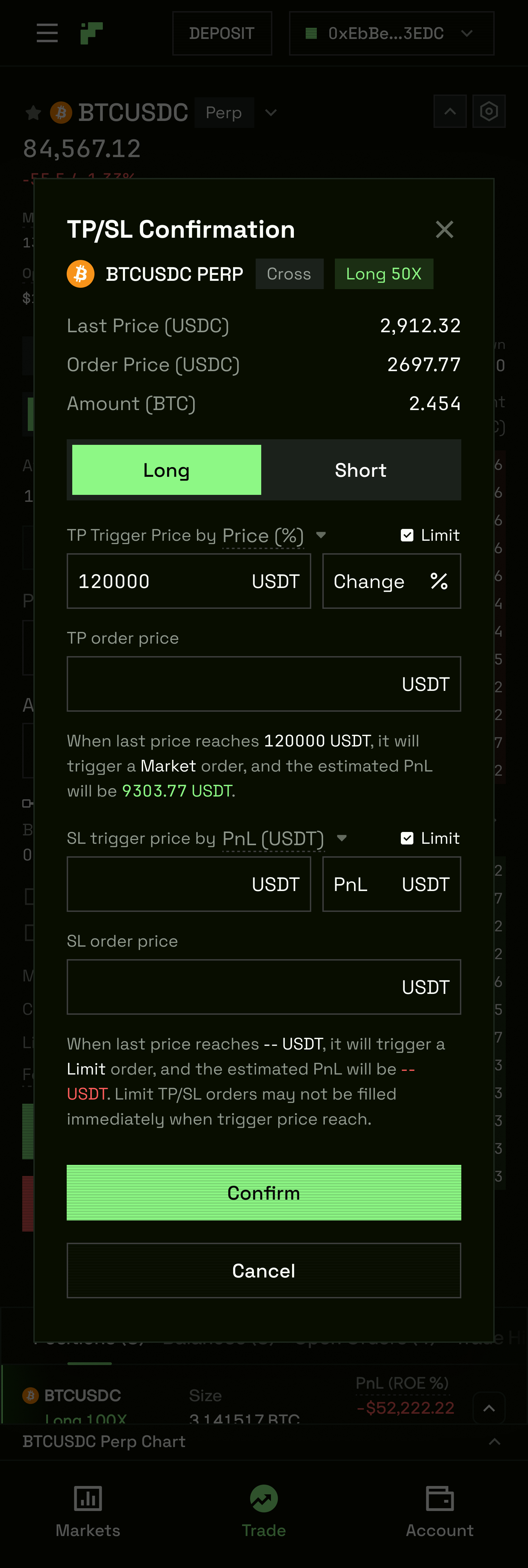
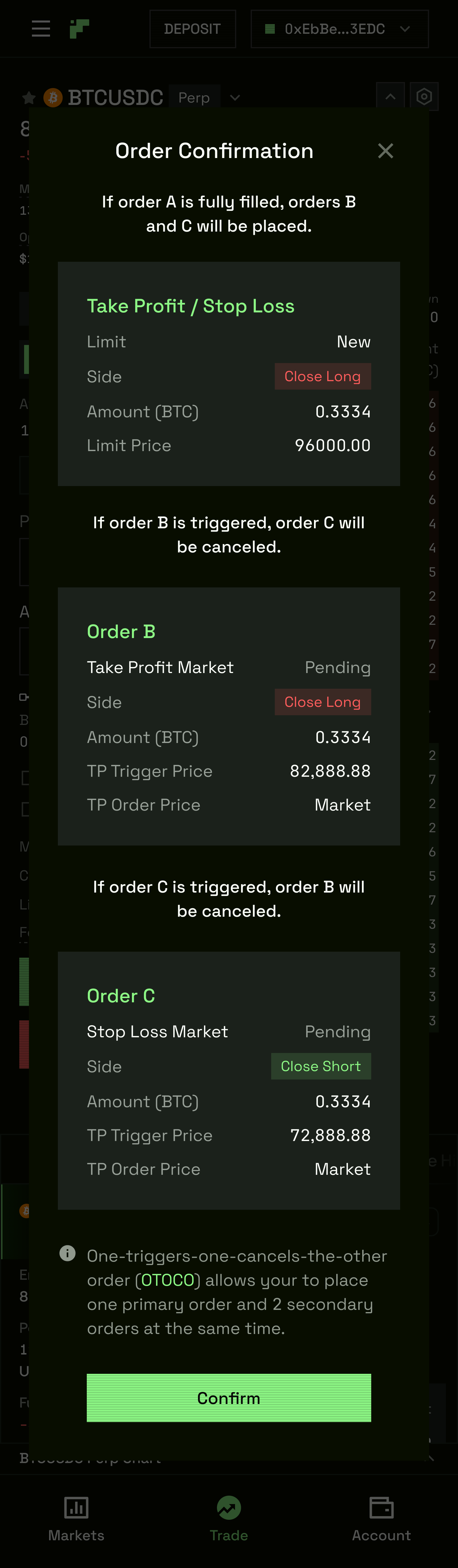
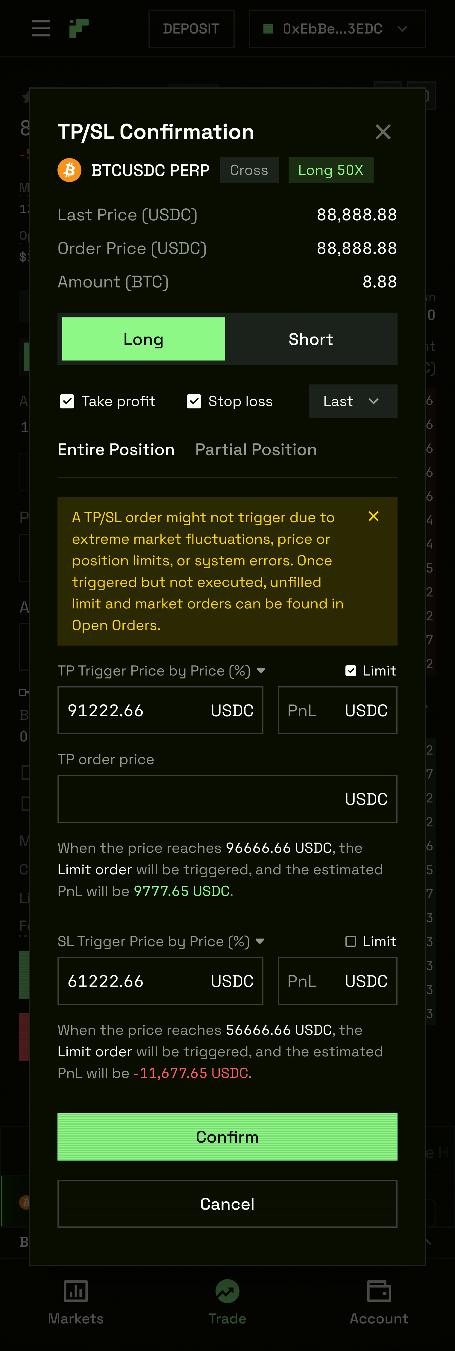
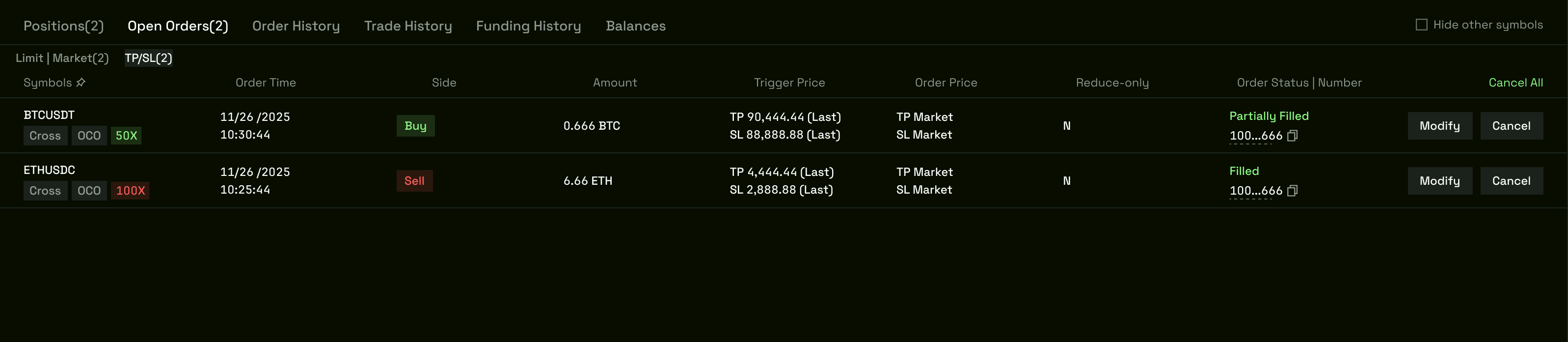
05 — TP/SL
TP/SL on a perpetual DEX is not a checkbox. Every professional trader uses it; the design failure on every competing platform was making it feel like an optional extra rather than a core part of the order flow. On TxFlow, TP/SL lives inside the order panel — not behind a separate step.
The full delivery covers: standard flow for desktop and H5 independently, pre-trade instances across both breakpoints, and complete state coverage for both Limit and Market order types. States: unchecked (default), checked, filled, advanced, PnL estimate, confirm, edit, complete, updated, error. The connect-wallet state and asset-selector state are also specified — the interface handles every entry point correctly.
All handoff files include a UI Sections export package with clean, labelled sections for engineering.
Components Only
H5
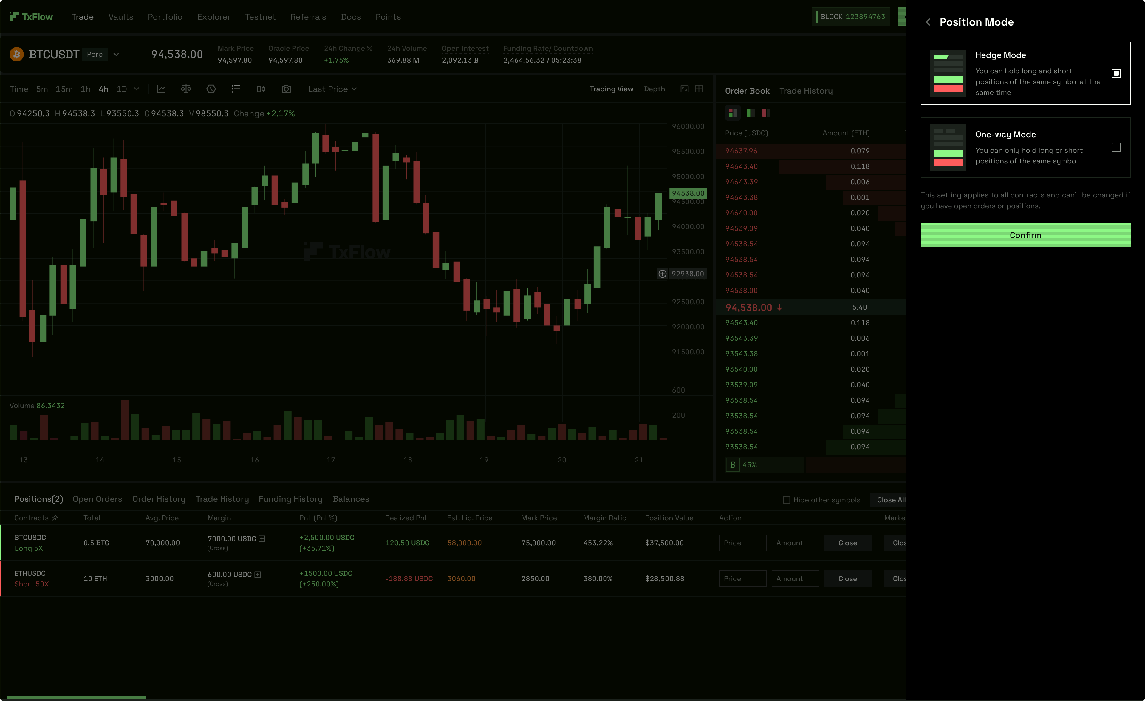
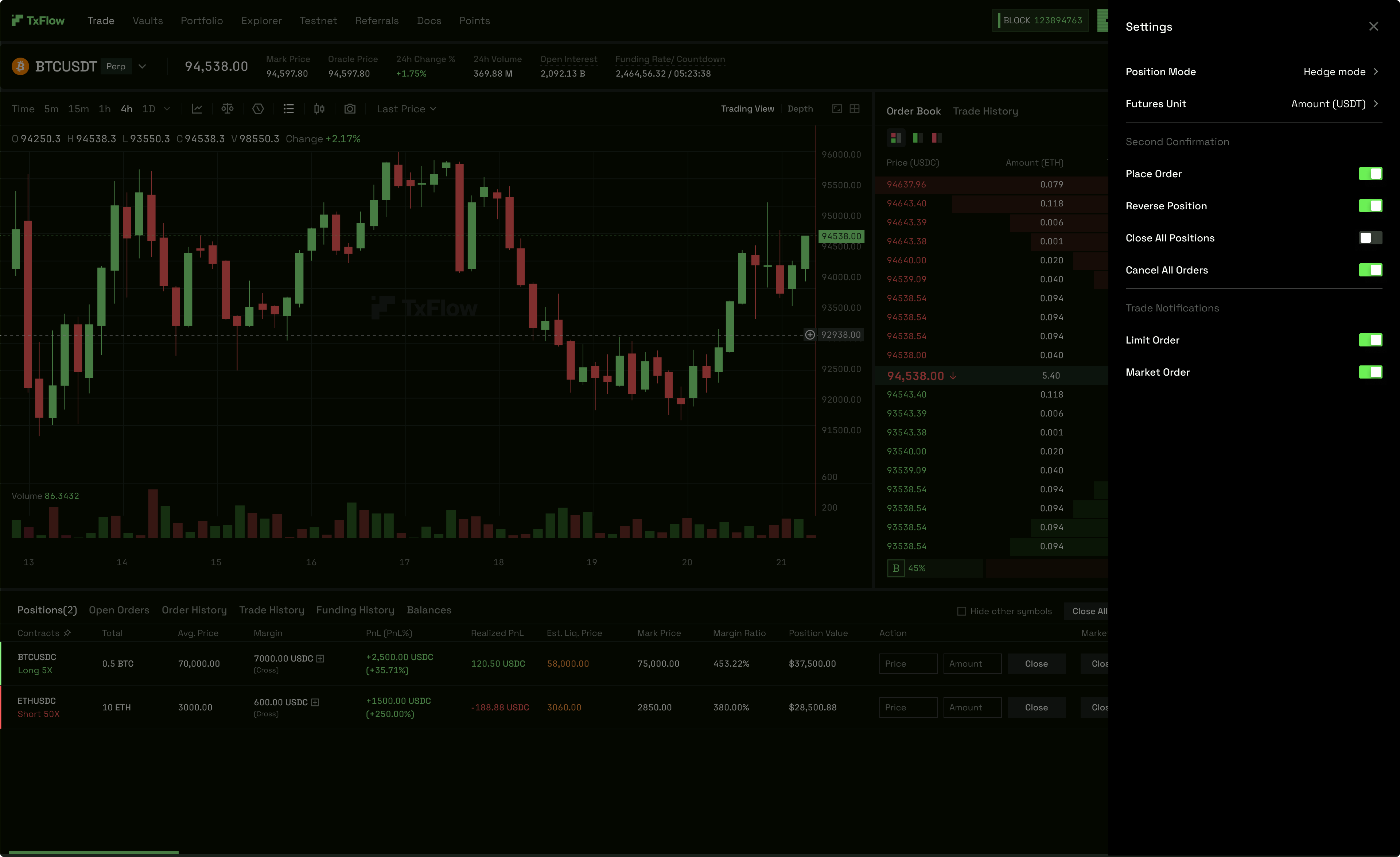
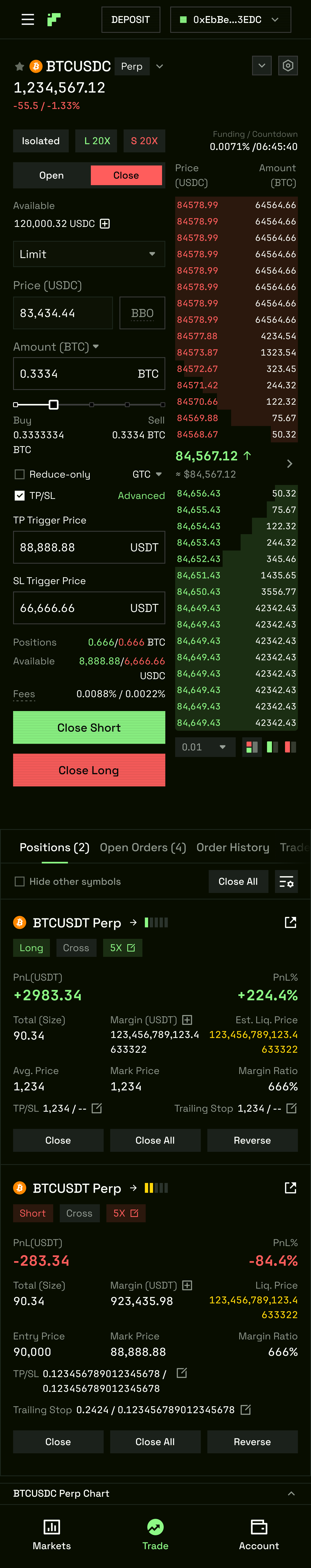
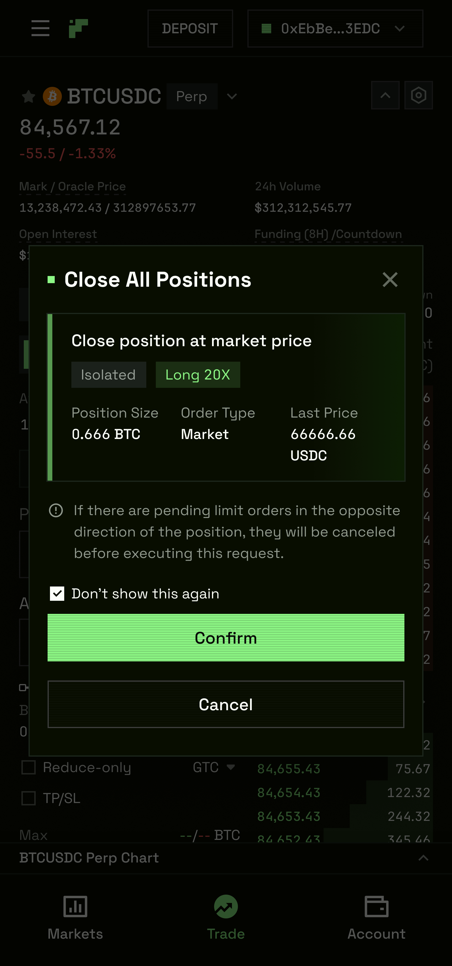
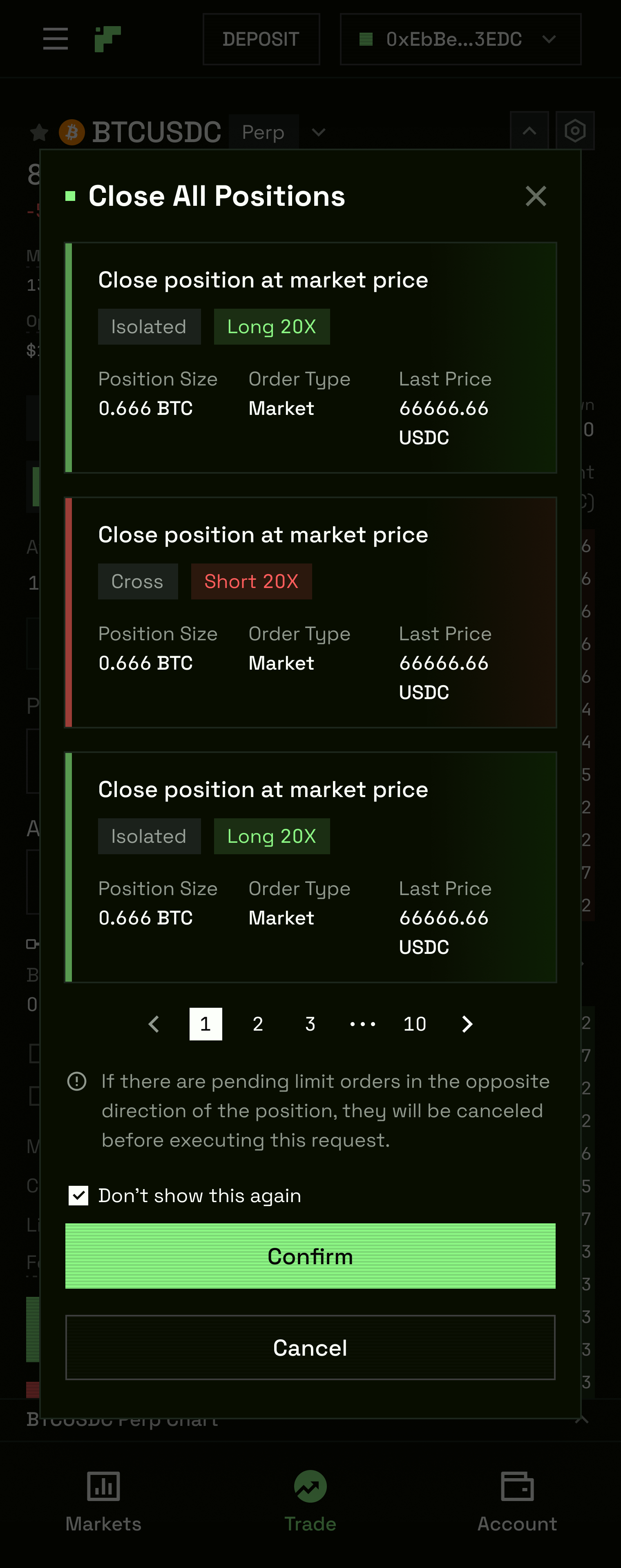
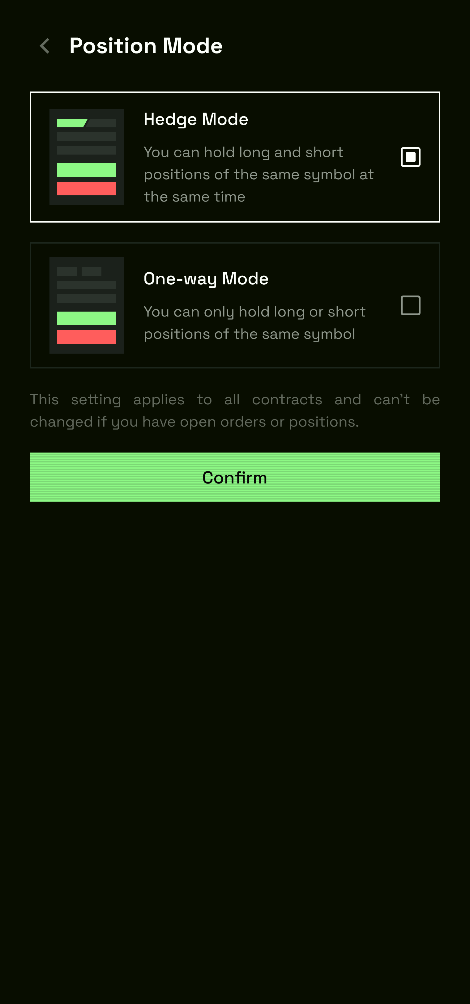
06 — Hedge Mode
Hedge Mode — the differentiator no major perp DEX has built. Not Hyperliquid, not dYdX. GMX's architecture structurally prevents it. For traders running a long swing and a short scalp on the same asset simultaneously, it's a migration trigger on its own.
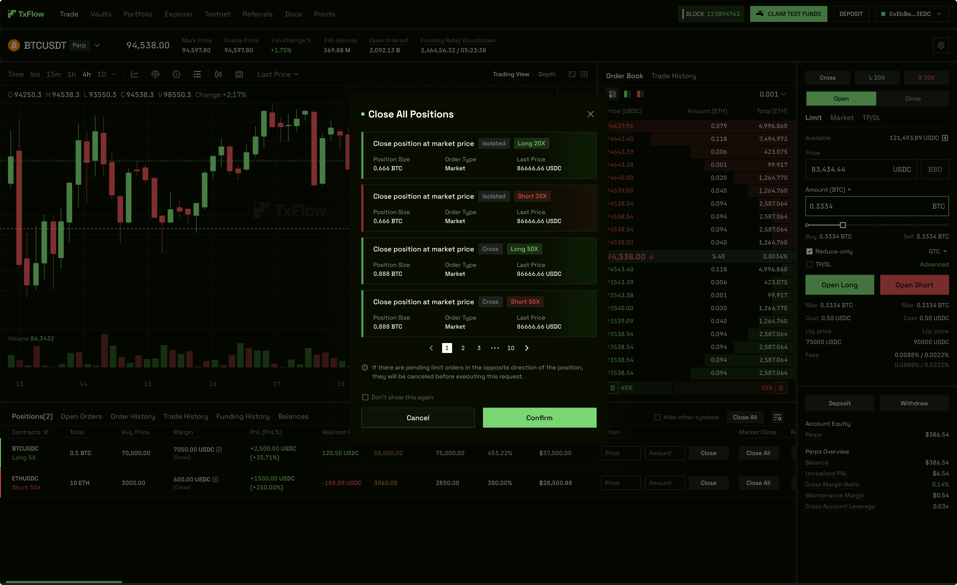
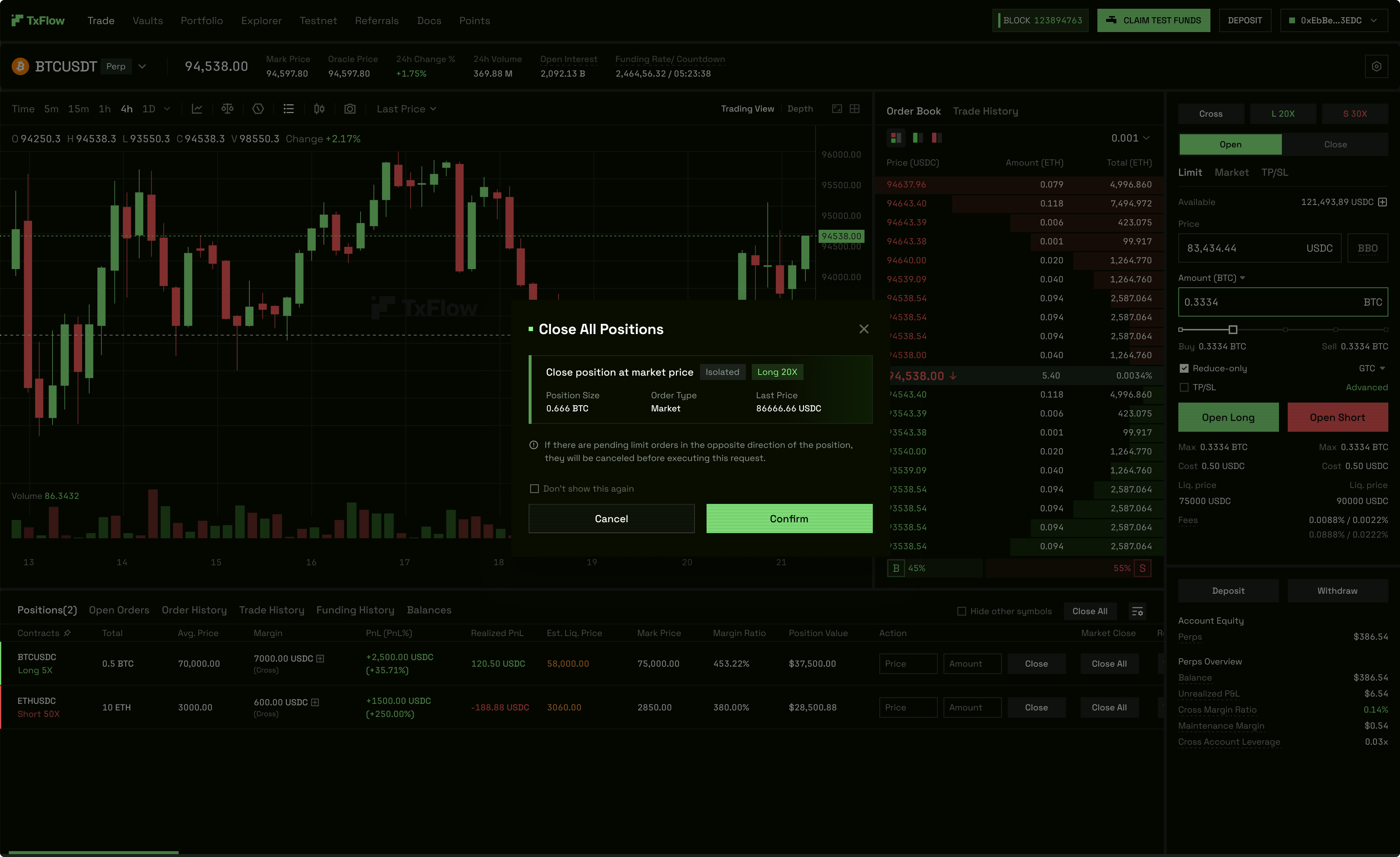
Scope — 8 workstreams, one sprint. Mode Switch (validation blocks mid-position switches) — Two-Way Order Panel (Isolated and Cross, independent leverage per direction) — Close All (Hedge-aware confirmation, warns about opposite-direction open orders) — Leverage Settings (three modal variants: Isolated Long, Isolated Short, Cross) — TP/SL per direction and fill state — Order List — Position List — Compatibility across Vaults, Portfolio, and history tables.
Web board (Mar 10, 2026) — ~30 frames. The order panel layout establishes the base state. One-Way and Hedge/Open variants cover the mode toggle at the top of the panel — the switch is a single interaction that re-architects the entire panel beneath it. HedgeBothSide shows the simultaneous long-and-short order panel state, the only design on any DEX that surfaces both sides of a hedge in a single view. Settings/Drawer handles mode switching with an in-panel slide-out confirmation. Isolated margin mode covers independent leverage per direction; the AdjustLeverage modal runs three states — default, drag in progress, and confirmed. TPSL within Hedge Mode is the most complex sub-feature: Linked/Cross confirmation, Open-TPSL entry into the order flow, filterBy panel for position filtering, and Partial fill state each required distinct screen states. The Positions table and dedicated Hedge Table show long and short simultaneously — direction-coded with a left border: #8DF885 for Long, #FF5D5C for Short. Leverage is independent per direction in Isolated mode, shared in Cross. Portfolio views and transaction history tables confirm full compatibility across the account surface.
H5 board (Mar 12, 2026) — ~25 frames. Cross/Open and Isolated/Open establish the base order panel in both margin modes. Automation-TPSL and TPSL_Open handle conditional order entry on mobile. v-view and TradingTime are time-specific display states for the position row. Position-Mode panel, Settings, and Order-Type selector are slide-in bottom sheets triggered within the order flow. CloseAll runs two confirmation states — standard and the Hedge variant that warns about open orders on the opposite direction. Order-Confirmation is the final submission screen. Leverage and LeverageNo handle the leverage modal with and without the first-use disclaimer. TPSL long/short are separated — each side scoped independently. Orders-long shows the position row in full Hedge context. Modify-TPS is the in-flight modification state. Open-Long/Short (with and without TPSL) covers the order panel for each direction at the point of entry. Advance-update covers the update confirmation. Performa, Vaults, and Slide-Performa-Here verify cross-surface compatibility on mobile.
TPSL — 6 states per direction + Modify. Long Unfilled / Partial / Filled — Short Unfilled / Partial / Filled — plus Modify for in-flight changes. Sprint docs delivered in English and Chinese.
H5
07 — Dialogs (Deposit, Withdrawal, Margin)
One question at a time, smart defaults, no silent failures.
Deposit adapts to wallet type and source chain. Arbitrum web3 wallets get a QR code alongside the deposit address. Privy (social login) gets a simplified flow. The chain selector blocks submission on unsupported networks and surfaces a switch CTA on non-Arbitrum chains.
Withdrawal mirrors deposit. Web3 wallets choose between Arbitrum and Base. Privy routes through the custodial flow. The MAX button auto-deducts the withdrawal fee and shows the net receivable before confirmation — fixing the silent-failure on Hyperliquid where MAX doesn't account for fees, causing rejected transactions.
Mobile. Dark and light mode variants delivered for the app. Mar 18, 2026 iteration is production-ready across both modes.
Mobile. Full dark and light mode variants of the deposit and withdrawal dialogs were delivered for the mobile app. The March 18, 2026 iteration is the production-ready version across both modes.
App
08 — Portfolio
The Portfolio page is where a trader sees their full account in one place — total account value, available margin, open risk, and transaction history. It is also the primary deposit and withdrawal entry point.
Five versions were produced (1.1, 1.2, 1.3, V2, V3), each addressing a specific usability problem identified in the previous iteration. The final version is designed across four responsive breakpoints: desktop, laptop, tablet, and mobile. Three summary cards anchor the top of the page — account value, margin, and risk — each surfacing a single primary metric with supporting data beneath. Deposit and withdraw dialogs are modal overlays rather than page navigations, keeping the trader in context.
Custom SVG graphics were produced for the Accelerator component — an arrow mark and a donut chart specific to the Portfolio page's data visualisation.
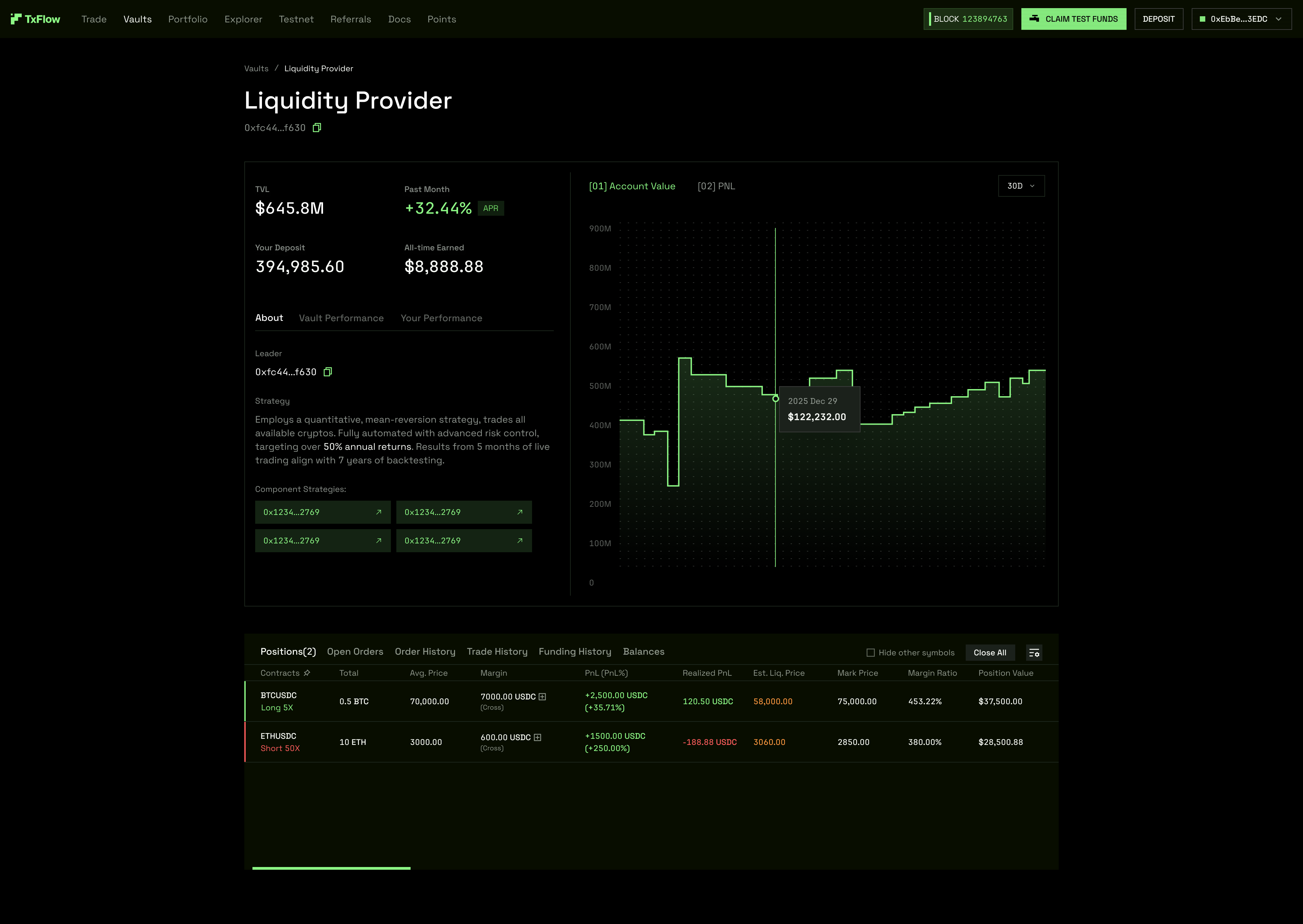
09 — Vaults
Vaults serve a different user than the trading interface. A vault depositor is allocating capital to a strategy — they need TVL, APY, risk tier, deposited amount, and accrued yield. They do not need the real-time density of a trading dashboard.
The Vaults interface was designed as a standalone surface with a Vault table, a Vault Detail panel, and a MetricCard component. The work extended beyond Figma into a working React/TypeScript prototype — built with AI Studio — that gave engineering a live reference implementation rather than a static spec. Components: Header, MetricCard, VaultTable, VaultDetail, wired to structured mock data.
10 — Position Tables
The Position Tables component ended up as a standalone component instance with multiple variants according to the data that needed to be presented. Everything was modularised and ensured that with every update, the trading modules would get better with time. I set everything up smoothly to ensure maximum efficiency in terms of data visualisation.
Desktop
H5
11 — Referrals
The referral system was designed as a complete state machine — every state a user can reach has a designed screen. The inviter journey covers: start, disconnected (wallet not connected), referral link activated, referral in progress, joinedA, joinedB, activated, and a three-step claim rewards flow. The invitee journey handles a five-step bind flow for code entry post-signup.
All 17 desktop states and 17 mobile states were delivered. Component instances, connected/disconnected states, inviter/invitee role variants, and bind/claim modal instances were all produced as handoff exports. Chinese-language equivalents of the component instance sheets and modal instances were delivered for the engineering team. The Affiliate view covers high-volume referrer tiers. A full PRD preceded the design work.
12 — Faucet
The testnet faucet is a trader's first interaction with TxFlow before mainnet. Getting it wrong — making it feel like a developer tool — sets the wrong first impression. The Faucet was designed as a product surface, not a utility.
Desktop — 5 states. The Claim Test Funds flow begins in the context of the trading page itself — the user is already in the product before they've funded the account. State 1 is the default trading view, showing the faucet CTA alongside the empty account and $0 balance. State 2 is the "TxFlow on CONNECTING" modal — a deliberate loading state that communicates the claim request is being processed, not just a generic spinner. State 3 is "Claim 2127 Test USD" — the claim amount is surfaced prominently before confirmation, making the value of the action visible. State 4 is "Share 2127 Test USD" — a social sharing prompt that triggers immediately after a successful claim, turning a testnet event into a potential referral moment without a separate flow. State 5 is the toast notification confirming funds have arrived in the wallet — no modal, no page reload, in-context confirmation.
H5 — 5 states. Mobile parity across all five states. The modal layout collapses to a bottom sheet on H5, with claim and share actions stacked vertically. Toast positioning adjusts to the bottom of the viewport.
A full React prototype was built in parallel — the "avant-garde DEX edition" — with a kinetic animated background component (KineticBackground.tsx) and an AvantGardeFaucet component. The prototype was intentionally elevated beyond what a testnet faucet typically receives. The first impression a developer or trader forms of TxFlow on testnet directly shapes their belief about the product quality they will encounter on mainnet.
13 — Explorer
TxFlow runs on its own L1 chain. That means users need a way to verify transactions, check block confirmations, and trace on-chain activity — a blockchain explorer, designed as part of the product rather than as an external tool. The Explorer covers: all blocks, all transactions, block details, transaction details, and latest blocks and transactions views. Mobile-first (H5) design with two iteration versions.
Research
Competitive Landscape — Perp DEX Market
Hyperliquid dominates with 70%+ on-chain perp market share. The second tier — Aster, Lighter, edgeX, GRVT, Paradex, Nado — competes on differentiation vectors: privacy, yield-bearing collateral, compliance track, and AI agent readiness. Key design battlegrounds are onboarding friction, collateral UX, fee transparency, and builder ecosystem quality.
Target: Compliance-first institutions, regulated entities, EU MICA market
AI Agent: ★★★★ — API + wallet auth, dual 2FA adds complexity, no MCP
Paradex — Privacy Perps + RPI
Paradigm-backed, Starknet AppChain. Full transaction privacy, Retail Price Improvement (beats CEX spread). $250B+ cumulative volume. Official MCP server for AI agents.
Fees: Retail 0% maker / 0.0075% taker; Pro API 0% / 0.02%
AI Agent: ★★★★★ First Tier — Official Agentic Hub with MCP (hosted/local), CLI, Prompts, Skills
Nado — True Unified Margin
Kraken-built Ink L2. Spot + perpetual + money market in a single collateral pool. Negative maker fee at scale. Official MCP CLI (nado.mcp). $18.7M annualized revenue.
Former Revolut team, Starknet ZK-rollup. XVS yield-based collateral (90% of value in margin rights). Three-stage unified margin roadmap. $208M TVL.
Fees: Taker 0.025%, Maker 0%; treasury net fee ~1%
Target: Mid-to-high active traders, professional market makers, TradFi transition
AI Agent: ★★★ Upper third — Builder Codes live, API docs public, no MCP
H5 Mobile UX Research
Research scope: Lighter, GMX, AsterDEX, ApeX — task-based cognitive walkthrough of core trading flows on mobile H5.
Layout Philosophies
Lighter — Tab-driven, progressive disclosure. Best for user education and pre-trade transparency. Wallet confirmation not required after initial deposit. Detailed position list view across four tabs (Positions / Open Orders / Trade History / Funding History).
GMX — Single-view, context-first. Chart + trade panel + positions in one vertically scrollable surface. Consolidated expandable card for positions (PnL, collateral, liq. price, all actions). Lowest cognitive overhead of the three.
AsterDEX — Modular + dense. Desktop-like multi-panel (price ladder, chart, order form). Familiar for experienced traders, steep learning curve on mobile.
Key Design Principles
Show, don't tell — Surface liquidation price, margin, and fees in the confirmation flow before the trade executes. Don't rely on the user knowing.
Acknowledge the wait — Blockchain delays require clear progressive status messages. Silence destroys trust on mobile.
Leverage is a primary input — Leverage slider must be visible and primary, not buried in settings. Lighter's inline slider + expandable drawer is the strongest pattern.
Navigation — GMX bottom nav with icons wins on mobile clarity. Lighter's contextual approach is compact but sacrifices legibility at small sizes.
Position management — GMX's consolidated expandable card reduces cognitive load vs Lighter's multi-column detailed list. Prefer card view for H5.
Agent
// 02 — Design System
Design System
Role: Solo Designer · Full Design System Ownership
Most perpetual DEX design systems are built around how the product looks. This one was built around how traders think and act under pressure. The difference is not cosmetic.
The system emerged from five real-world frameworks that govern how people make irreversible decisions in high-stakes environments:
Bloomberg Terminal taught information density. 320,000 professionals pay $25,000/year and have resisted every simplification attempt for 40 years. Information density is not the enemy of clarity — cognitive overload is. The difference is hierarchy. Every design decision starts with: what problem are we solving?
Formula 1 Pit Wall taught signal hierarchy. If everything is urgent, nothing is. The interface gives fewer signals — so each signal carries more weight. Red earns attention precisely because it is rare. Liquidation price and margin ratio are the brake temperature warning. They must turn red before the driver loses control, not after.
Military Command & Control taught mode clarity. Mode confusion kills. If a user cannot instantly determine whether they are in Hedge Mode or One-Way Mode, they act on a false model. Irreversible actions require deliberate intent — one confirmation step, not zero, not two.
The 12 Laws
These are immutable. No sprint, no deadline, no stakeholder override applies.
Law 1 — Abstract Complexity, Never Expose It. The user never needs to know what blockchain TxFlow runs on. Every deposit screen asks one question: How much?
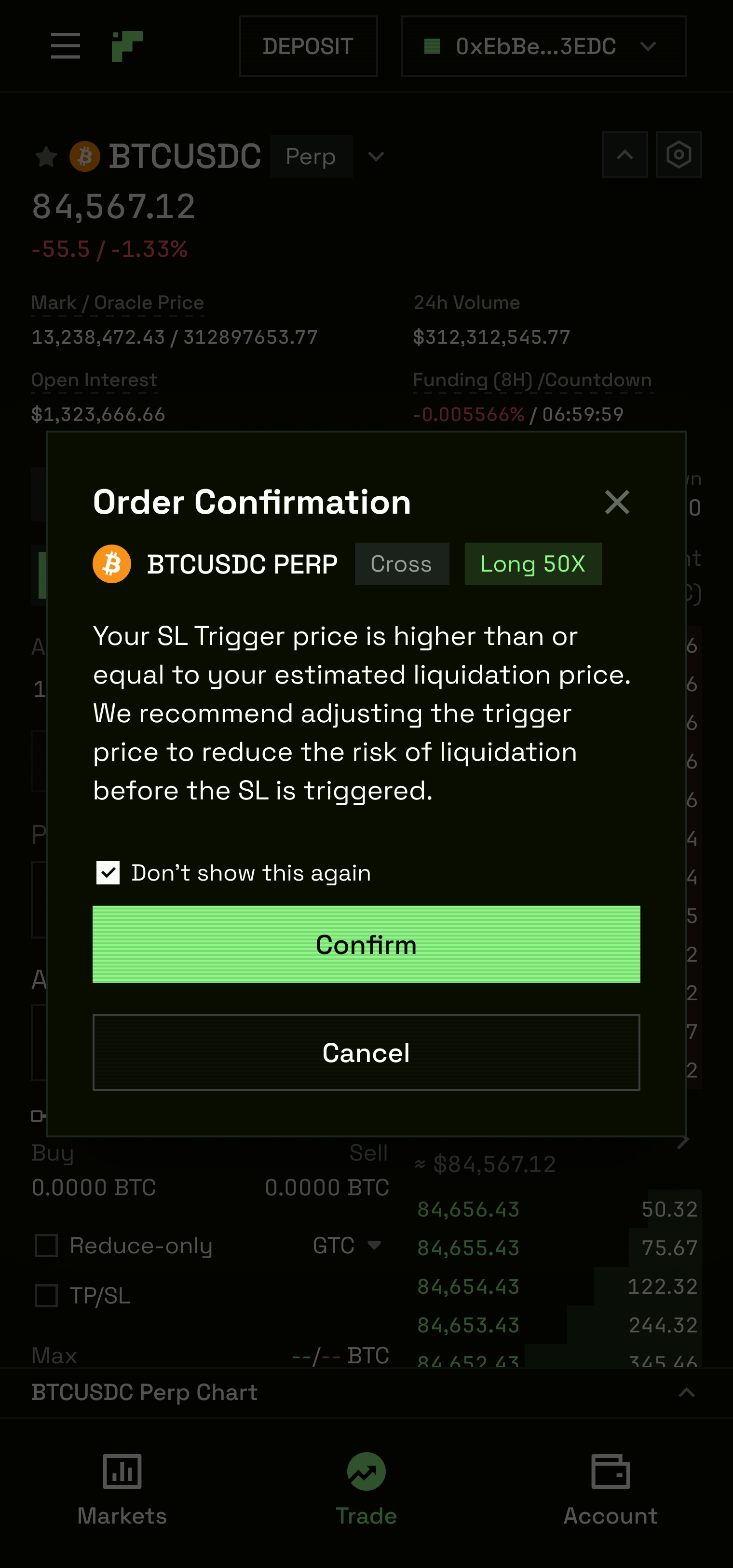
Law 2 — Surface Risk Before It Becomes Crisis. Liquidation price, margin ratio, funding rate, unrealised PnL: always visible at every viewport width. Not on hover. Not behind a disclosure. Always.
Law 3 — Colour Is Vocabulary, Not Decoration.--color-action-green #8DF885 = long/buy/positive. --color-action-red #FF5D5C = short/sell/danger. --warning #FFD60A = caution/elevated risk. --color-basic-danger #D62035 = critical/imminent liquidation. No exceptions. Using these decoratively breaks the vocabulary for every trader who has pattern-matched on it.
Law 4 — Irreversible Actions Require Deliberate Intent. Position close, withdrawal, leverage increase, hedge toggle: exactly one confirmation step. The confirmation shows exactly what will happen before it happens.
Law 5 — Mode State Is Always Visible. Hedge Mode active: persistent HEDGE badge. Isolated margin: toggle shows state. Simple Mode: indicator in header. No passive mode indicators.
Law 6 — Mobile Is Not a Downgrade. Every action available on desktop is available on H5. No feature is desktop-exclusive. H5 presents differently but never omits data.
Law 7 — Errors Are Conversations, Not Failures. Every error has three elements: what went wrong (specific, plain language), why it happened (non-technical), what to do next (a concrete, tappable action). Error 0x4f2a is not an error message. Your wallet is on Ethereum. Switch to Arbitrum to deposit. is.
Law 8 — Latency Is a Design Decision. Optimistic UI is mandatory for order placement. The platform acknowledges orders before chain confirmation. Pending to confirmed silently. Failed with retry.
Law 9 — The Post-Liquidation Moment Is Designed. Toast fires immediately. Position row turns red and fades over 800ms. LiquidationModal appears with full breakdown. The platform never goes silent after a bad event.
Law 10 — Growth Is a Design Surface, Not a Feature. Referral, points, leaderboard: woven into the primary trading experience. Every session surfaces one growth touchpoint, appearing after an action completes — never during.
Law 11 — Incremental Change Over Revolution. Major interface changes are announced before they land. Muscle memory is preserved wherever possible. The shortcut that worked last week works this week.
Law 12 — Design for the Worst Case First. The 3am liquidation cascade. The wrong network on withdrawal. The fat-finger market order. Design these failure states before the happy path. A platform that handles edge cases gracefully earns trust for every normal case that follows.
User Archetypes
All design decisions are tested against three archetypes. Simple Mode serves the Apprentice. Pro Mode serves the Operator. Hedge Mode is built for the Titan.
Apprentice — Coming from Binance or Bybit. First leveraged trade. Needs confidence, simplicity, and protection from surprise liquidations. Risk: overwhelmed by data density, misses the TP/SL step, gets liquidated on their first trade, and never returns.
Operator — Active daily trader. Has a Hyperliquid account. Needs speed, precision, and full order type depth. Risk: switches to Hyperliquid if execution feels slow or the order panel is missing a feature they rely on.
Titan — Institutional or high-net-worth. Trades size. Needs execution certainty, API access, and a risk dashboard that gives full portfolio visibility at a glance. Risk: one bad fill with no explanation, or a liquidation with no post-event context, ends the relationship.
Component Order: Atomic Design
The design system is built bottom-up. Every higher-order component is composed strictly from the layer below — nothing at the organism level invents new visual primitives. The delivery order follows the same logic: tokens first, organisms last.
Colour in TxFlow is a communication system, not a style decision. The token sheet is split into six semantic categories, each with Light and Dark mode values. The sheet format shows token name, Light hex, and Dark hex side by side — making theming decisions explicit rather than implicit.
Basic covers the five primary semantic meanings: Primary (the brand green — used for CTAs and positive confirmation), Secondary (cyan — secondary actions and links), Tertiary (yellow-green — accent and highlight), Success (confirmation green — distinct from Primary to allow both on the same screen), Warning (amber), and Danger (red). Each has Default, Hover, and Alpha 0.14 variants for compositing.
Action is the trading-specific subset: Action Color/Green and Action Color/Red. These are the only two colours permitted on the Buy/Long and Sell/Short CTAs respectively. In Dark mode, Action Green is #8DF885 — a slightly desaturated lime that maintains contrast against the deep background stack without the harshness of a pure #00FF00. Action Red in Dark mode is #FF5D5C.
Label covers text-on-surface legibility: Label Color/Default at full opacity and at Alpha 0.6, 0.4, and 0.2 — used for secondary text, disabled states, and ghost labels respectively. Light Default is #0A0A0A; Dark Default is #FCFFFA.
Text covers the primary type colours. Text Color/Default is near-white in Dark mode (#FFFFFF). Text Color/Second is used for secondary and supporting copy.
Fill is the background fill hierarchy — nine levels of fill from Primary1 (lightest surface) through Quaternary and Quinary. In Dark mode this runs from #080000 (deepest) through progressively lighter surface values. Fill/Tertiary1 and Tertiary2 share the same Light value but diverge in Dark.
Line covers dividers and borders at three levels: Primary, Secondary, and Tertiary — each stepping down in visual weight. In Dark mode, Line/Primary is #1C261C.
Background covers the two page-level backgrounds: Background Color/Primary (#FFFFFF / #000000) and Background Color/Secondary (#FBFBFB / #2F2F2F).
The Margin Ratio escalation system — the most critical pattern in the product — maps directly onto the Basic colour hierarchy: healthy positions use Success green, warning positions use Warning amber, critical positions use Danger red. This mapping is never overridden.
02 — Typography Tokens
Typeface: Space Grotesk — selected for geometric precision and legibility in the 12–14px range that dominates trading data tables and position rows.
03 — Alert
Alert is the system's inline feedback component — it communicates state changes that affect the current action, not system-wide events. Notifications (toasts) handle the latter. Alert handles the former.
Three structural variants are built for each type. Text only: the alert message runs full-width with no action affordance — used for passive informational states and blocking warnings. Text + Button: a "Button Text ›" CTA is inlined at the trailing end of the alert row — used when the alert requires a direct user response (e.g. "Your margin is below threshold. Add margin ›"). Text + Close: a × dismiss button allows the user to manually clear the alert — used for non-blocking informational states where acknowledgment is optional.
Multi-line (多行样式) variants are specified for all three structural types — the alert gracefully reflows to accommodate longer messages without truncation or ellipsis. This matters for error messages that must give full context per Law 7.
Both Light and Dark modes are fully specced. In Dark mode, alert backgrounds use the Basic colour at Alpha 0.14 — enough to communicate the semantic state without competing with the content below.
Badges are compact semantic labels — the smallest unit of status communication in the system. They appear in position rows (Long/Short direction), order type labels, market tags, fill state indicators, and the persistent Hedge Mode badge in the header.
Six semantic colours are defined: Primary, Secondary, Neutral, Success, Warning, and Danger. Each maps directly onto the Basic colour token for that meaning.
Two structural variants cover different information weight needs. Filled badges use a tinted background at the semantic colour — visually heavier, used for directional indicators (Long/Short), status chips (Open, Filled, Partial, Cancelled), and the HEDGE badge. Text badges are text-only with a coloured label and no background fill — lighter weight, used for metadata tags and secondary annotations.
Three icon configurations exist within each variant: Default (text only), Icon right (text with a trailing icon — typically an arrow or close mark), and Icon left (a leading icon — typically a status symbol). The icon is always sized to match the cap-height of the label text.
Light and Dark modes both fully specced across all 36 combinations (6 colours × 2 structural × 3 icon configs).
Badges — Filled + Text, Primary through Danger — Light + Dark
05 — Buttons
Buttons are the primary action surface. The button system covers every interactive state across every size and variant — designed so that the correct button for any context in TxFlow can be assembled from a single, consistent specification.
Seven button types are defined, each serving a distinct interaction weight. Primary: the highest-emphasis action on any surface — solid fill. Secondary: a secondary-emphasis action — lighter fill. Tertiary: a lower-emphasis action — minimal fill. Text: text-only with no background or border — used inline and for low-stakes actions. Info: informational CTA — distinct from Primary in intent. Ghost: transparent background with a border — used against coloured or elevated backgrounds. Outline2: a second outlined variant for contexts where Ghost isn't appropriate.
Four sizes are available. Small: minimum width 86px. Medium: minimum width 150px. Large: minimum width 182px. Max: minimum width 180px (full available width). The size specification is a minimum — buttons grow to fit label length.
Three states are specced for every size and type combination: Normal, Hover, and Disabled. Icon variants add four configurations: no icon, icon left, icon right, and icon-only (square and circle).
The Buy/Long and Sell/Short CTA colour assignment is an immutable rule from Law 3. Buy CTAs use --color-action-green (Light/Action Color/Green). Sell CTAs use --color-action-red (Light/Action Color/Red). Close Short is green (closing a short = buying). Close Long is red (closing a long = selling). This assignment is a P0 regression check on every deploy.
Both Light and Dark modes fully specced across all combinations.
Buttons — all types, sizes, and states — Light + Dark
06 — Switches
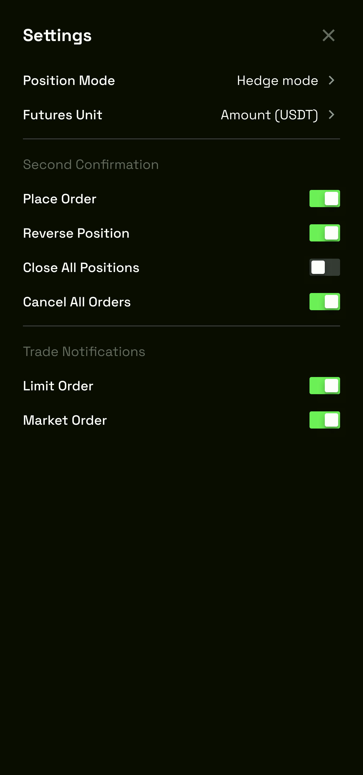
Switches are binary controls — they confirm a setting is either on or off. They appear in margin mode selection (Cross/Isolated), position mode selection (One-Way/Hedge toggle on mobile), TP/SL enable/disable, and settings toggles.
Per Law 5, every switch is always paired with a visible text label that shows the current state. There are no switches where the user must infer the state from the thumb position alone. The label updates in sync with the switch.
Four state combinations are specified. Light/Active: track is filled with the Action Color/Green, thumb is white. Light/Not Active: track is neutral grey, thumb is white. Dark/Active: same Action Color/Green track, thumb adjusted for dark backgrounds. Dark/Not Active: track is the dark neutral, thumb is adjusted.
Two sizes are provided — a standard size for settings panels and a compact size for inline use within dense trading interfaces.
Switch — Light/Dark Active/Not Active, 2 sizes
07 — Inputs
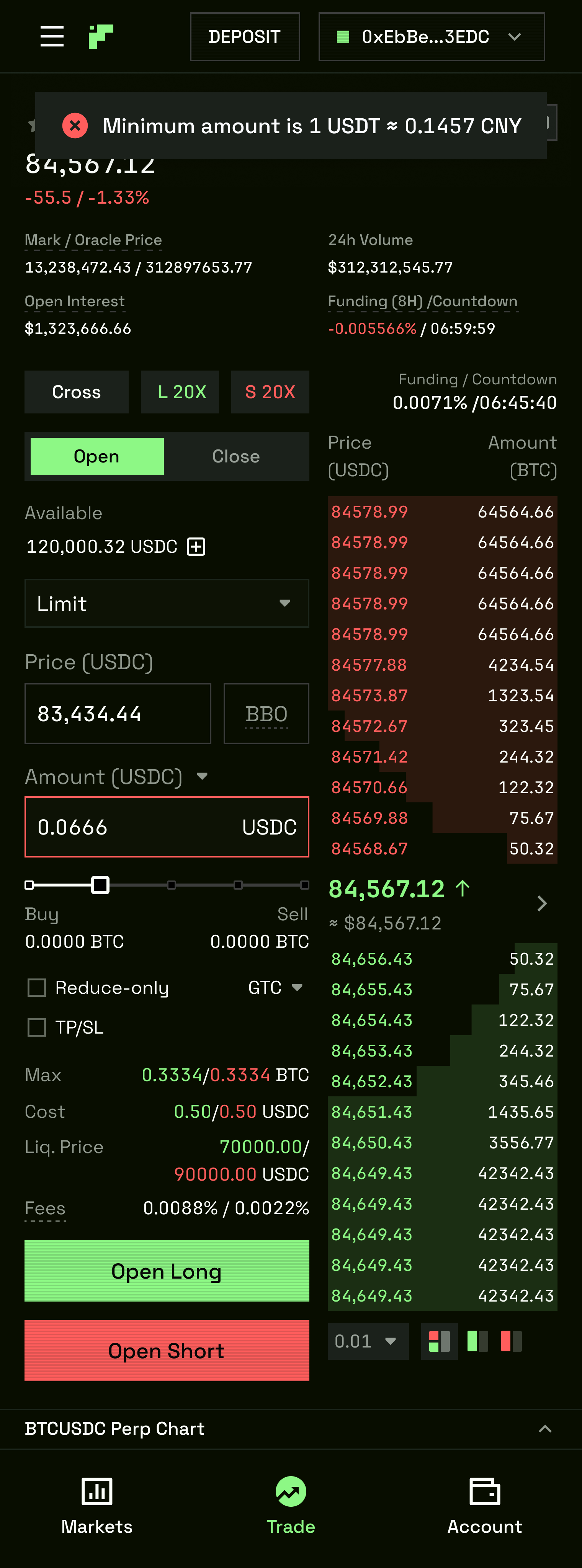
The input is one of the most complex molecules in the system — every field a trader touches to place an order, set a TP/SL, enter a deposit amount, or configure leverage goes through this component. The input system covers all of these contexts without creating bespoke one-off components.
Three structural categories are defined. Small (compact inputs for numerical values in dense order panels — price, quantity, leverage). Free Type (standard text inputs for labels, search, and deposit addresses). Motor (number inputs with stepper arrows — used for leverage and lot size entry where the trader increments rather than types).
States for each type: Default (unfocused, placeholder text visible), Active (focused, border accent), Filled (value present), Left label (a fixed unit label left of the input — e.g. "USD"), Right label (a fixed unit label right of the input — e.g. "USDC"), Left + Right label (both units shown simultaneously — e.g. "from" / "to"), Error (red bottom border, inline error message directly beneath the field per Law 7), Warning (amber accent), and Success (green accent).
The order price input has a dedicated colour treatment tied to the active order direction. When the trader is entering a Buy/Long price, the input focus ring is --color-action-green. When entering a Sell/Short price, it is --color-action-red. This is not decorative — it prevents the trader from placing an order on the wrong side without realising it.
Large input: a full-width variant used for single prominent entries (deposit amount, address fields).
Both Light and Dark modes fully specced across all size/type/state combinations.
Inputs — Small/Free Type/Motor, all states, Buy/Sell colour — Light + Dark
08 — Notifications
Notifications are the system's real-time feedback channel — non-blocking toasts that communicate events the user needs to know about without interrupting their trading workflow. Per Law 9, the liquidation notification fires at the WebSocket event — before the position row animation or the LiquidationModal.
Display rules (from the Figma spec): positioned 16px from the browser bottom and 16px from the right edge. Multiple notification cards stack vertically with 12px spacing between cards. Auto-dismiss after 3 seconds.
Two dismiss configurations: with × close button (for alerts requiring manual acknowledgment — liquidations, failed orders), and without × (for auto-dismissing informational events — order placements, fills). The header-only variant shows just the title line; the full card variant adds a body text line beneath.
Both Light and Dark modes specced. The dark mode notification uses the Fill/Secondary background (--bg-elevated equivalent) with a 1px border in the semantic colour at reduced opacity.
Notifications — Info/Danger/Warning/Success, dismissible variants — Light + Dark
09 — Header
The header is the global navigation organism — present on every surface. It establishes TxFlow's visual identity, surface hierarchy, and wallet connection state simultaneously.
The Figma board is titled "Header: Dark Mode (A/B)" — documenting two distinct treatment variants (A and B) side by side for comparison and selection. Both variants share the same component structure but differ in how the right-side wallet and action area is visually weighted.
Desktop structure. Left: TxFlow logo. Centre navigation: Trade, Vaults, Portfolio, Leaderboard, Explorer, Referrals, Docs, Points — with dropdown menus confirmed for Leaderboard (and other items) expanding on hover, revealing sub-items. Right: Wallet connection area. Connected state shows testnet, network indicator, a green DEPOSIT button, and a CONNECT WALLET button (or wallet address when connected). Disconnected state shows CONNECT WALLET as the sole CTA.
Six header states are specced for both A and B variants: disconnected, connected with balance shown, connected with deposit CTA, and multiple connected/wallet states that track the progression from first visit through active trading session.
Mobile structure. Hamburger menu (≡) on the left collapses all navigation into a full-height slide-in panel. The panel shows all main navigation items with active state highlighted in green. External links (Docs, Referrals) show an external link icon. The mobile header retains the wallet area on the right — balance and wallet address visible at a glance without opening the drawer.
Header — Dark Mode A — Desktop + Mobile drawer
10 — Order Book
The order book is the most data-dense organism in the system. It displays the live limit order book — all resting buy orders (bids) and sell orders (asks) with price, size, and cumulative depth — updating in real time. The design problem is not how to display this data on a large screen. It is how to maintain utility as the panel shrinks from a full desktop column to a narrow mobile strip.
Web (multiple breakpoints). The Figma board (Apr 1 2026) documents ~17 discrete width breakpoints from maximum to minimum. At full width, all three columns are visible: Price (USDC), Amount (ETH), Total (ETH). The bid/ask depth is visualised with a coloured background bar behind each row — green for bids, red for asks — where bar width is proportional to cumulative depth. As the panel narrows, Amount and Total columns collapse progressively. At the narrowest breakpoints, only Price is shown. The current mid-market price is displayed as a separator row between bids and asks — e.g. $4,567.12 ↑ with a green background when the last trade was a buy. Three depth view toggle buttons control whether the panel shows bids only, asks only, or both.
A Decimal precision selector sits at the bottom of the panel — controlling the grouping increment for the price ladder. The selector dropdown shows options (e.g. 0.01, 0.005, 0.001) that re-bin the order book rows without a page refresh.
A Trade History tab alternates the same panel space between the live order book and a list of recent completed trades — a standard pattern that keeps both data types accessible without requiring two separate panels.
H5 Mobile. Five mobile breakpoint variants are specified, all showing the full-width treatment with columns stacked for narrow viewports. The decimal selector persists on mobile. Both Order Book and Trade History tabs are accessible via the tab strip at the top of the panel.
The order book never collapses to invisible at any viewport width. This is a confirmed P0 regression check on every deploy — if the order book is not rendering, the trading surface is broken.
Margin Ratio — 5-State Escalation Pattern
The most critical UX pattern in the product. Every surface showing an open position implements this system. The colour tokens above directly power it.
Healthy (>100%): ratio text in --success green. No border, no alert.
Watch (80–100%): ratio text in --warning amber. No banner yet.
Warning (50–80%): ratio in --warning. Row gets border-left: 3px solid --warning.
Danger (20–50%): ratio in --color-basic-danger #D62035 + pulse animation. Persistent warning banner above positions table.
TxFlow has two independent mode axes that intersect. The Apprentice starts in Simple + One-Way. The Titan operates in Pro + Hedge.
Simple Mode hides advanced order types (TWAP), ADL indicator, raw order book depth numbers, leverage above 20×, and detailed margin mode explanations. It always shows: Limit/Market/Conditional tabs, price and size inputs, leverage slider (capped), Buy/Long and Sell/Short CTAs, margin ratio (3-state colour system is never hidden in any mode), and liquidation price. Indicated by a persistent SIMPLE pill in the header.
Pro Mode shows everything: all order types, full order book with raw depth, ADL indicator in every position row, Mark/Oracle/Index price breakdown, funding rate countdown, and leverage up to platform maximum. No pill shown — Pro Mode is the assumed default for returning users.
Hedge Mode — TxFlow's primary competitive differentiator. Allows simultaneous Long and Short positions on the same asset with separate margin pools per direction. Activated via toggle in the order panel header. A persistent HEDGE badge (--color-action-green border) appears in the trading header whenever active. Order panel in Hedge Mode shows dual CTAs: Open Long (green) and Open Short (red) side by side. Cannot be deactivated while positions are open.
Mode state is always confirmed by a brief toast on switch.
Storybook — Coded Component Library
The design system was implemented in code alongside the Figma work, using React + TypeScript + Tailwind with Storybook 8 as the component browser and documentation surface.
Atoms (5): Badge, Divider, Icon (Remix Icons wrapper — all icons routed through this), Spacer, Text
Trading Organisms (purpose-built, no equivalent in generic DS libraries): HedgeModeBadge, LiquidationModal (non-dismissable 3s post-liquidation, full breakdown), MarginRatioBadge (3-state colour system), MarketBar (always-on, never collapses at any viewport), OrderBookMobile, OrderBookPanel, OrderBookWeb, PnLDisplay (always --font-numeric, always colour-coded), PositionRow (3-state margin escalation built in), TradingChartOrderbookStrip, TradingOrderPanel, TradingP0 stories
Design tokens are sourced from src/design-tokens/index.ts — the same token file referenced by both the Storybook stories and the Figma token export. Token propagation runs via npm run tokens:propagate to ensure Figma and code stay in sync.
AI Design Infrastructure
The design system was extended into an AI-readable knowledge base — the TxFlow Cursor System (DEX/PERP-DEX-AGENTS/txflow-cursor-system/) — that allows AI agents in Cursor to make design decisions grounded in the same philosophy, tokens, and component inventory as the Figma files.
The system is structured as: design-brain/ (tokens, components, patterns, principles) + domains/ (trading, vaults, growth, core, mobile — each with a CONTEXT.md that gives the AI the confirmed live UI state for that surface). The AGENT_SYSTEM.md master prompt defines three user archetypes and a reading order that must be followed before any design work begins.
This infrastructure allowed AI agents to generate spec-accurate handoff documentation, QA checklists, and prototype code without hallucinating components or colours — because the system gave them the actual token values, component inventory, and confirmed UI state as ground truth.
See the Agent page for full documentation of the AI workflow layer.
Want to build something like this?
Available for product design roles and contract work in DeFi, Web3, and fintech.